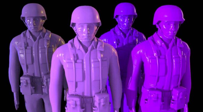
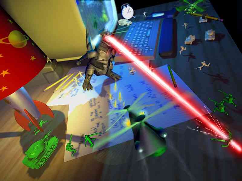
There is an inherent contradiction at the heart of any world built from toys. Plastic soldiers, molded smiles, bright colors, simplified anatomy… these elements are culturally coded as harmless. They belong to childhood, to imagination, to play. The moment they move, speak, and wage war, the premise risks collapsing into a parody.
The solution is not to fight that contradiction. It is to weaponize it.
A serious toy universe does not deny that its characters are toys. It refuses to treat that fact as a joke.
The material is plastic. The conflict is not.
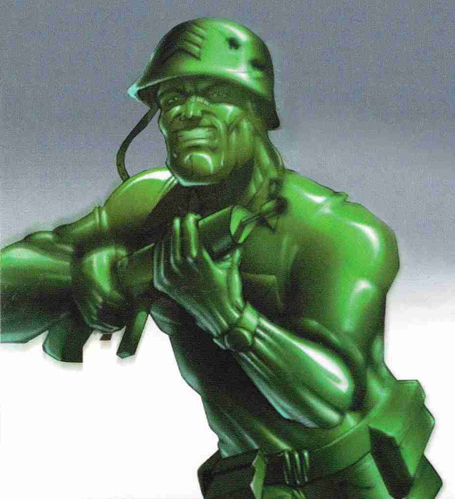
What creates seriousness is not realism in the biological sense, but consequence in the material sense. Plastic cracks. It splinters. It melts. It warps under heat. Like the real plastic, it does not bleed, yet it scars permanently. Damage is not only mere cosmetic. A gouge remains. A burn deforms. A limb once snapped does not regenerate unless rebuilt… and rebuilding changes the identity of the figure. Although they are toys, the conflicts (for them) are as dramatic, dystopian, chaotic, and emotional as the movie Saving Private Ryan.
On the other hand, the fact that the Army Men wonder where they come from and who made them, without knowing humans at first, gives the Toyverse a captivating air of mystery. They now know they are toys… but why they are alive?.
It is not satire. It is collision.
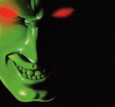
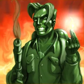
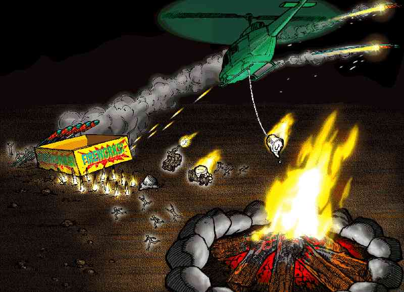
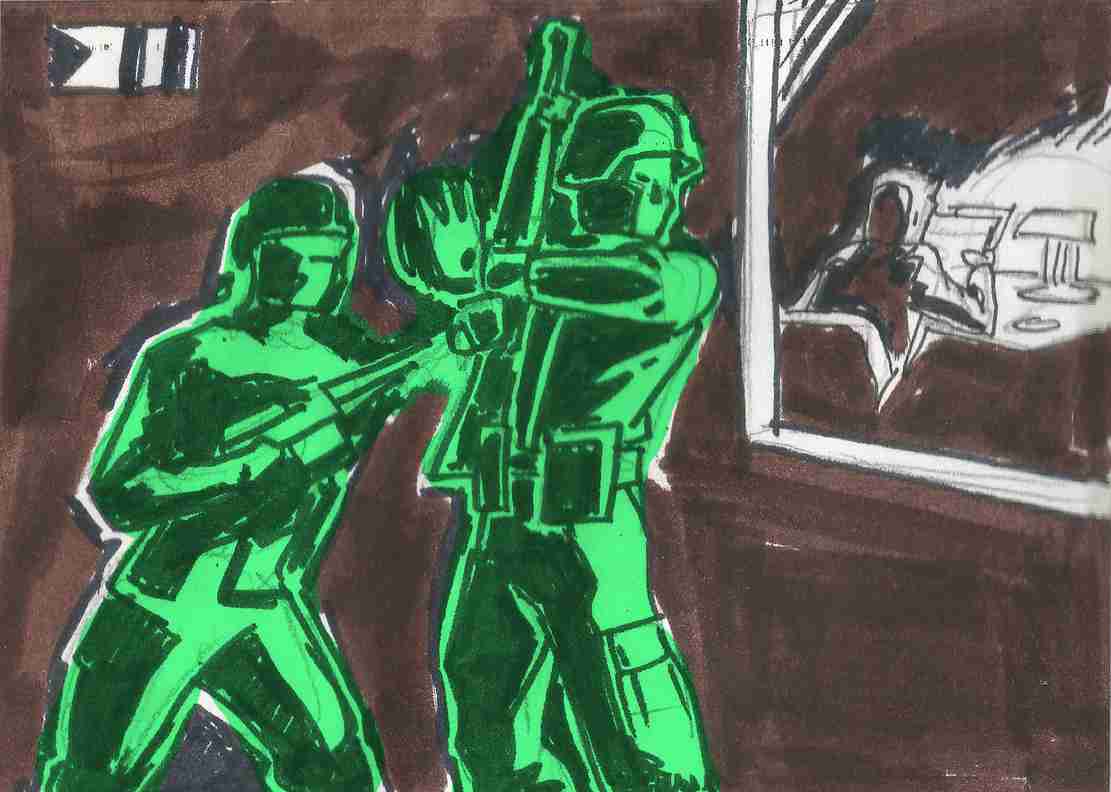
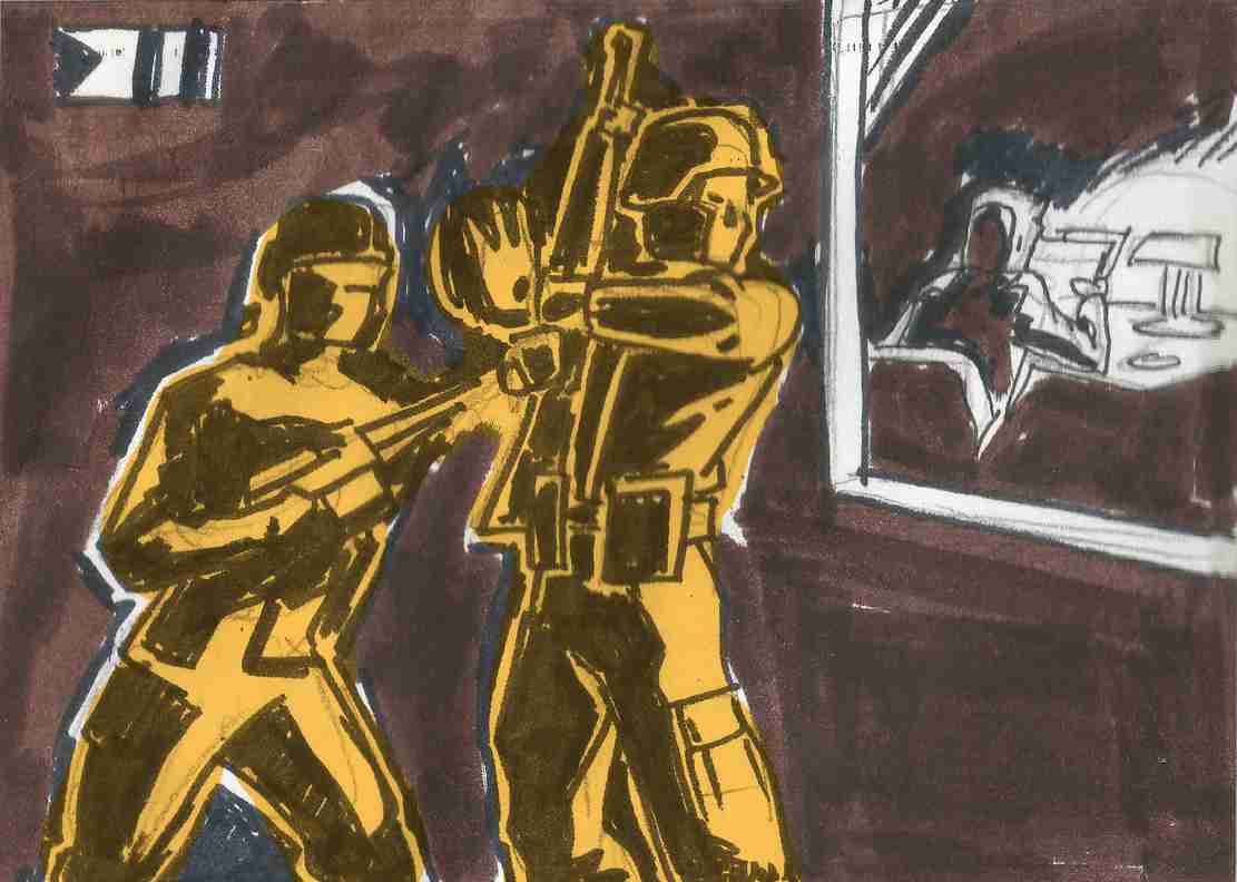
Violence, in this context, becomes strangely more disturbing than flesh-based violence. When a molded face designed to be eternally heroic is shattered, the dissonance is immediate. When a smiling infantry figure is left partially melted, its once-clean silhouette sagging and distorted, the visual contradiction does the emotional work. The horror is not gore. It is the corruption of permanence.
Imagine this scene, but with a plastic soldier half-melted by a flamethrower… same creepy disturbing effect
Childlike design placed in uncompromising situations generates a powerful, unsettling tone. A toy sculpted with simplified optimism (wide chest, bold stance, clean lines) suddenly reduced to fractured debris forces the audience to reconcile two incompatible readings at once. It is not satire. It is collision.
Plastic Irony
This is where irony becomes effective… not as humor, but as tension. The irony of a cheerful teddy bear functioning as a calculating war criminal. The irony of pastel-colored units enforcing brutal order. The irony of a soft plush antagonist whose stitched smile never changes while atrocities unfold around it. These contrasts destabilize expectation, and that destabilization produces seriousness.
Happy Three Friends is an example of this, or any bloody anime of 80′: They were a success because at the time nobody expected a cartoon to be bloody, let alone sexually suggestive with its portrayal of female sensuality. Even fewer expected important characters to die, as was the case with Optimus Prime at the end of Transformers G1.
If the world treats these characters as emotionally and politically real, the audience has no escape hatch. There is no wink to retreat into.
No escape
Violence, when used carefully, establishes stakes. It should not be constant spectacle. It should be sharp, visible, and transformative. A melted helmet fused to a figure’s head is not a shock moment… it is a reminder of vulnerability. A snapped arm replaced by a mismatched color limb tells history without exposition. The visual aftermath matters more than the impact itself.
The environment amplifies the tone
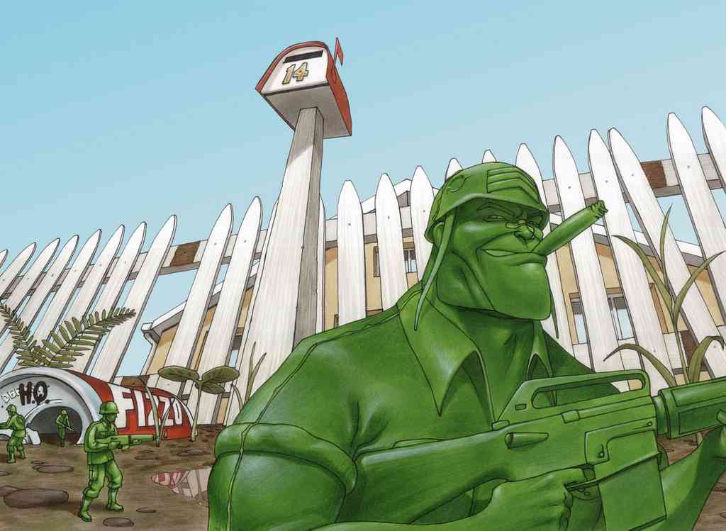
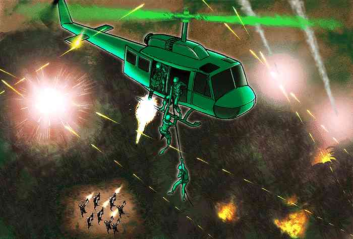
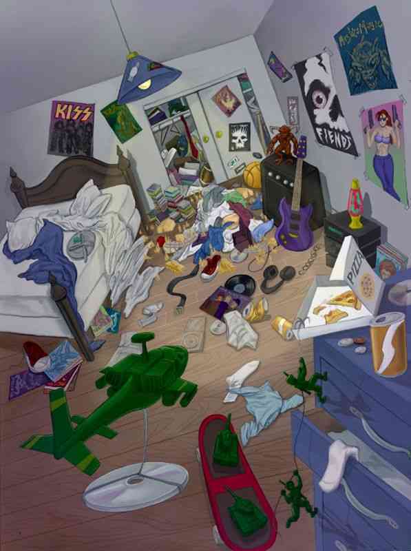
Scale must inspire awe rather than whimsy. A carpet is not “cute terrain”, it is an unstable fiber forest that swallows patrols. A kitchen counter is not a prop, it is a monolithic plateau of artificial stone. A staircase becomes a vertical siege campaign. When staging emphasizes height, depth, shadow, and mass, the toy scale dissolves. The audience stops thinking in centimeters and starts thinking in distance and danger.
Imposing scenography carries emotional weight. Strong silhouettes against vast domestic architecture. Harsh lighting cutting across molded surfaces. Smoke rising between oversized table legs like industrial pillars. When compositions are treated with the discipline of war cinema rather than children’s animation, tone shifts immediately.
Art direction is not decoration… it is argument
Color can function the same way. Bright, saturated plastic under cold, directional light becomes severe. Glossy surfaces reflecting firelight transform innocence into tension. A pristine green soldier under neutral light feels nostalgic. The same soldier half-shadowed, scratched, and standing before a towering appliance feels mythic.
Another essential choice is permanence
A toybox world often implies reset. Battles happen, figures are rearranged, and nothing truly changes. A serious universe cannot afford that elasticity. If a battalion is destroyed, its absence must be felt in later campaigns. If a faction loses territory, maps must shift. If a leader falls, instability must ripple outward. The sense that history accumulates (that nothing resets) converts play into chronology.
Even the concept of manufacturing can become existential. These beings are molded, cast, assembled. Does that define destiny? Is identity tied to batch, color, or purpose? Can a figure melted down and recast be considered the same individual? What does death mean in a world where bodies are objects? These questions deepen the premise beyond aesthetic novelty.
The greatest tonal risk is self-awareness. The moment a character reduces their own existence to a joke (“we’re just toys”) the illusion fractures. A serious toy universe must believe in itself completely. Its wars are not pretend. Its politics are not an elaborate game. Its casualties are not temporary.
The contrast between innocence of form and severity of action is not a gimmick. It is the foundation
A molded grin shattered by artillery. A plush villain issuing cold strategic commands. A bright plastic platoon silhouetted against a towering, indifferent world of human-scale architecture.
When handled with discipline, the visual language does the heavy lifting. The audience feels the weight without being told to.
In the end, seriousness does not come from making toys more realistic.
It comes from making consequences unavoidable.
Plastic is not fragile because it is a toy. It is fragile because it can break… and once broken, it never returns to what it was.
The Evolution of Plastic Soldiers in the Army Men Toyverse
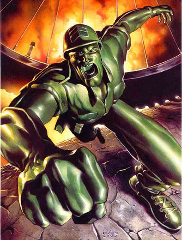
Like the clones in Star Wars, Plastic Soldiers are mass-produced with a single purpose: to fight. Fresh out of the mold, they are identical in appearance and function. They have no personal identity, no opinions, and no customization. Their abilities are the same, their uniforms are standard, and their mindset is programmed to obey orders without question.
Initial Uniformity: Born from the Mold
Their existence is purely functional. They are replaceable, interchangeable, and in the chaos of war, individuality is not a priority.
Battlefield Marks: Experience and Change
However, war is unforgiving, and no soldier remains the same after facing the reality of combat. With each mission, Plastic Soldiers begin to develop their own instincts. The scars of battle (cracks in the plastic, burns, improvised accessories) become marks of identity.
Just as the Star Wars clones adopted unique hairstyles, armor modifications, and personal emblems, Plastic Soldiers also find ways to stand out. Some reinforce their weapons with duct tape, others paint symbols on their helmets or adjust their posture, slightly bending their joints to differentiate themselves. These small adaptations become badges of veteran warriors.
The Awakening of Individuality: More Than Just Soldiers
Over time, the standardization of their existence begins to crumble. Those who survive long campaigns develop their own thoughts, question orders, reflect on their purpose, and adopt an identity beyond their initial function.
The Star Wars clones evolved from mere troops to individuals with distinct voices, such as Rex and Cody, who led with autonomy and genuine emotions. In the Toyverse, Plastic Soldiers follow a similar path. Once uniform figures on a battlefield, they become characters with distinct personalities, choosing how to fight, what to preserve, and how to leave their mark.
The Experienced and Enhanced: Beyond Natural Evolution
Not all Plastic Soldiers follow a progression solely based on combat experience. Some, whether through battlefield merit or strategic necessity, are selected for enhancement programs (similar to the Super Soldier project or cybernetic modifications seen in Star Wars with Clone Commando Echo, or even characters like Cable from X-Men and Bucky Barnes, Marvel’s “Winter Soldier).
These soldiers undergo physical and tactical upgrades that elevate them beyond their comrades. Some receive structural reinforcements, advanced armor, or bio-mechanical enhancements that increase their endurance and strength. Others are transformed into hybrids of machine and soldier, integrating advanced communication systems, improved sensors, or even prosthetics with specialized abilities.
However, the cost of these enhancements is not just physical. Like Echo in Star Wars: The Clone Wars Season 7, many of these upgraded soldiers face an identity crisis: Are they still Plastic Soldiers, or have they evolved beyond what they were created to be? Are they tools of war or individuals with their own purpose?
For some, enhancement is a blessing; for others, a curse. Their role in the Toyverse becomes a dilemma between utility and individuality, where war reshapes them not only physically but also spiritually.
Conclusion: Evolution Beyond the Mold: More Than Plastic, More Than Soldiers
A Plastic Soldier’s fate is not set at the time of its creation. Though they are born with a fixed purpose: war, experience gives them something invaluable: identity. Thus, what was once a homogeneous army transforms into a brotherhood of unique warriors, each with their own story sculpted in plastic.
The progression of Plastic Soldiers in the Army Men Toyverse mirrors the journey of Star Wars clones: from interchangeable units to unique individuals with their own stories. But in the case of the enhanced ones, a new element is at play: transformation not only as a result of war but also through deliberate intervention.
From mass-produced warriors to experienced soldiers who choose to forge their own destiny, each Plastic Soldier faces a different path. Whether shaped by battle or by technology that turns them into something more, their evolution defines the true weight of individuality in a world where they were created to be identical, and for war.
Flags, logos, and other visual representations are powerful tools in graphic design, serving as symbols that convey identity, values, and messages of groups, nations, factions, and communities. Let’s explore these elements from a graphic design perspective, focusing on representation, iconography, and the meanings behind various design elements and their users.
Army Men Nations flags
Flags in the Army Men franchise are somewhat diverse. Some use Real-World references, their initial font, or some kind of Shapes or Symbols. Black and White are used for the contrast element.
Army Men Green Army FlagGreen Flag from SH DreamcastArmy Men Tan Nation FlagTan Flag from SH DreamcastArmy Men Blue Nation FlagBlue Flag from SH DreamcastArmy Men Red Nation FlagSarge’s War GC Red flagGrey Flag from SH Dreamcast
Toyverse Project Original Flags
White Army FlagOrange Army FlagCyan Nation FlagViolet Nation Flag
In the case of the Orange and White armies we used the W and O from the “Real World” logo, which is heavily based on the “Real” slogan from 3DO. But the most for the White Army, because that W is too captivating for us to leave it alone in that logo. It also follows a bit the design aesthetic of the T of the Tan Army.
In the case of the Cyan Army, it is a flag more in the classic style of a Real-World country flag.
But in the case of the White Army flag, we are considering this idea for the design. Although it may end up being a mirror image… or even more distant, it may end up being the logo of Lord Malice or Major Malfunction!
Lord Malice possible logoMajor Malfunction possible logo
Representation in Graphic Design
Representation in graphic design involves creating visual symbols that encapsulate the essence of the entity they represent. This could be a nation, a company, a social movement, or a community. The goal is to create a design that is instantly recognizable and communicates the core values, ideas and identity of the group.
Other flags & logos
Space Troopers flagStorm Legion Flag (AM Strike’s Tan Colonel Destruction)Colonel Destruction’s Storm LegionBaron Von Beige squadron flagBaron Von Beige squadron CGI original textureAqua Marines flag (Water or Winters Marines)The order of the Rabbit
Iconography
Iconography is the study and use of images and symbols to represent ideas, concepts, or information. In graphic design, iconography is crucial because it allows for the quick and effective transmission of messages. Symbols and icons are more than decorative elements; they are the shorthand of communication, cutting through the clutter of words to convey complex messages swiftly.
The Army Men video game franchise, which began in 1998, is known for its distinctive iconography that draws heavily from the classic green plastic toy soldiers. Here are some key elements:
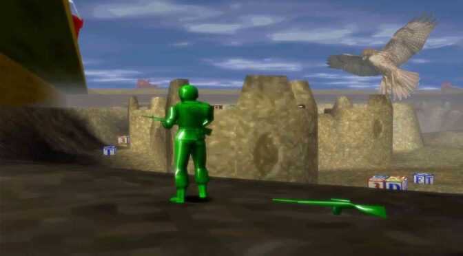
Color-Coded Factions: The games feature different factions represented by distinct colors, primarily the Green and Tan armies. Other factions like the Blue and Grey armies also appear, each with their own unique characteristics and allegiances.
Toy-Like Aesthetic: The visual style of the games emphasizes the plastic nature of the soldiers. When characters are defeated, they often melt or shatter, reinforcing the idea that they are toys.
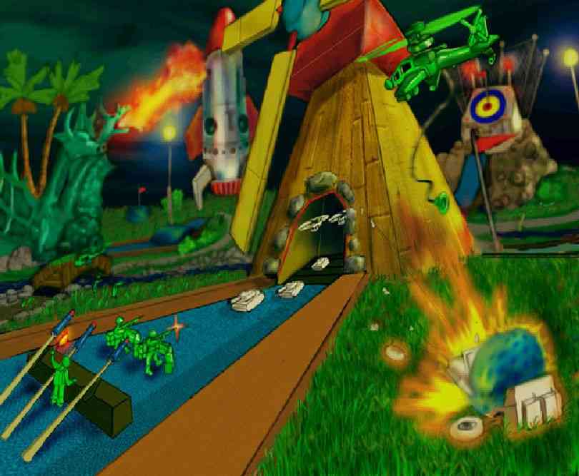
Real-World Settings: Many of the battles take place in exaggerated real-world environments, such as kitchen counters, gardens, and bathrooms. This juxtaposition of small toy soldiers in large human environments adds a playful and imaginative element to the games.
Military Symbols: The games incorporate traditional military iconography, such as medals, ranks, and insignias, but with a playful twist to fit the toy soldier theme.
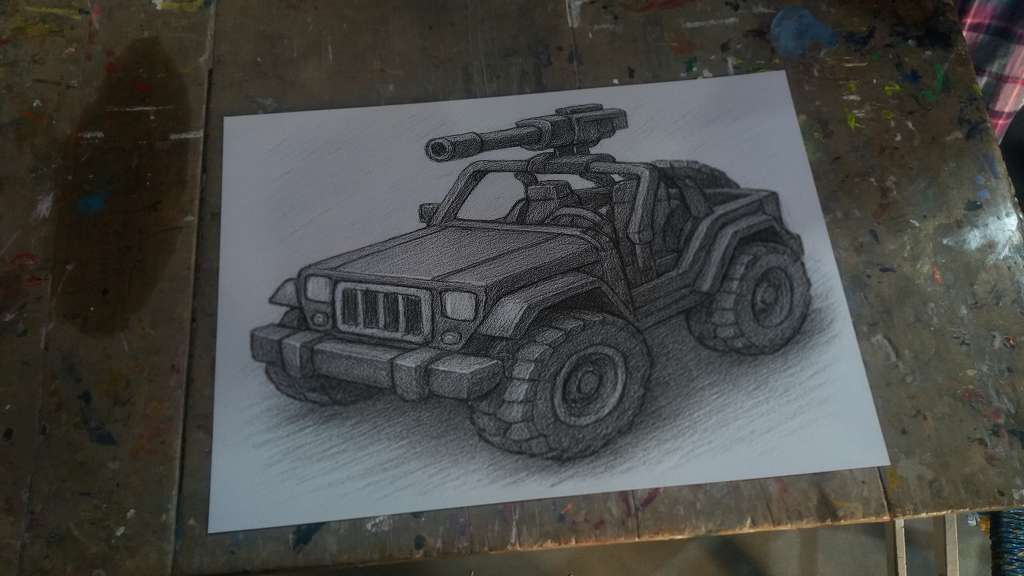
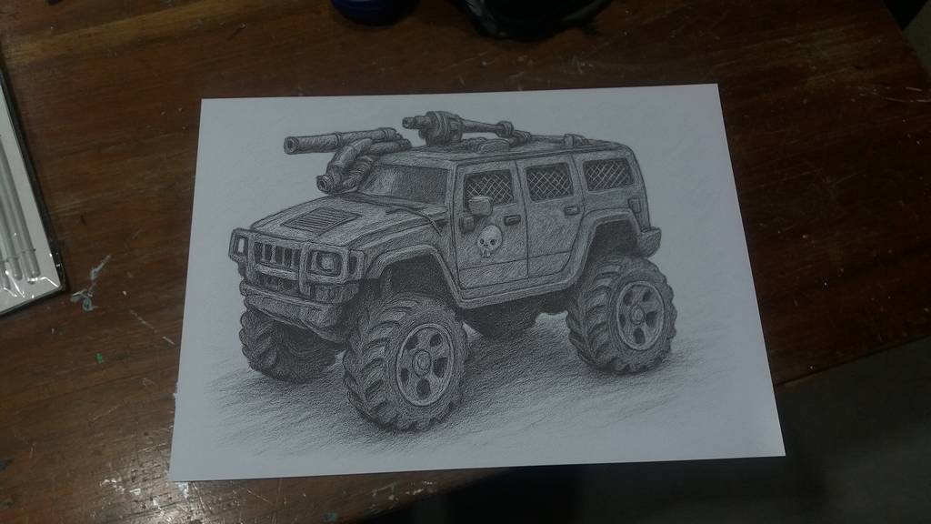
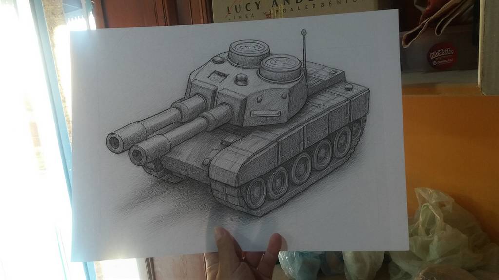
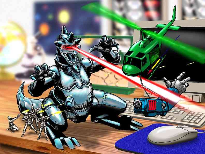
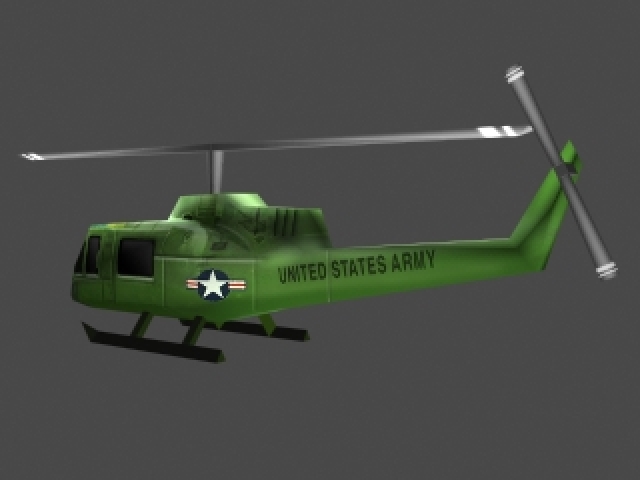
Vehicles and Equipment: The franchise includes a variety of toy-like vehicles and equipment, such as jeeps, tanks, and helicopters, all designed to look like they belong in a child’s playset.
These elements combine to create a unique and nostalgic experience that appeals to both fans of classic toy soldiers and video game enthusiasts.
Original logotypes:
A remake of the Army Men Classic Logo
This was the first logo for the game franchise, later used in Army Men 3D. Later they used different versions for Army Men 2, Army Men Toys in Space and even Sarge’s Heroes and Air Attack. But it was right during the release of these last 2 games that they came up with the final version:
Definitive Army Men logo, with “Real Combat .Plastic Men.” slogan
This version was used in most (if not all) of the later games, with out the slogan. It was used for last versions of Sarge’s Heroes and Air Attack, until 3DO went out of business. Even after that it was still used for Sarge’s War and Major Malfunction.
Our Army Men Toyverse Project Logotypes
Army Men Real World Project
This logo is from our Toyverse project, the logo that the Army Men Alliance uses in their research initiative into the Real World, the world of humans. The design uses the REAL logo from the defunct company 3DO, a kind of slogan they used. It is worth noting that the 3 colors between the letters of REAL are the colors of the 3 pieces of the key that opens the portal in the first game and in Army Men 3D. Since we couldn’t find any matches for the font used, to add WORLD we cloned the R and the L, and created the other letters trying to respect the same style, giving a special emphasis to the W.
This logo captures the mystery and novelty that the Real World means to Army Men.
Army Men Revolution new videogame logo
This is the logo for our video game project. We wanted a somewhat innovative logo, without losing the essence of Army Men. And since it revolves around the Red Army, we gave it that color and some of the essence of the fonts used in the propaganda of the Soviet Union, in which our version of the Reds are strongly based (not for nothing their official flag is a star). Something that helped us finish the idea of the logo was the 2024 movie “Deadpool & Wolverine”, because of that texture of worn painted and metal underneath, which also alludes to the fact that one of the super weapons of the Red Army will be that they manufactured a massive army of vehicles and all kinds of war tools in Real World metal alloys.
Army Men Toyverse project
This is the logo for the Toyverse project, which serves to encompass other projects under the same initiative, in which ideas, canon and assets are shared. Read more in Army Men Toyverse project.
If you feel like the style sounds familiar, it’s because it’s very similar to the style of “Toys in Space”, which we think is a game that represents the imaginative diversity that can be brought to the world of Army Men.
Army Men REAL PLASTIC MEN logo
This is almost the same logo as the 2.0 logo, but in our case we used it for the branding of the plastic soldiers line in the Real World (Real Plastic Men).
Elements in design and their meanings
Colors: Colors play a significant role in visual representations. Each color can evoke specific emotions and symbolize different concepts. For example:
Red: Often associated with passion, energy, and danger. In the case of the Reds, it is appropriate because it represents their nationalist passion and protection of themselves and their culture. They believe that their ideals are correct above all other beliefs, and they defend their culture to the point of being totally closed to the outside world. At first they will be conservative and extremist in keeping it that way.
Blue: Represents calmness, trust, and stability. In the case of what brings us here, Blue is usually a color related to the sky, but especially to the Sea, Water and Ice. For this reason, the element dominated by the Blues will be water or ice, as we can see in the defensive towers of Army Men Warfare. Blue is also a cold and dark color, which helps to go unnoticed in the dark, which is what every spy needs to operate.
Green: Symbolizes nature, growth, and harmony. In the case of our project, it symbolizes the Greens’ initiative to respect the nature of the other worlds and maintain them in harmony, trying not to interfere with or modify them.
Orange: They represent fire, the element that the Orange Nation will dominate. Although the personality of some of its characters will go hand in hand with the intensity of fire.
Gray: They represent neutrality and the absence of diversity. In our Toyverse, the greys were like the Nazis: they rejected everything they considered incorrect or out of the normal status. Their colors lack individuality and diversity. It is also useful when it comes to camouflaging with the environment, one of the most neutral colors for this purpose.
Black: Can denote power, elegance, and mystery. You’ll know why…
Plants: Trees can symbolize life, growth, and wisdom, while flowers like roses can represent love and beauty.
Shapes and Symbols: Shapes and symbols are integral to iconography. Common shapes and their meanings include:
Circles: Represent unity, infinity, and protection.
Triangles: Can symbolize stability, power, and direction.
Stars: Often used to denote excellence, aspiration, and guidance.
Imagery: The use of specific images can convey deeper meanings. For example:
Animals: Different animals can symbolize various traits. For instance, an eagle often represents freedom and strength, while a lion symbolizes courage and royalty.
The Toyverse thrives on the belief that every toy has a soul, a tiny spark of magic. So in the Real World, the world that ties all toys to a common origin, is so bigger that contains a few “embasies” from the other worlds, officially recognized by some toykinds and some of this worlds. So if any toy stranded in the Human World in need of help, like a discarded action figure or a half-buried dinosaur, now toys know that they have an embassy to allocate and obtain any help they need.
The Prehistoric Domain:
Here, the grassy plains echo with the roars of plastic dinosaurs. Tiny T-Rexes chase after elusive triceratops, while pterodactyls soar above the sandbox cliffs. This is the Real World prehistoric embassy for Prehistoric animals.
The Jurassic Valley:
Bounty Hunter Butterscotch discovered a secret entrance in one of the pyramids discovered by Vikki Grimm in the Prehistoric World, and there is where this embassy is located, out of reach of the Dinosaurs, underground.
The Medieval Enclave:
Within the shadow of Camelot Castle, toy knights don their plastic and metal armor. Big noble steeds, wooden rocking horses, gallop soaring across the plains (without moving anywhere). There, next to the Round Table, is the embassy. Sometimes King Arthur himself passes by to talk to the toys in need.
Dragons, crafted from green felt and googly eyes, guard treasure chests filled with marbles and shiny buttons, used for the embassy fortifications.
The Cosmic Expanse:
In the outer space from the Real World, The Great Plastic Meteor floats in a stable orbit. A space station has been set up there that serves as a space port for toys.
Astronauts (action figures or other toys with makeshift helmets) embark on daring missions. Sometimes their rocket ships, constructed from cardboard tubes and glitter, blast off toward the ceiling, exploding into a thousand pieces… because of course, if they do not hit the ceiling, as soon as they reach a considerable height they dismantle with the high speed of winds. But sometimes, and only sometimes, a toy is smart enough to build a resistant and aerodynamic rocket that allows them to reach the upper atmosphere to put their spacecrafts into orbit.
The Alien figurines that populates The Great Plastic Meteor station, with wiggly arms and neon-green skin, communicate in cryptic beeps. But they exchange intergalactic stickers as tokens of friendship.
The Underwater Abyss:
Beneath the bathroom sink of the former Lord Malice’s HQ household, lies the mysterious Underwater Abyss embassy. Rubber duckies double as submarines, exploring the depths of the porcelain to find the way to the open sea.
There, on the coral reefs (made from discarded sponges) shelter schools of plastic fish, lies the underwater embassy. It is guarded by a well-known superhero action figure who is in charge of toy rescues and a large fleet of Army Men submarines that patrol the perimeter.
There elusive red haired Mermaid Chickz occasionally surfaces, combing her hair with a toothbrush.
The Toybox Nexus:
The heart of the Toyverse (the Toybox Nexus) connects all these realms. It’s a swirling vortex of imagination, where forgotten toys gather to share stories.
Here, a wind-up robot dances with a plush teddy bear, and a RC car races against a wind-up snail. The Nexus thrums with creative energy and it’s the place where all those toys that are left halfway through an interdimensional journey go, whatever the reason for this happening is.
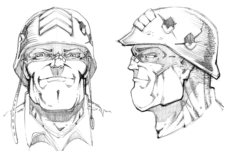
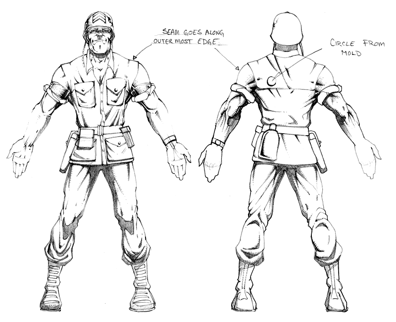
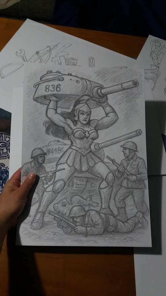
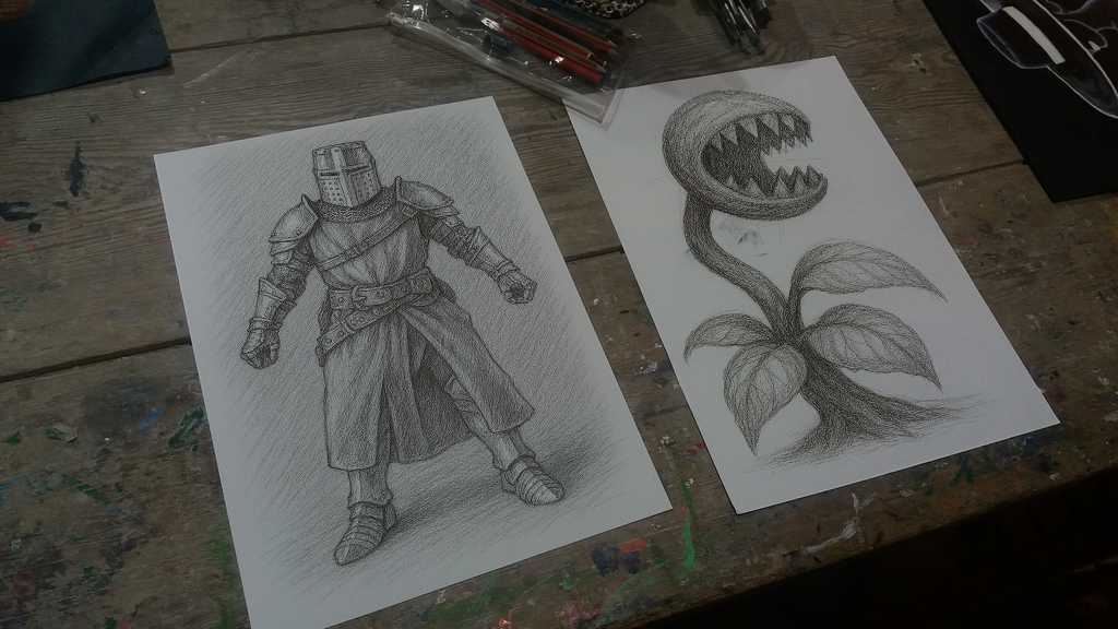
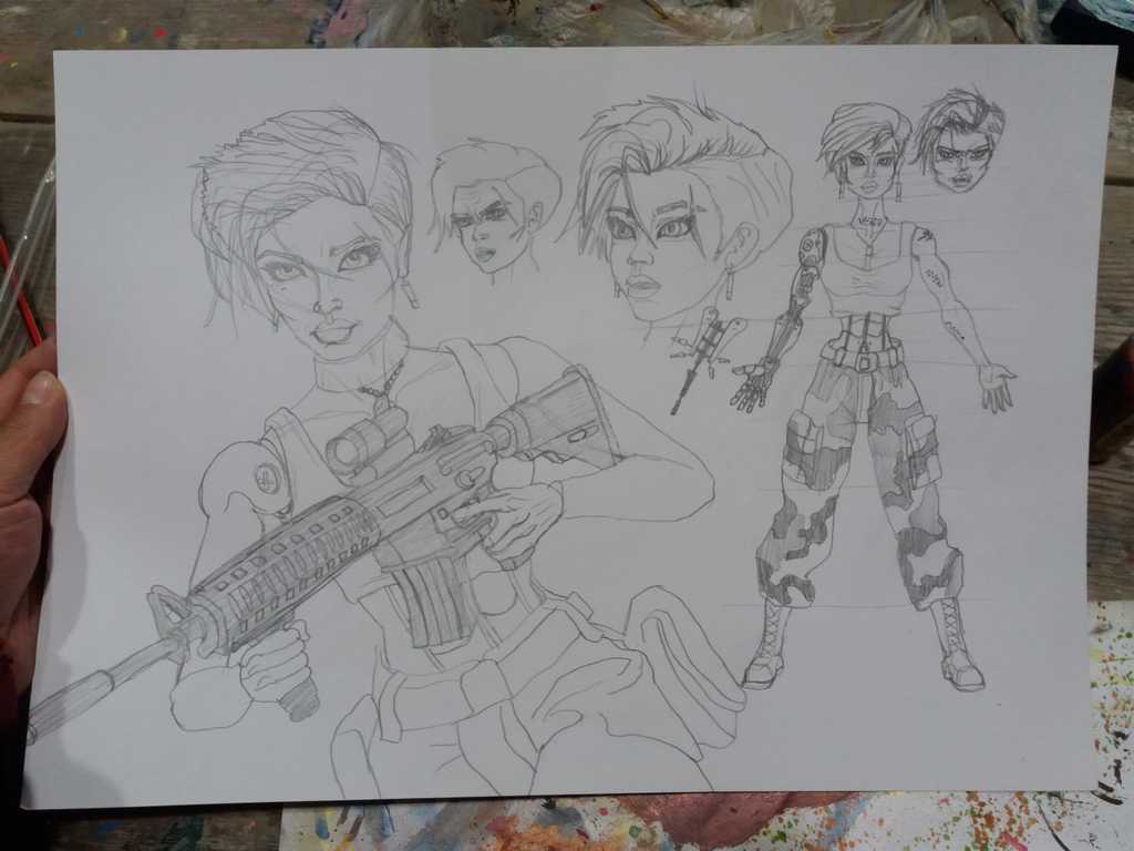
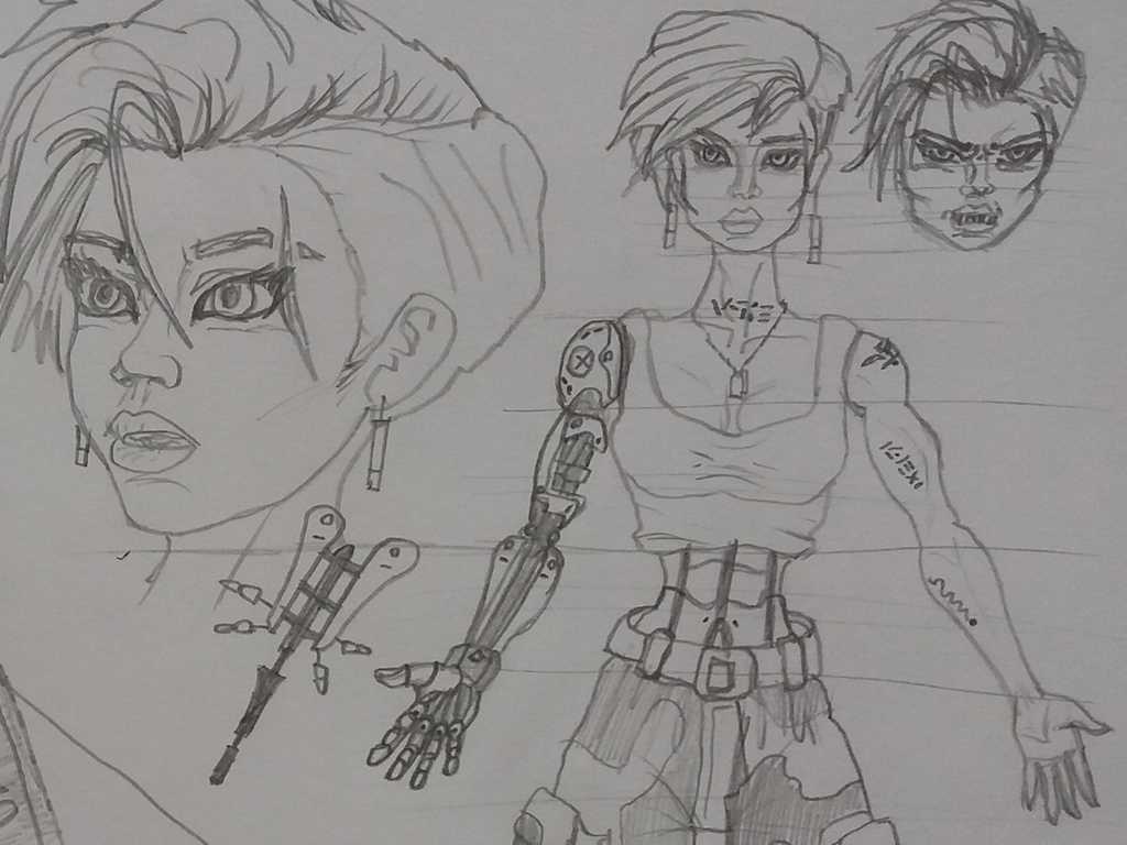
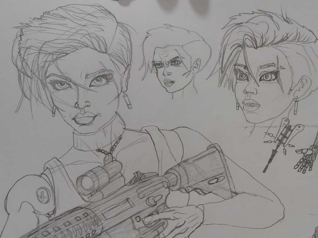
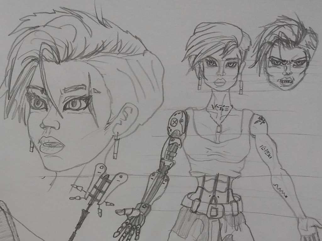
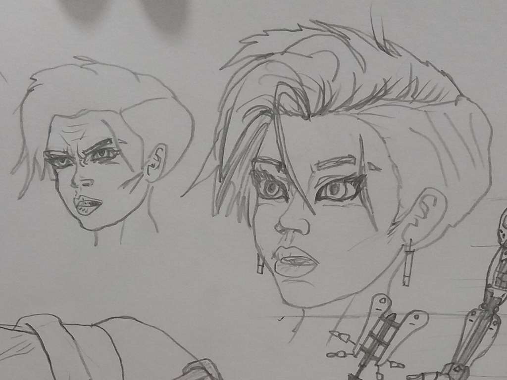
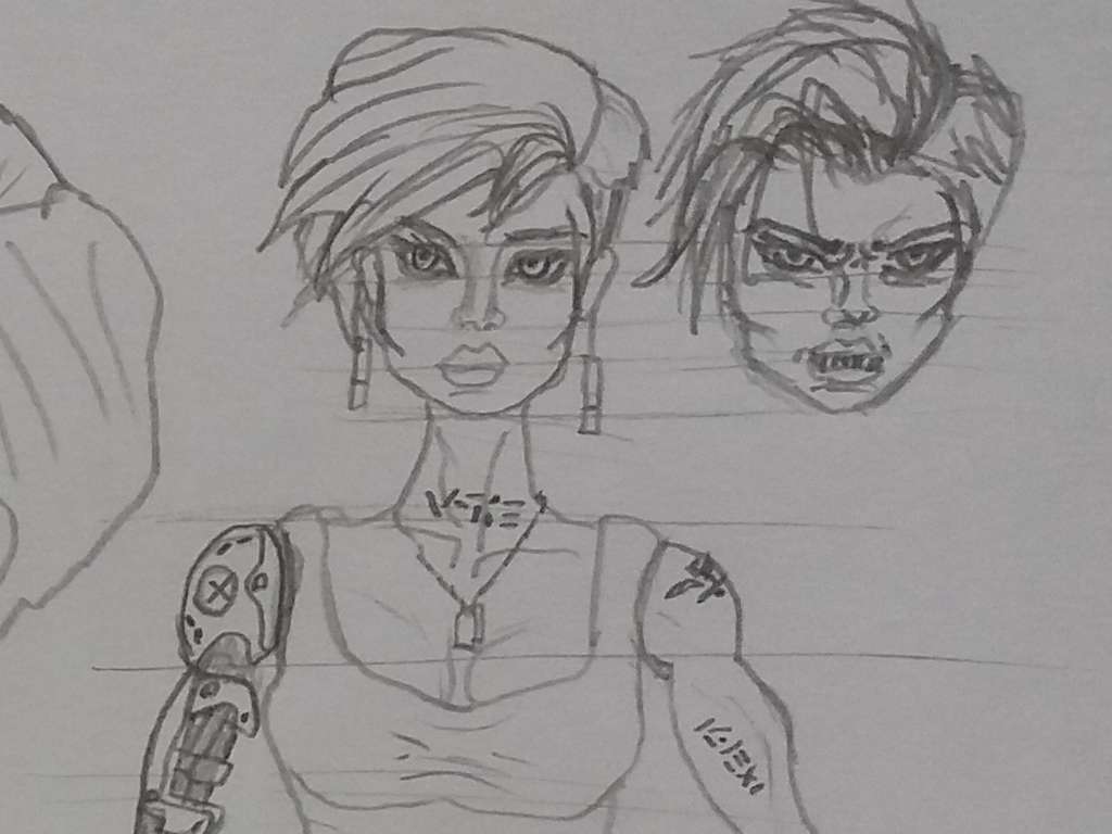
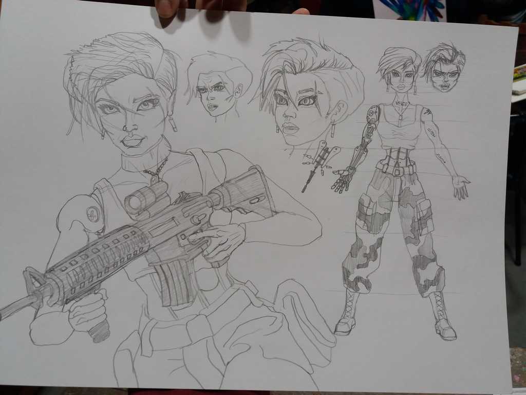
The points to take into consideration for our Army Men concept artists:
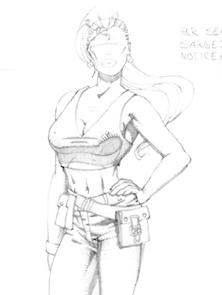
Sarge Hawk Vitruvio Army Men Concept Art
At first the Army Men must look like real soldiers, realizing later during the that they are actually miniature.
Any childish item, like a teddy bear, should look fierce and terrifying. A serious threat, although it may seem harmless at first for the player to take it lightly.
They should look like real little toys, plastic soldiers. There are details impossible to achieve on a certain scale, which make the plastic soldier 3D models look small.
Conceptual art is an artistic and simplified sketch in which the conceptualization or idea is more important than the drawn/conceptualized art. Ideas prevail over their formal or sensitive aspects so that the artistic aspect of the concept takes a back seat, favoring the speed of production time of the idea, also reducing the mental process of understanding the idea.
Sarge Hawk vs Ants
By dispensing with the complex creation of the final product before it is approved, so much time is not wasted on visual pieces that could not be approved. Therefore these sketches accelerate the idea production process. Regardless of the technique, material or form used to represent it is not something strict.
Before reaching the final choice of an idea, there may be several previously rejected conceptual pieces, and even this process can go through several steps, such as a very simple concept, which then evolves into a more complete and complex one (which is still a conceptual piece). After a concept art is approved, the chosen idea moves on to the actual production of the final product.
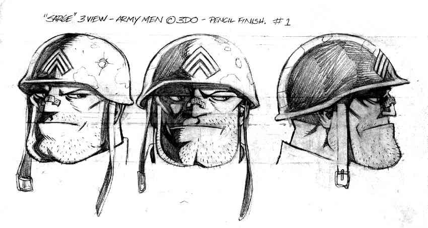
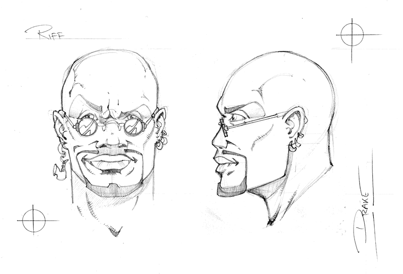
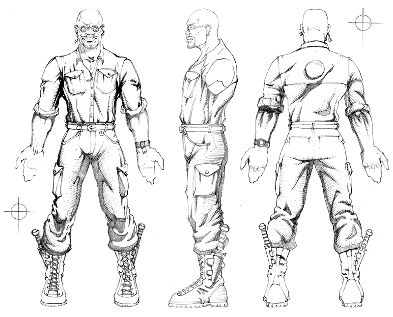
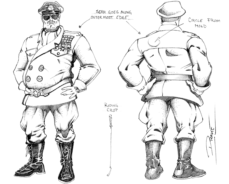
Classic Concept Art from 3DO
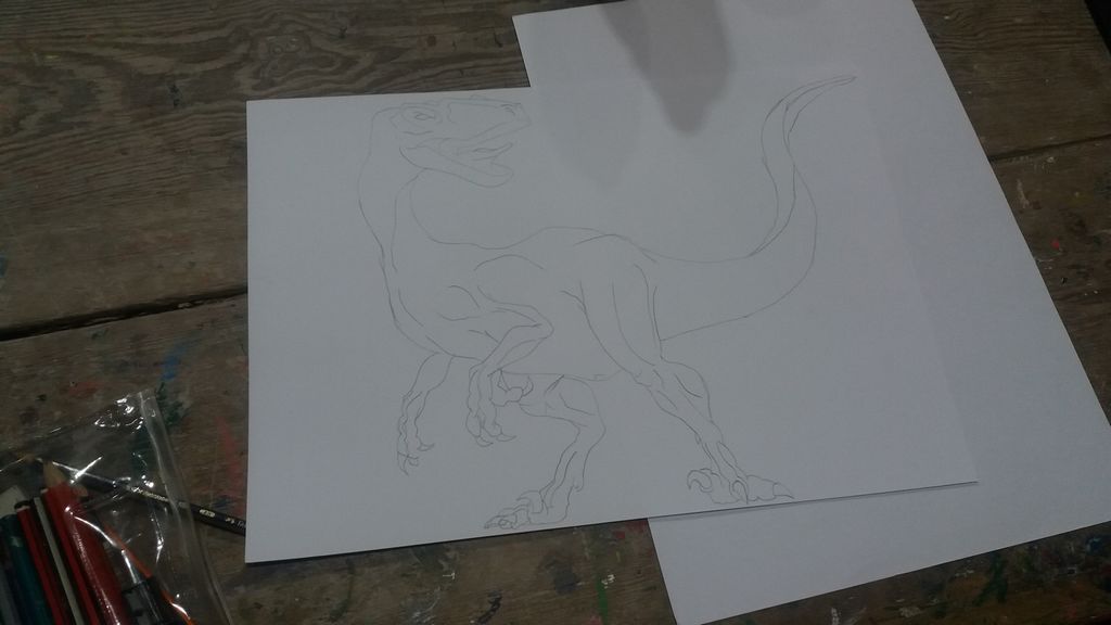
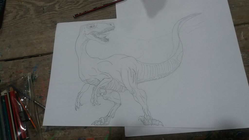
Characters from pencil to CGI
In the case of a video game, sketches are always the step prior to designing the 3D CGI character. In this case, we can see how the drawing evolves into 3D modeling, or how the 3D modeling evolves into the drawing? Both cases represent a back-and-forth of creative feedback.
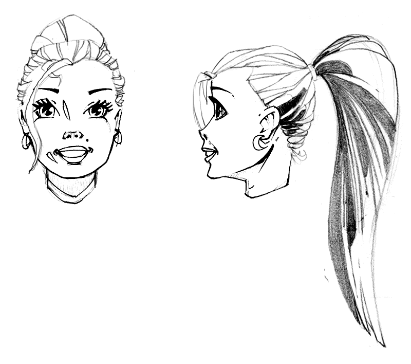
A step prior to the final Vikki design…The final design!
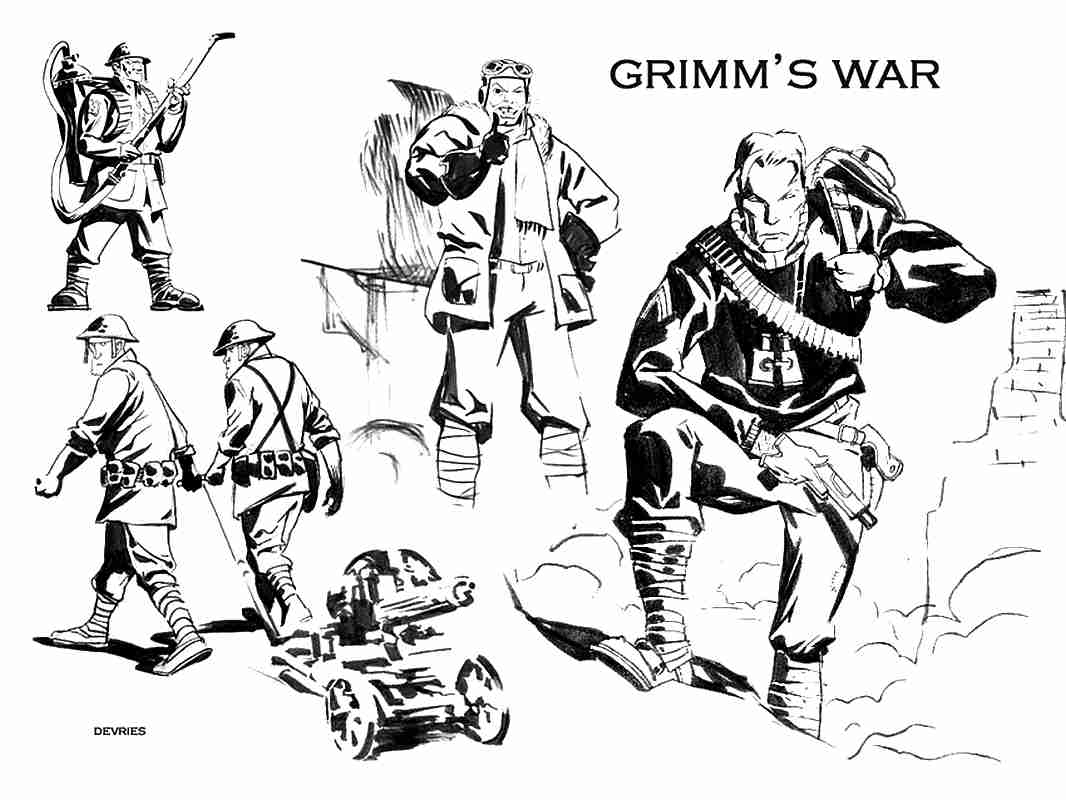
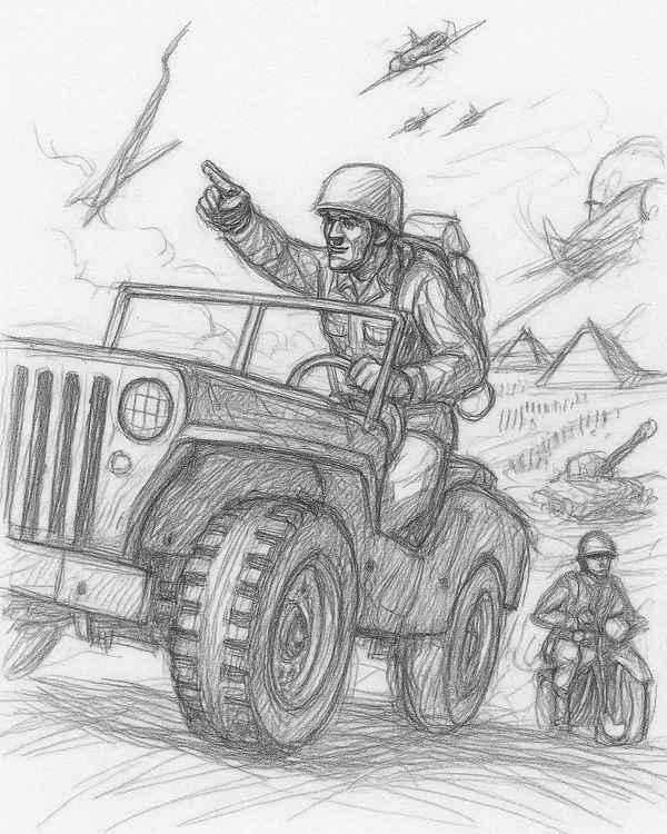
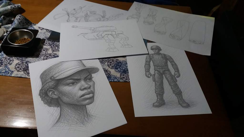
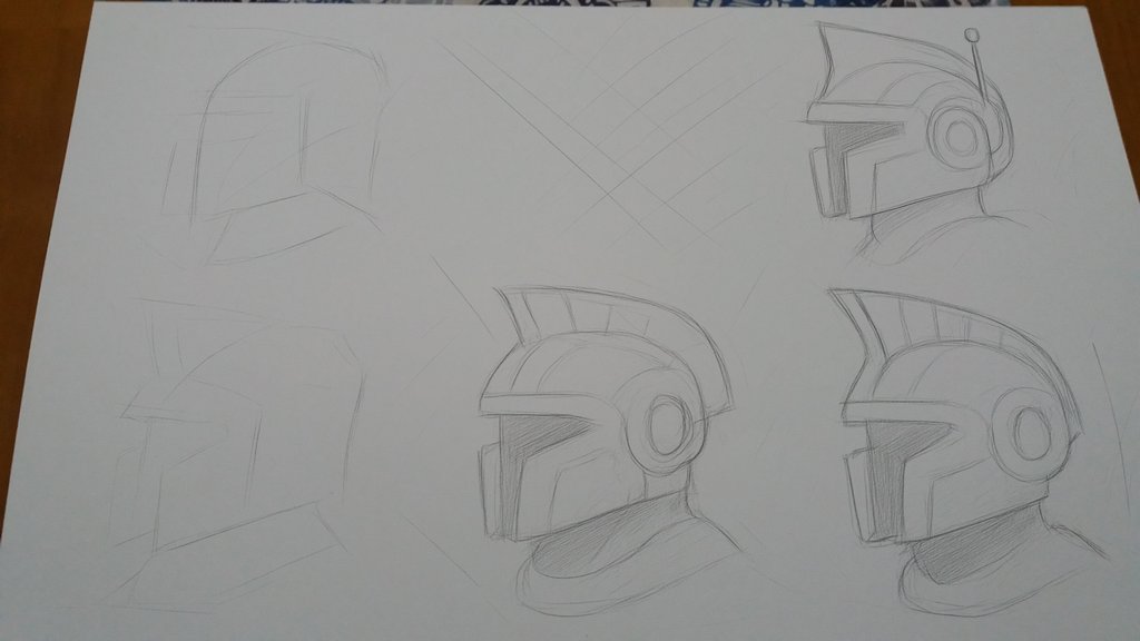
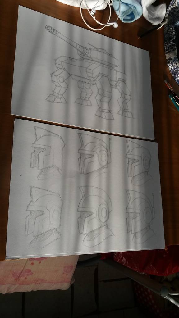
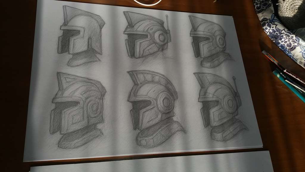
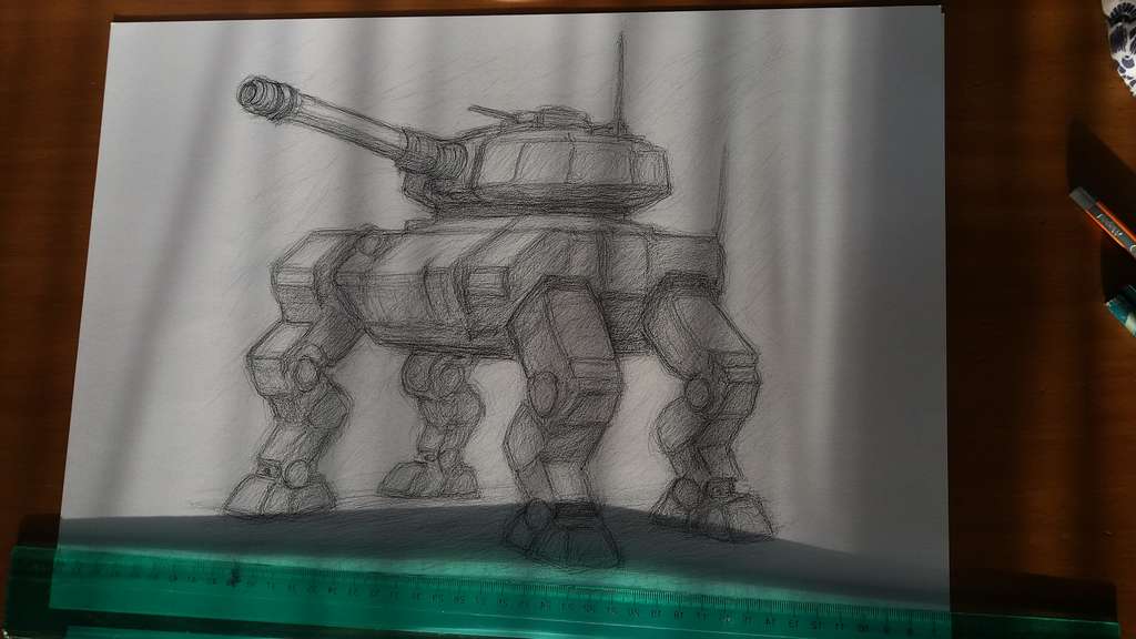
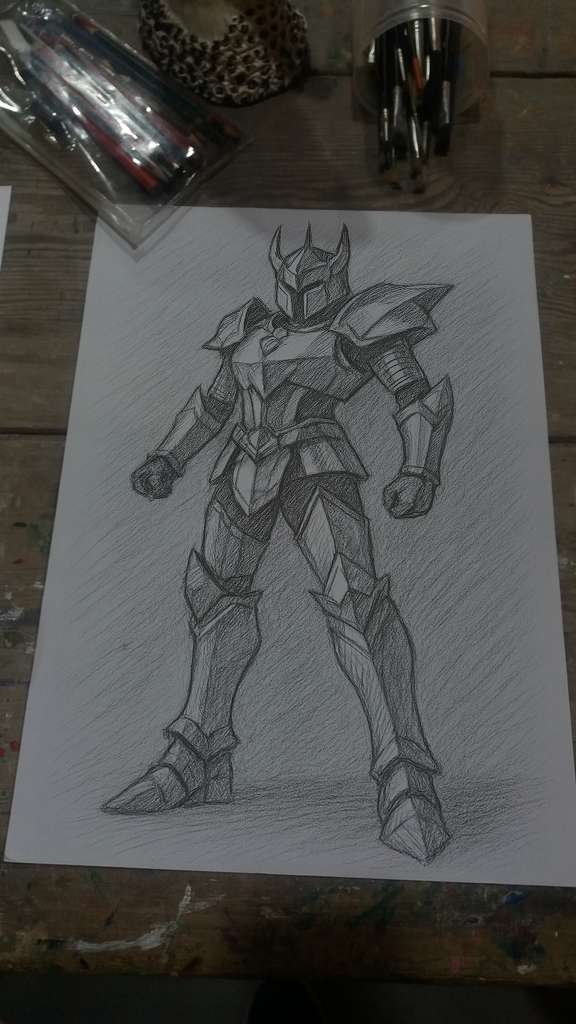
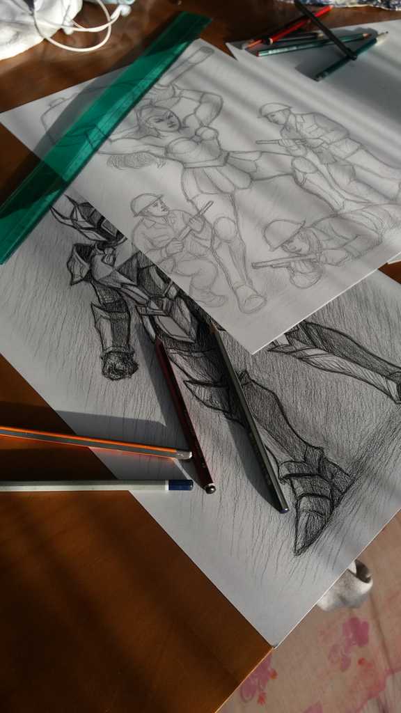
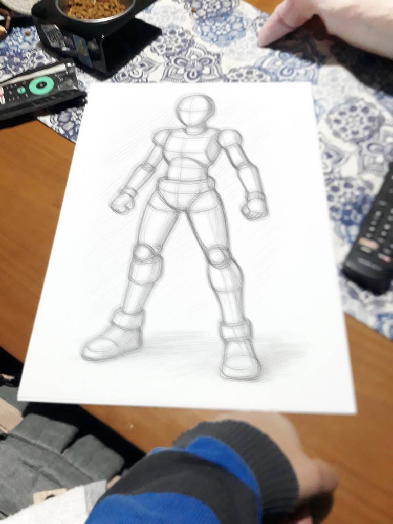
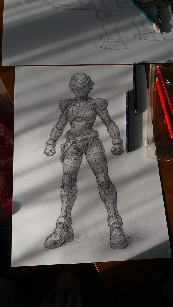
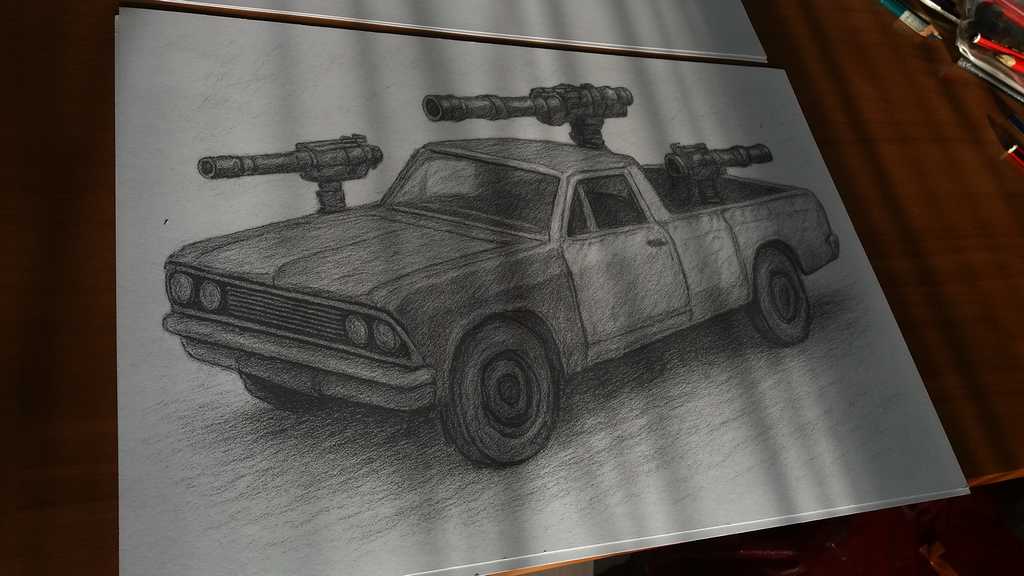
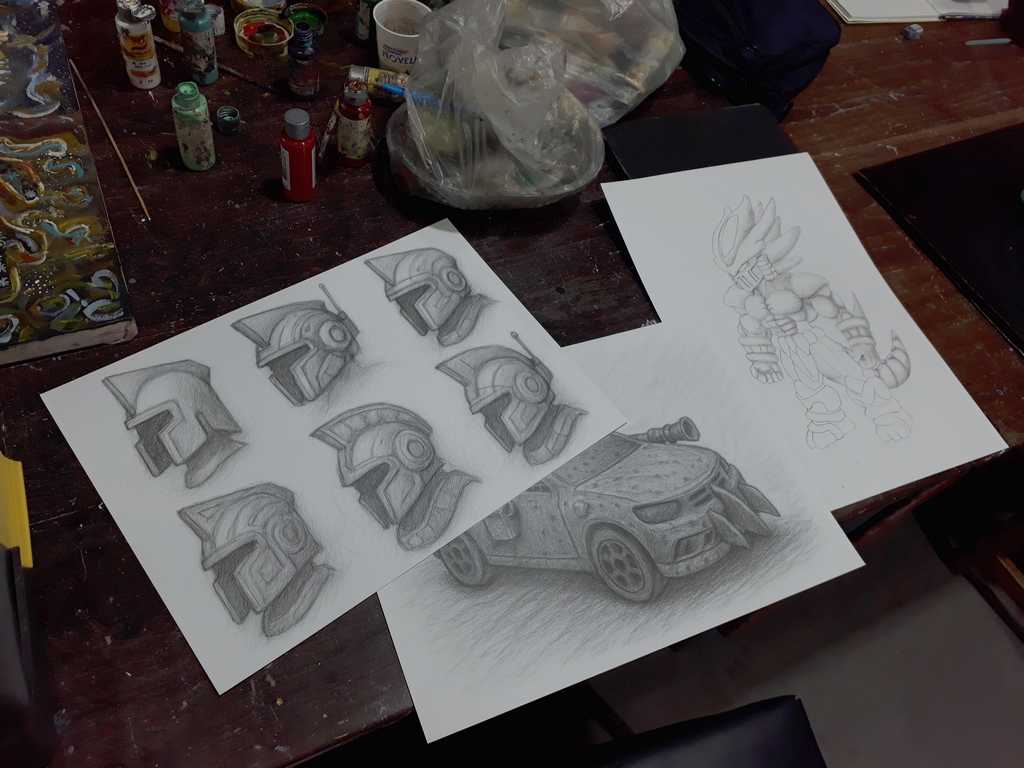
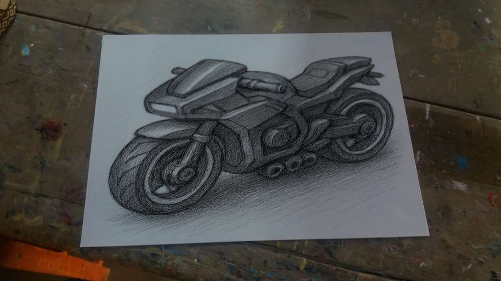
Our Pencil Character & Vehicles Concept Art
This Army Men expanded universe project, which we call “Toyverse,” requires the same steps and methodologies to achieve similar results, which resemble the old Army Men in both design and visual identity. So here are some examples…
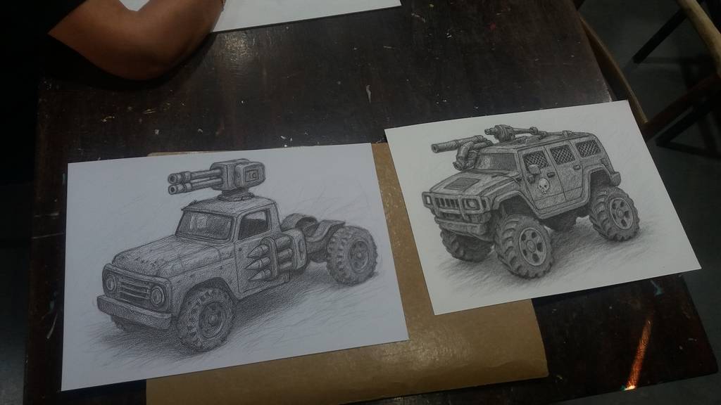
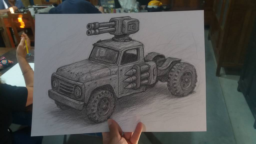
Concept Art, from basic pencil lines to the complex tridimensional idea: In this case a Mad Max or Vigilante 8 modified Die-cast battlecar.
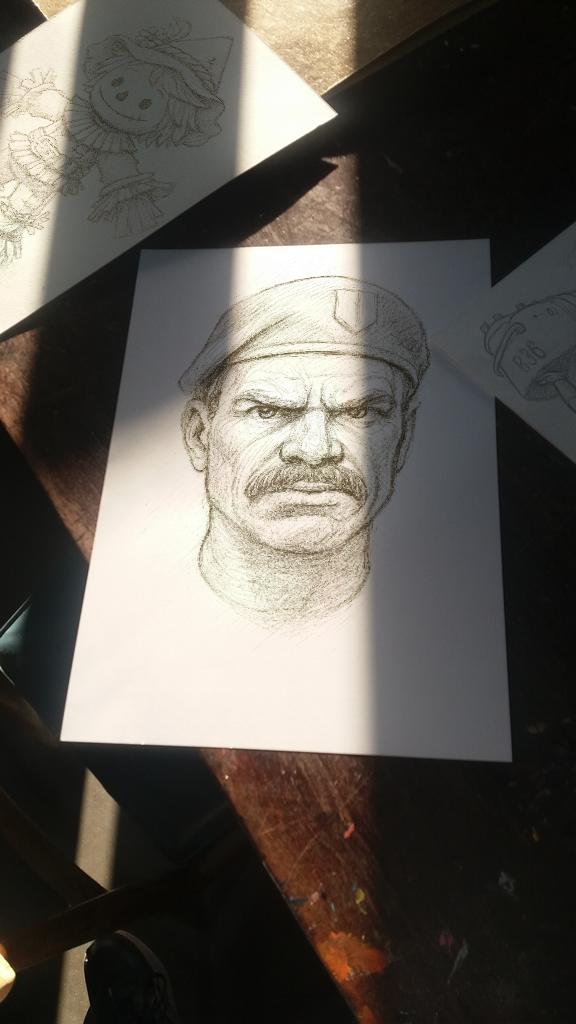
… and a Super Soldier in full combat armor.
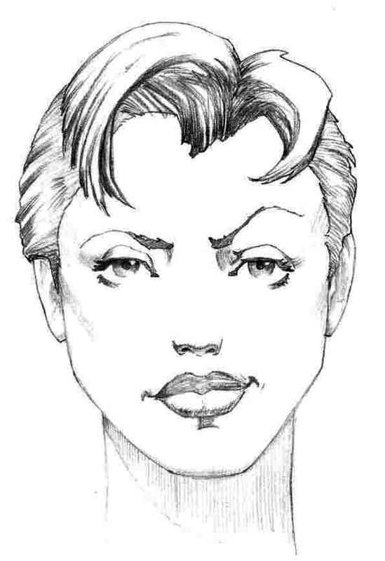
Penny from Army Men Strike, form 3.
Turtle tank full color concept art.
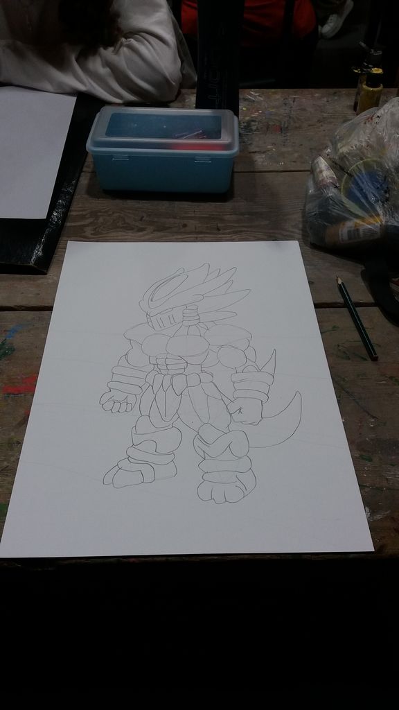
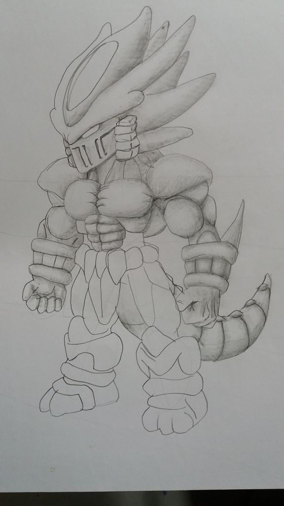
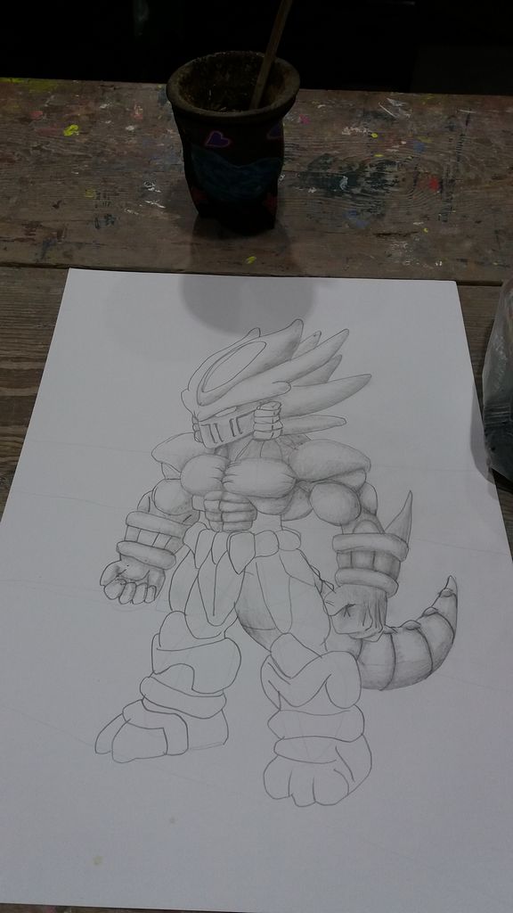
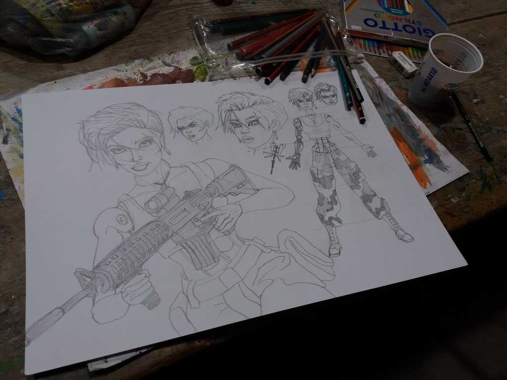
From Sketch to Complete Concept Art
The process of creating an illustration does not end with the first stroke. Every visual piece goes through different stages of transformation, maturation, and refinement. What begins as a set of loose lines on paper can evolve into a complex digital scene with depth, color, textures, and three-dimensional elements.
Below, we explore step by step how a simple idea becomes a finished work of art.
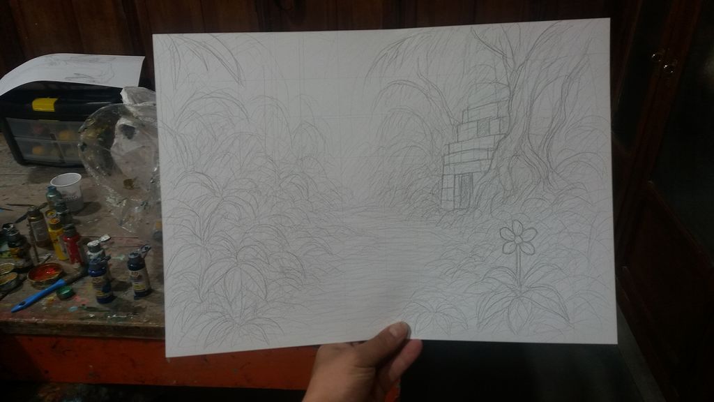
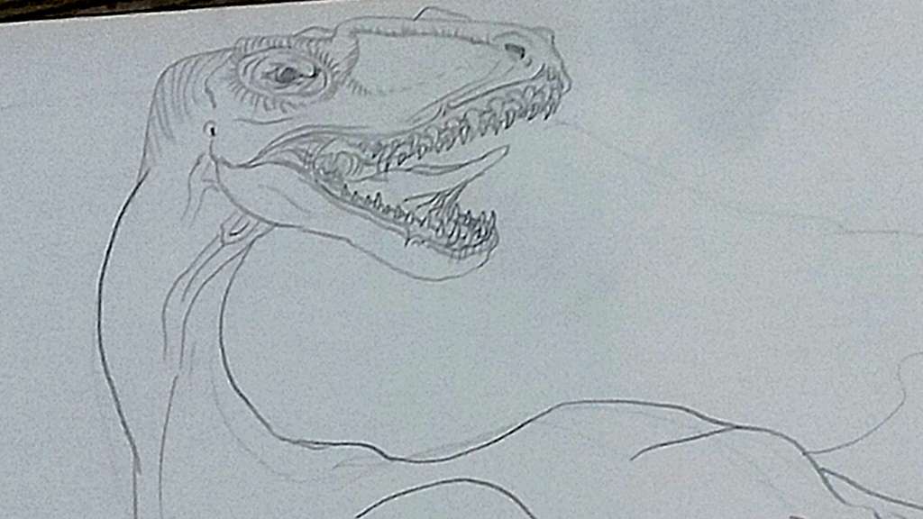
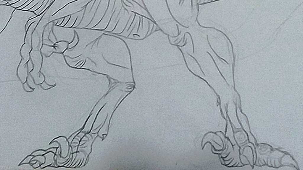
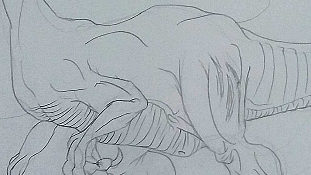
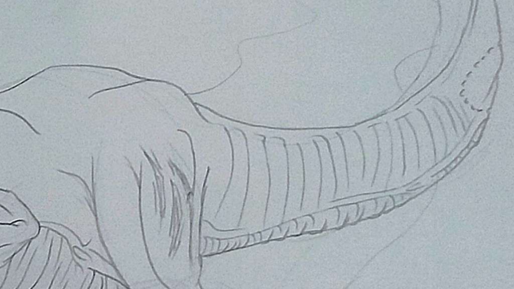
The Creation of a Forgotten Jungle
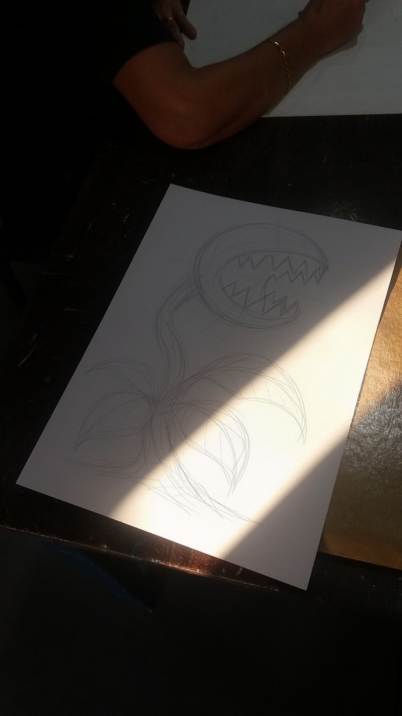
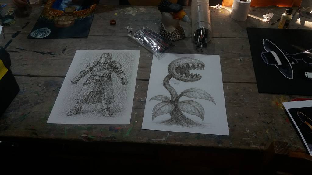
The process of this piece begins with the carnivorous plant, first conceived as a basic sketch with guiding lines. The initial strokes, just a skeleton of geometric shapes, captured the essence of its silhouette: the twisted stem, the oversized mouth, and the sharp teeth. Little by little, the drawing was refined until it gained volume, detail in the leaves, and a posture that conveys tension and aggressiveness. This creature became the central axis of the composition.
From Sketch to Complete Artwork: The Creative Journey of a Digital Illustration
With the base defined, the work progressed to the construction of the narrative environment: a dense jungle crossed by a river or spring flowing through the center of the scene. The vegetation grew in complexity: scattered flowers, trees with exposed roots, and an ancient temple made of massive stone blocks, hidden among the undergrowth. This drawing stage served to establish the visual structure of the piece, defining the relationship between the elements and the balance of the composition.
Slide from one image to another to compare
Slide from one image to another to compare
The next step was digital painting, where the setting gained life and atmosphere. Through layers of color, a humid, dark, and greenish environment was created, typical of a dense and oppressive jungle. The contrast between filtered light and deep shadows added depth and drama, enveloping the carnivorous plant and the temple in a mysterious ambience.
The piece evolved even further with the incorporation of a 3D model of the Spitfire of Flight Lieutenant Ruggels. Far from standing out as an external object, it was integrated into the visual narrative.
The fuselage was damaged by bullet holes, evidence of its violent fall.
Moss and vegetation had grown over its surface, symbols of the relentless passage of time.
The dents and metallic wear reinforced the idea of a war relic abandoned in the jungle.
In the post-production phase, plants in the foreground and overlapping vegetation were added to the 3D model, softening its outline so that it blended with the pictorial style of the illustration. Adjustments of color, texture, and line ensured that all the elements coexisted within a unified aesthetic.
The final result is a piece that tells a story without words: the confrontation between man’s destructive force and the resilience of nature. What began as simple sketch lines transformed into a cinematic and conceptual scene, where time, the jungle, and the remnants of the past interact in a visual balance full of mystery.
Full Color 3DO Character Concept Art
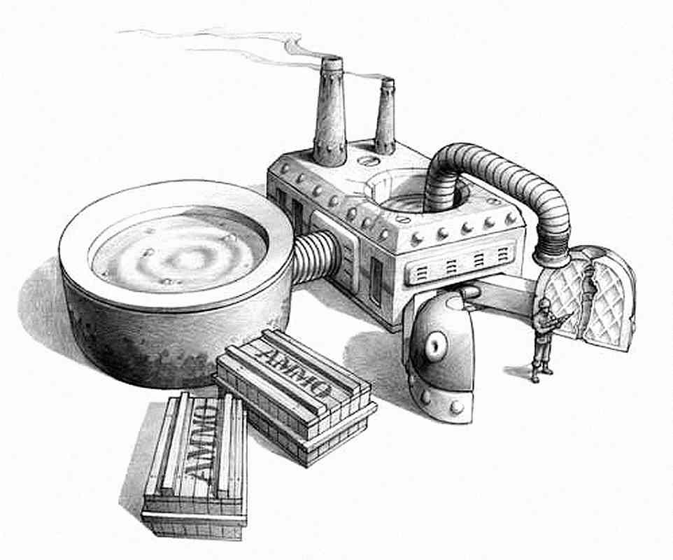
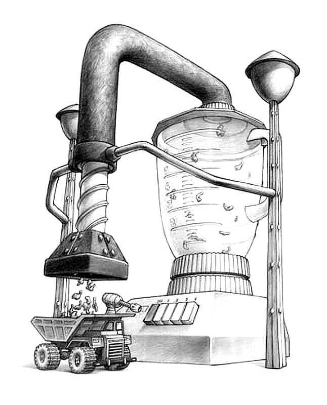
Some full-color pieces from a variety of Army Men games. Concept art and some images are character concepts, others are simply promotional images.
Army Men Strike Concept Art
Army Men Air Attack 1 & 2 Concept Art
Some of the ideas that want to be tested in helicopter games are interesting. They probably all would have been achieved in Air Attack 3, maybe?
Making Concept Art a reality
Remember those great Concept Art pieces? Well, we started making them a reality (sort of).
There are some ideas in Concept Art pieces that never became reality (or, in fact, most of them never did). So here we’ll show you the process of how we make them a reality, one way or another.
Concept ArtCGI recreationConcept ArtCGI recreationConcept ArtA more developed drawing, half CGI
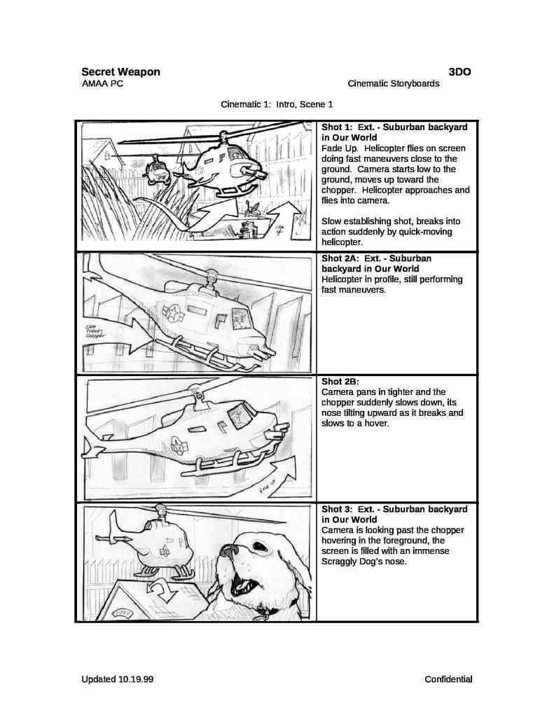
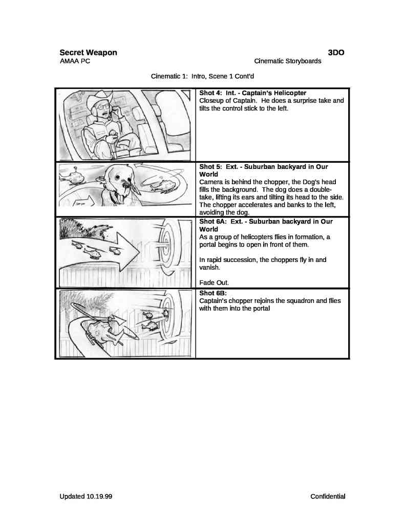
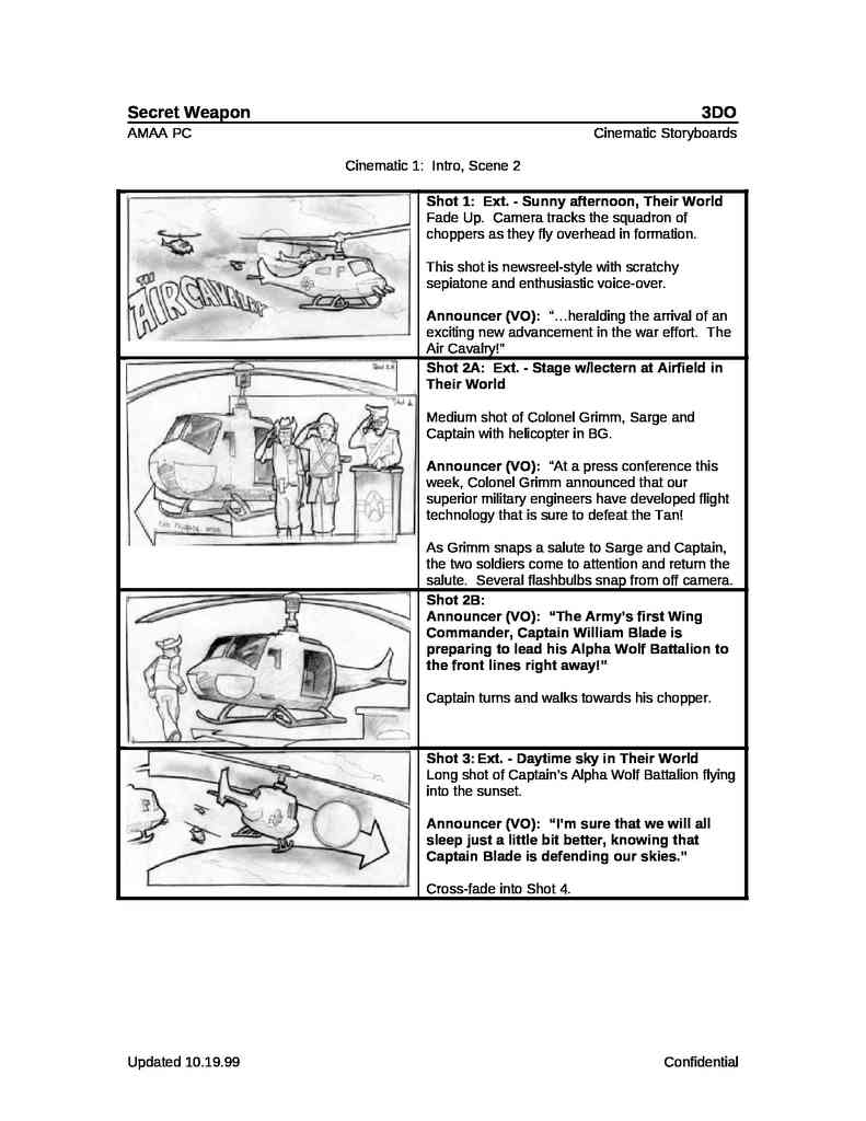
Storyboards
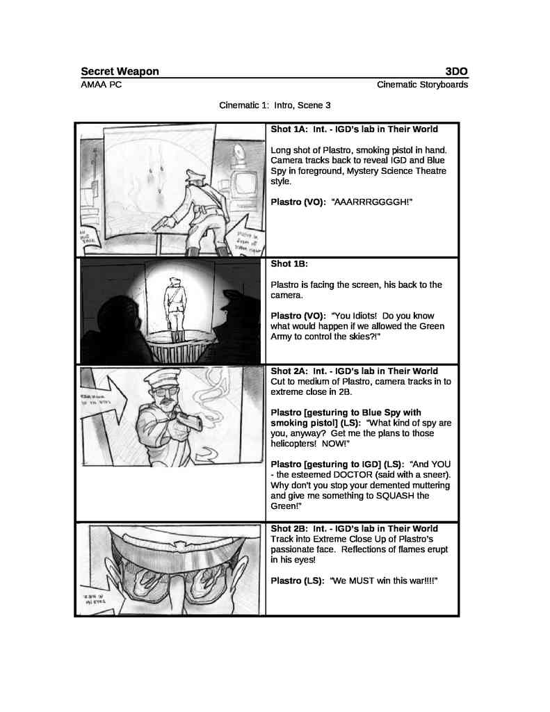
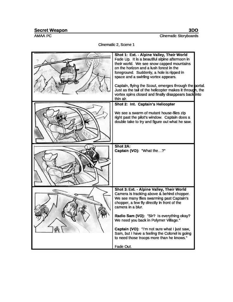
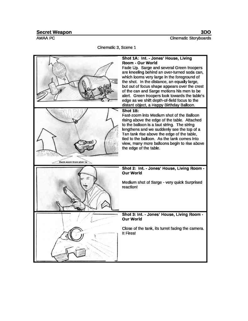
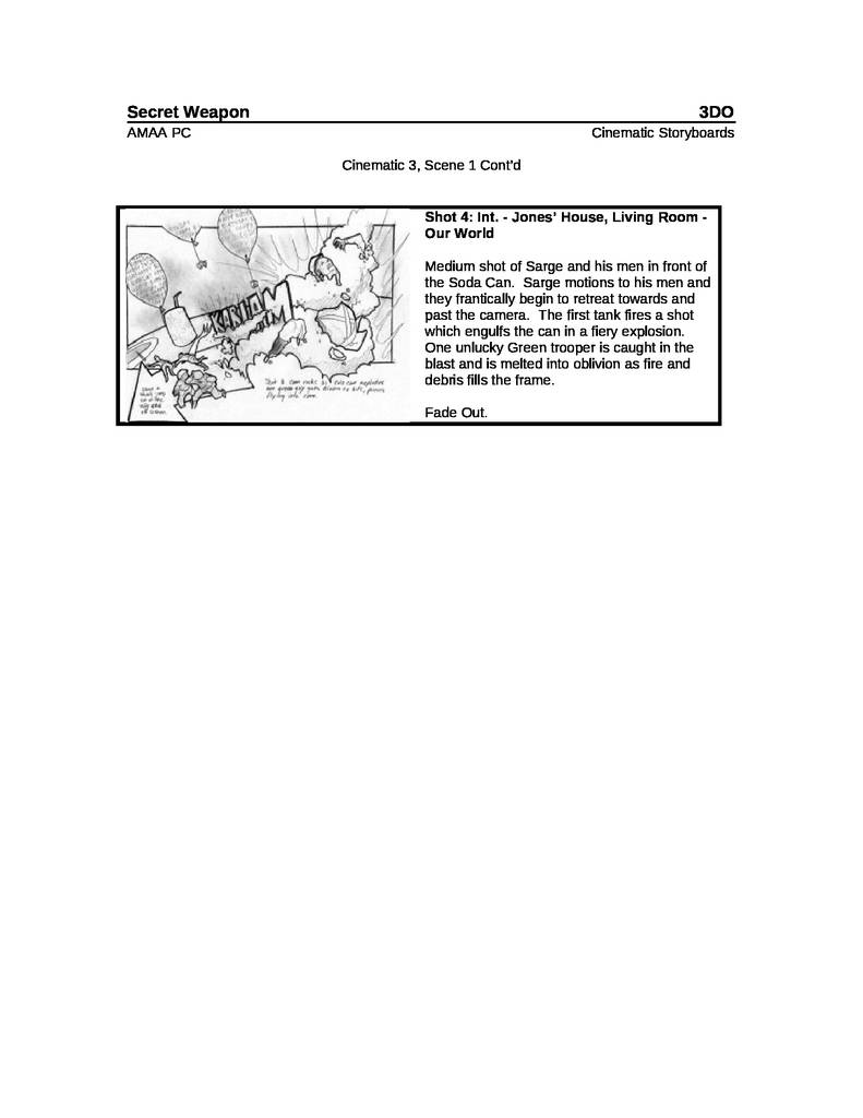
The Army Men franchise used a lot of storyboarding for the CGI animations of the games’ cut scenes, but also for the in-game animations of Sarge’s Heroes 1 and 2 for the Nintendo 64 (made with the game engine).
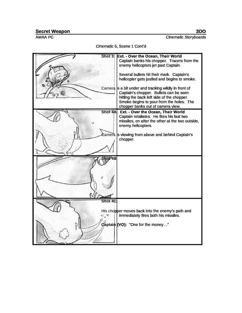
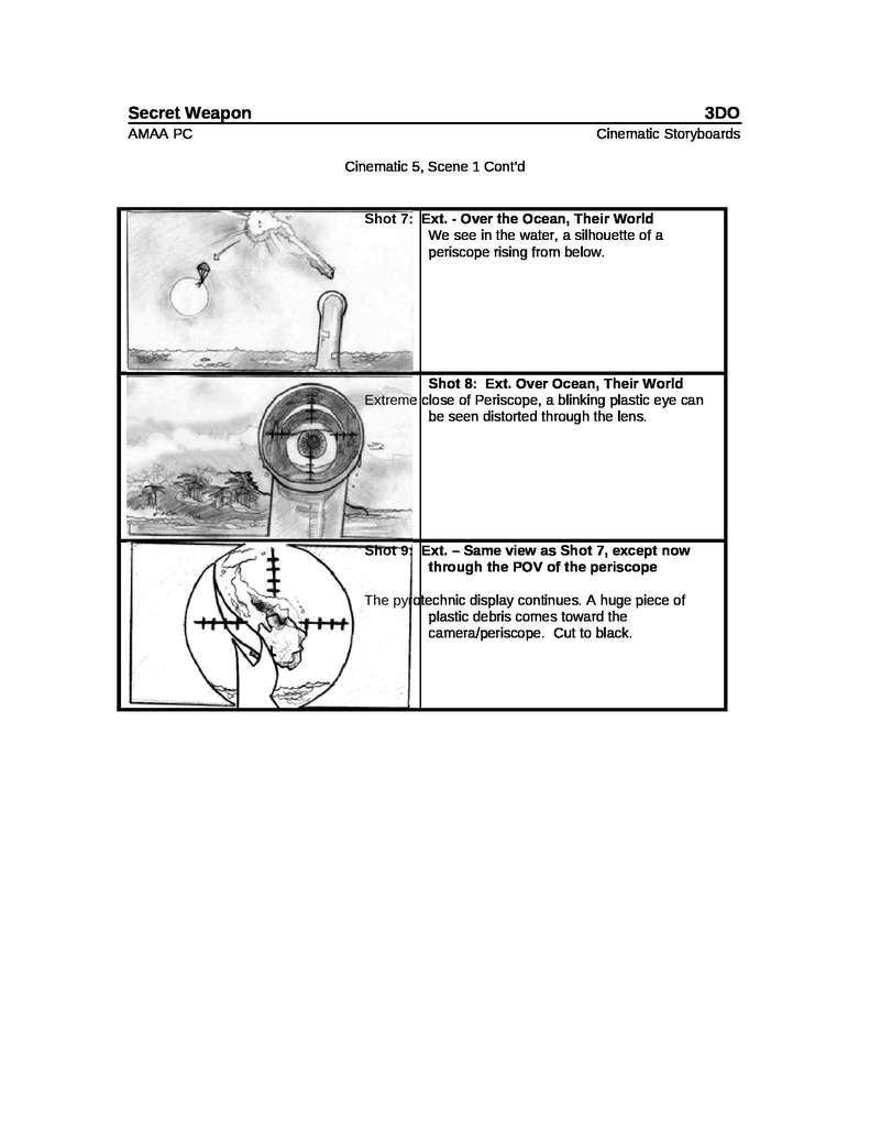
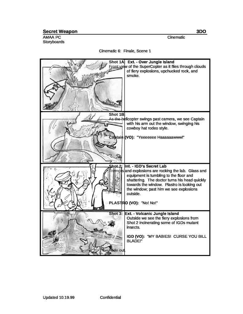
Army Men: Sarge’s Heroes Storyboard
To put it simply, storyboards, at least in this case, look like comic book adaptations of movies, but with instructions and guidelines for animation. For example, where a character is at the beginning of a shot, and where they are at the end. They are a series of graphic instructions that serve as a rough draft or basis for later animation. Keep in mind that different teams did different jobs, so those who drew the storyboards (drawn by hand) were somewhat like scriptwriters for the animation department.
Army Men Air Tactics Storyboards
The entire storyboard for the CGI animated images of Army Men: Air Tactics. Scanned and inserted into digital text files.
One of the scanned conceptual storyboards, a step prior to inserting them into the digital text files.
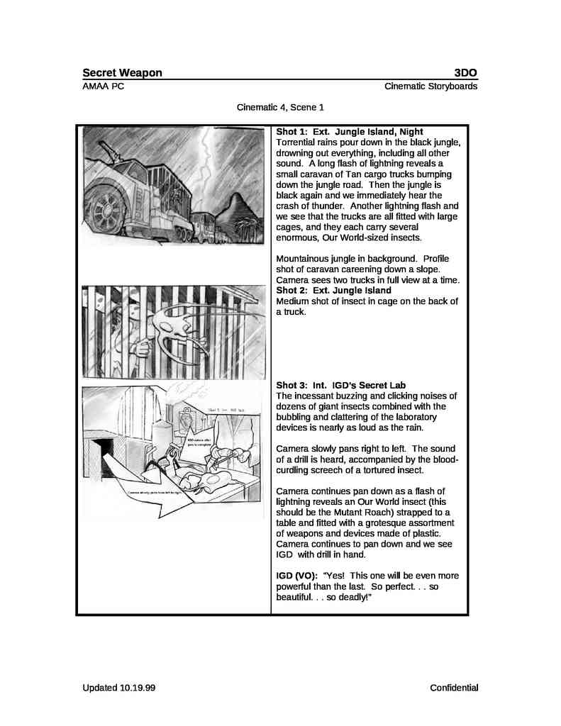
Army Men (1998) storyboards
Storyboards made for the original Army Men game, but used later in World War for PS1 or simple not used.
How do we interpret these Storyboards?
In the case of finding Conceptual Art of the original Army Men games, before the Heroes saga, we would need more information as it is in black and white, which would not allow us to interpret what colors each one is. The following is an example:
Others ways of making Storyboards & Concepts
Example of photo montage
Both Army Men Revolution and our animations will take place in environments based on real places. Therefore, here is a simple example of a Storyboard made with photographs:
Example of montage with image editing or Photoshop
The following is a conceptual representation of how the Heroes would function, for Sarge’s Heroes, in its early stages of development.
The heroes were supposed to have a more prominent role, functioning as companions during battles, following the protagonist’s movements but contributing their weapon skills (e.g., Scorch with his flamethrower, Riff with his bazooka).
It was even considered to be a kind of turn-based game, like some RPGs of the time.
This style of concept art is made up of CGI renders, Photoshop, etc., to ensure maximum fidelity to the idea of how the video game should look.
The stoves that are activated to burn the enemy or the magnifying glasses, for practically the same thing.
In this case a conceptual example of calling an airstrike
These examples could even showcase different UI designs, and as in this case, graphically illustrate some of the desired special mechanics that hardly ever made it into the final product. But dreaming is cheap!
How they wanted the PS2 game to look? Sarge’s Heroes 2
Edited images composites of CGI 3D models, scenarios in a HD definition (maybe the map editor or 3D editing program too) and a lot of added effects.
Army Men: Sarge’s War Artwork
How to make a depressing, dark, and gritty Army Men: Sarge’s Heroes? Immerse everything in realistic war environments, like those of World War II Europe: everything destroyed, ruined, and with noisy, dirty, and stained textures.
More than Storyboards and Character Concepts
Back in the late 1990s and early 2000s, right at the dawn of digital design, due to a shift in generational change, processing speed, and lower computer power, hand-drawn artwork was the fastest way to conceptualize practically everything.
Army Men User Interface (Graphical User Interface, GUI or UI) hand drawn concept art
Army Men Level Design
Army Men Hand Drawn Level Design
And in fact, some hand-drawn artworks, later digitized and painted on the computer, ended up included in games, such as Sarge’s Hero designs in the bios of the first game of the same name.
In short, from character, vehicle and object design, to dynamic concepts for animation, graphic representations of the story’s narrative, the design of the games’ menu graphic interfaces, to the design of the playable scenarios… concept art (at least in those days) was the backbone of the graphic/visual design of the Army Men adventures, the words and ideas represented visually, which previously began being printed on paper.
Curiosities and Trivia:Toy Story movie Concept Art from the Plastic Soldier scenesSources for this article:
… So here we go with an in-depth study on the soundtracks of the Army Men franchise games…
Soundtracks are an indelible mark on a franchise’s identity. They are very important when creating a sequel video game to a franchise as established in collective knowledge as Army Men.
Sounds and Music Samples all around the globe!
Examples long used in the past like the introduction of “Stealth Frag” track of Quake 2, the first part was used in at least two FMV in Army Men games: in Sarge´s Heroes 1 or 2 and Sarge’s War. Listen the first part of Quake 2 “Stealth Frag” and some of those Sarge’s Heroes series.
Sonic Mayhem¿s Quaker 2 soundtrack “Stealth Frag”
Army Men: Sarge’s Heroes “Snow” Shrap mission CGI Cut scene
Army Men: Sarge’s Heroes 2 “Cashier” mission CGI Cut scene
The kitchen that brings back memories
Lot of this sounds came from “East West” sample CD’s like “Symphonic Adventures” & “Percussive Adventures”
East West – Symphonic Adventures
East West – Percussive Adventures
You can hear samples of these sounds throughout the Army Men productions after the first and second games, especially in the FMV CGI cut scenes animations, because they were all mostly produced by the same teams or because they used the same sound databases files.
Army Men (PC) & Army Men 3D
For the first Army Men, a few industrial soundtracks (among others) for film and TV by the Italian composers Armando Trovaioli (SIAE), Mario Nascimbene (SIAE) (likely among others) were used, such as the example below:
Strategy (410862) Armando Trovaioli (SIAE)
The following pieces from Armando Trovaioli’s-Mario Nascimbene “War / Danger” album were used for both Army Men and Army Men 3D
This 4 soundtracks are the same but remixed or just without some instruments, used in the first in-game soundtrack for PC’s Army Men Depot Run mission:
Night Attack (RCAL1010-4): Blaring brass and military snare drums followed by drop to distant timpani. Used in-game.
Marching Drums (RCAL1010-26): Snare drums. Medium tempo. Used in-game.
Dread (RCAL1010-27): Stacked chords of menacing brass. Suspenseful. Used in-game.
Unexpected Threat (RCAL1010-30) Menacing brass and snare drums. Used in-game.
Danger Ahead (RCAL1010-18): vObsessive theme in 5/4 time. Very agitated and intense. Featuring piano, brass, timpani, strings and xylophone. Fast tempo. Used in-game.
Mobilization (RCAL1010-24): Timpani intro, pounding percussion and horn fanfares make up military march. Used in-game.
This 4 soundtracks were used in the CGI Intro and Ending from both games, Army Men & Army Men 3D:
Choking (RCAL1010-21): Fast agitated theme with strings and brass. Used in the Green Plastic News intro.
Sunday Morning Goose Step (RCAL1010-23): Military marching band featuring bass drums, tubes and piccolos. Used in the Green Plastic News intro.
The Assault (RCAL1010-34): Violent then eerie dramatic theme featuring brass, bassoon, clarinet, strings and timpani. Medium tempo. Impending attack. Used in the Green Plastic News intro.
Strategy (RCAL1010-35): Forceful intro leading to action and then to standstill; featuring brass, strings and timpani. Medium tempo. Used in the Ending.
The album description from Universal Music Database is: “Music for action movie; soldier march with full orchestra; agitated and intense; military march.”
The menu music was “Larry’s Orchestral Adventure” from “Drama – Volumen 1” (Universal Production Music) Killer Tracks. Description of the track in the Universal Production Music website: “An abundance of colors and dynamics marching through a full orchestra.”
Larry’s Orchestral Adventure (KT34-7) from “Drama – Volumen 1” album – Universal Production Music “Killer Tracks”
On the other hand, Army Men 2, for some reason, chose to use pieces of classical music (with expired copyright) composed in an electronic style, very similar to MIDI.
The final part of “William Tell Overture”, named “March of the Swiss Soldiers”
The “William Tell Overture” is a piece of music by Gioachino Rossini. He wrote it for his opera, William Tell. The opera was first performed in 1829. The overture has four sections: Dawn, Storm, Call to the Cows (often used in animated cartoons to signify daybreak) and the one used in the first Army Men 2 mission “Kitchen”, March of the Swiss Soldiers, famous for being the theme music for the “The Lone Ranger”.
Johann Strauss “The Blue Danube” AM2 version
“The Blue Danube” is the common English title of “An der schönen blauen Donau”, Op. 314 (German for “By the Beautiful Blue Danube”), a waltz by the Austrian composer Johann Strauss II, composed in 1866. Originally performed on 15 February 1867 at a concert of the Wiener Männergesang-Verein (Vienna Men’s Choral Association), it has been one of the most consistently popular pieces of music in the classical repertoire. Its initial performance was considered only a mild success, however, and Strauss is reputed to have said, “The devil take the waltz, my only regret is for the coda—I wish that had been a success!
L’apprenti sorcier (the Sorcerer’s Apprentice) by French composer Paul Dukas in 1897
L’apprenti sorcier (the Sorcerer’s Apprentice) is a symphonic poem by the French composer Paul Dukas composed in 1897 and based on the ballad of the same name by Johann Wolfgang von Goethe.
Most of the soundtracks from Air Attack (1999) were recycled from the 3DO game Uprising: Join or Die (1997). Some of the soundtracks were also used in the Battletanx franchise (also from 3DO). In both cases reworked for the Nintendo 64 versions, whose storage limits did not allow the original soundtracks to be stored. In both cases maybe were modified slightly.
You can hear a few Air Attack soundtracks here…
Although Air Attack credits the composers Burke Trieschmann, Tommy Tallarico and Barry Blum, im Uprising: Join or Die appears to be an apparent studio called “D.I.M.”. Later investigations revealed, according to witnesses, that D.I.M. was a production studio located in New York City.
N64 Battletanx: Global Assault “Tower Over Londond”
Always (Album Version) from the Rock band Halfcocked was the song from the menu of the game (very consistent with Vikki’s personality and the intention of the game).
Always · Halfcocked – Provided to YouTube by Universal Music Group
The initial animation of Portal Runner, like the rest of Cut Scenes from Army Men games, has pieces of varied musical samples, some of which we can even hear in other media today, and during that time, such as the introduction of the song GUMMY by BROCKHAMPTON, from the album SATURATION II (EMPIRE Distribution). As you can hear in the attached videos. It should be noted that on our YouTube channel we have received several copyright claims, as in this case, but Portal Runner was released in September 2001, and the GUMMY theme song was released in 2017.
Portal Runner Sep 2001 intro section wit the intro music
GUMMY song by BROCKHAMPTON (2017)
In any case, this is usually a common mistake on the part of YouTube and other social networks, since they are mostly managed by AI, and the history of sound and music samples business from more than 20 years ago, before the internet today and online business models, is very poorly documented and is very difficult to verify or even find out.
Other examples of this stock sound samples used in other media
From 2:34 we can hear the first part of the Macross 0 soundtrack below…
The first part of this soundtrack in 2:34 is the same of Starship Troopers movie main themeSources for this article:
Weapons will work in a very particular way in the Army Men Toyverse. They will work normally in the worlds they come from, but will stop working in other worlds, or will be nerfed at least. This way we ensure that the seemingly weak plastic weapons can compete against the new metal weapons. And we also make sure that you must use swords, axes, hammers, bows, arrows or your fists, in the Medieval World. So in every world you must behave “in-universe”.
That is, the world you visit is influenced by you and your elements (external elements), breaking its nature and rules. Therefore, this world you visit will seek to correct that anomaly in some way, by nerfing or disabling you and your weapons or equipments.
Functionality and materiality, not composition
The materials composition are not modified, but the shapes of some objects are, as is the case of Vikki and her bow in Portal Runner. These unique and exceptional cases allow us to make visual skins change, depending on the universe being visited. But it’s not discarded that in some way the materials may also change in the future, or that some world may produce this effect.
Composition is the proportion of the different constituents of the material (chemically and physically different). Structure, on the other hand, refers to the spatial distribution, orientation and association of the constituents. Characterizing a material is determining the parameters necessary to identify and describe it. In simpler words, it is impossible for a world different from where a weapon comes from, to transform its plastic into metal. But you can modify a banana-shaped plastic weapon to an apple-shaped one, always maintaining the same composition and proportion. The characteristics for the most part, although this can change radically to the point that, for example, a bow becomes a bayesta (which is almost the same, just seen differently by the Army Men).
Tone, hue, or tonality: the degree to which the visual color stimulus can be described.
Shades of Violet Army Men
The Army Men armies in our project, especially in canon and in Army Men Revolution, will have different shades within their own ranks, just like plastic soldiers in the real world.
Over the years, the different generations of Army Men have changed in hue. From the Olive Green in Army Men 1, to the English Green in Army Men 2, to the Apple Green in Army Men: Sarge’s Heroes. Even in Army Men: Sarge’s Heroes 2 on Playstation 2 we could see plastic soldiers of different shades within the Tan. So it will be a thing in our project.
PS2 Sarge’s Heroes 2 Tan Soldiers diferente shades of Tan (light ocher and egg yellow)Shades of Tan Army Men Plastic Soldiers
And maybe some soldier has a hue that is between two worlds… between Blue and Violet, Red and Orange, or Green and Tan…
To make an incredible video game sometimes you need to do a lot of research
A Pigeon Fighting – Conceptual Video for Army Men Revolution
A pigeon fighting a plastic soldier sounds ridiculous, until you see it with your own eyes…
High speed. Precision. A weight of 250 Gr (9 ounces or 0.6 pounds). After watching this video, you don’t have to use much of your imagination to know that a pigeon would be a fierce warrior against a 2 inches lightweight Plastic Soldier.
Newton’s second law of motion states that F = ma, or net force is equal to mass times acceleration. A larger net force acting on an object causes a larger acceleration, and objects with larger mass require more force to accelerate. Therefore, the weight added to the high speed would be a tremendous force hitting a plastic soldier.
But of course, the resistance of the plastic would cause the soldier to simply fly away. The same with his beak (experienced directly with my finger in the video) bites a little hard for a human, and can even damage living tissue. But for a plastic soldier it would only cause some deep scratches or marks.
Animal combat investigation
A Cockroach can run at such high speed that it could appear to you so suddenly that it would surely cause you a jump scare, even if you hear his crackling sounds. But, even with its large size compared to a Cockroach, you would never hear a Cat until it is too late.
Like each of the Bravo Company Commandos or the members of Team Assault, each animal has a set of characteristics that makes it part of a diverse variety of formidable opponents. Anyway, this is the limit of our imagination and theoretical knowledge. Which is why we had to go out and look for real information.
The dove that could not live naturally…
When it comes to translating reality into the digital realm, such as animating a pigeon and providing the NPC with, although incredible, realistic characteristics, we have to go outside and look for these components of the Real World and observe them carefully, always thinking from the perspective of a plastic soldier.
On this occasion we were lucky enough to meet a healthy, 100% functional pigeon, which was domesticated by people who then abandoned it in a bird shelter. The first time we saw her, she allowed herself to be petted and stayed quite still, which allowed us to take photographs and measure her to make the 3D model. She had just arrived at the shelter where she was disconnected from all human relationships, staying to live alone with other pigeons, away from humans who only go to the shelter to leave them food and change their water supply. When we returned, months later, her taming level had already begun to disappear. It was at that moment that we took this video.
What is the problem with domesticating a wild animal? The problem is that it makes them useless when it comes to living in their wild environments. A domesticated bird will surely die because of its ignorance, lack of knowledge or because of its “brainwashing”. She will not know how to look for food and will be eaten by a predator or hit by a vehicle, deaths from which she will not flee because she will not even know what they mean. She will not run from a human because she will not known it’s dangerous… dying by slingshot.
Now she was not as comfortable with humans and although she did not escape with the terror of a normal pigeon, she no longer liked being petted, which indicates that her treatment to live in the wild was going well.
She had already chosen a partner, a Messenger (or Racing) Pigeon that was also abandoned, bigger, adult and more beautiful than her, whose wing fracture left him on the ground, never to be able to fly at a height that would allow him to have a normal wild life. With her he had already had 2 chicks, which when they became adults, the caregivers took them out of the shelter to release them and never see them again.
Maybe this story was too long, and away from what we were talking about, right?. Well, I went extended on purpose to prove my next point…
And it’s like that that by accident…
…nothing happened to the pigeon. She is still undergoing treatment with a possible early release. But anyway, all this that we learned accidently and unexpectedly led us not only to realize the real possibilities of a plastic soldier fighting a pigeon, but also the stories that an uninformed person does not even imagine are behind an animal which is considered a “rodent of the air”. Bapulated, ignored, despised and mass murdered, she also tells us (unintentionally) about human nature and his lack of responsibility with the other life forms that make his ecosystem. The difficulties animals must go through to survive, which we do not see, are worthy of admiration.
We humans tend to downplay everything that is small, but on the other hand we are fascinated and concerned about animals such as cats, dogs, lions, elephants, etc. Larger animals that we consider exotic because they are rare and we are not surrounded by them all the time. Therefore, from the Army Men plastic soldier’s perspective, a simple pigeon would be considered an impressive and exotic animal, from a world very different from their own: uncommon. On the other hand, the pigeon would ignore it due to its smaller size, not considering it a threat like if they were insects (unless the Army Men shoot her). It is for all these reasons that we assumed that they would protect a pigeon as much as we would protect an elephant.
Therefore, not only did we learn to admire an animal that we had never even thought of before, but it also opened the doors to an immensity of narrative possibilities for our story. That’s why the title “Animal Warriors” doesn’t just have the simple meaning you thought before reading all this.
Before 3D design and video game design, other talented artists had to face the challenge of making small beings look realistic, and showing giant environments from their perspective. In this first part of this series, we will reveal some of its ingenious secrets, knowledge that will help improve the experience of the small world of Army Men: Revolution
Films like “Honey, I Shrunk The Kids”, The Indian in the Cupboard, Ant-Man, Fantastic Voyage, Inner Space, Willow, Hook, among others, are all movies that have used different techniques of visual effects to do large things smaller, or show how the world looks from the perspective of a plastic soldier.
The visual effects supervisor, Eric Brevig, has worked on this type of films, including one of our favorites, “The Indian in the Cupboard”, which presented visual effects by the ILM of George Lucas, a visual effects company created by “The Creator of Star Wars” to be able to make Star Wars.
These techniques have varied, from the forced perspective, large sets, filming on green or blue screen and, of course, digital media such as 3D.
But before reading this text we copied and pasted, with our opinions interjected, we ask you to go first to read it in the original source, attached below!
vfxblog: What had been your experience with any miniaturisation effects prior to The Indian in the Cupboard?
Eric Brevig: I had done certain short sequences in other projects. I did a 3D, double 70mm Disney EPCOT film for the theme park around 1980. It was like a dream sequence for a pavilion that they built there about imagination. And part of the dream sequence had the little boy, who was the main character, imagining that he was looking at a miniature circus, maybe three feet across, filled with tiny clowns a few inches tall and so forth. Then later on he shrunk down to fit into somebody’s hand.
And so that was the first time I had to really wrap my head around how you shoot mixed scale characters like that so that the perspective is correct and so forth. And since that was a 70mm 3D, meaning stereo 3D, project, there was much less tolerance for cheating things like scale and perspective.
I also did work on the Honey, I Shrunk the Audience for another Disney theme park several years later and just continued the same sort of things. I was on Hook at ILM as well with Tinkerbell. It was very familiar territory for me by the time The Indian in the Cupboard came up.
vfxblog: What is the major thing you think you have to get right with any kind of scale or miniaturisation work?
Eric Brevig: You have to be able to have the tiny element look like it was photographed from the same camera as the large element. And that means all aspects of photography – depth of field, shadow size, obviously camera position and camera motion and lighting. In Hook, because most of the time Tinkerbell was a fairy character that was glowing, the lighting became a combination of casting her light onto the background.
I remember we had a scene that I’d actually proposed to Steven Spielberg because I loved it in the Peter Pan animation, where the little Tinkerbell character walks up Peter’s shirt. Robin Williams was wearing a shirt and we had the character, Tinkerbell, walk through an ink pad so she left tiny little footprints. And it was just a lot of fun to work with Robin and getting him to, in a very tight close up, track his eyes where I was going to composite in the Tinkerbell character, and I gave him a little guide to follow. And then on overscale piece of blue screen set, we shot Julia Roberts following the same path.
But one thing that’s kind of fun when you’re doing little characters like that is that you can speed up the action because little things can move quickly. So I was adjusting the timing so that, at the rate that an adult Julia Roberts, full size, could walk up a set that looked like somebody’s blue chest, laying down of course, that her character, composited in, would track exactly where his eyes had been looking.
vfxblog: With Tinkerbell in Hook, and in several other films like Honey, I Shrunk the Kids, one of the main methods was to build over-sized sets. And then there’s also shooting the actors against bluescreen and compositing them in, and there were some forced perspective shots. But was that kind of the idea, to mix it up a bit, so that audience isn’t really quite sure how you’ve done it?
Eric Brevig: Yeah, I think that’s the most fun. We did one or two forced perspective shots, which I love to do and I kind of, growing up really was enamoured with the work that the Disney studios had done on Darby O’Gill and the Little People, which was all essentially forced perspective. There’s maybe one or two composited shots in the entire movie, but most of it was very sophisticated forced perspective and mirror shots, where a front surface mirror is partially removed, revealing a background set that’s painted and lined up precisely to match the foreground.
When I was a student in college, one of my student films, because I had no technical equipment to do anything sophisticated, was basically a mixed scale student film, where I bought $1 mirror tiles at the local construction supplies store and carefully scraped off the silver from the back and lined it up with the foreground set and the background set. So that was all stuff that I loved to play with and experiment with as a kid. And then, because I think on Hook Steven really wanted to do that the old school way, my art director and I set it up for him, so we could make it look like Julia was in the doll house, and the doll house was in the foreground, and she was on an oversized set in the background.
But the reality is, it is so cumbersome to take the time to do that in front of camera, and so much faster and easier to use compositing and CG that we did it one time and they said, ‘That’s great, let’s not do that anymore, let’s just go back to the way you want to do it,’ which is using multiple photography elements.
vfxblog: Hook came out in 1991. By the time Indian and the Cupboard came along in 1995, had digital compositing moved on to a point that was even more beneficial for pulling off scale shots?
Eric Brevig: Well, it didn’t necessarily help with scale, because both the large scale and small scale characters were played by actors, so you’re obliged to photograph them both. If you have a small character in a fantasy world or in a CG world, life is much easier. But if you’ve got both characters, large and small scale on screen together in a photorealistic world, you’re obliged to come up with a way to photograph them both so that they both look like they’re in the same environment. And also, for the actors and performers, you have to come up with a way for them to interact and act together.
So a lot of the work on Indian in the Cupboard was to facilitate that kind of emotional relationship that was the core of the movie. It wasn’t a fantasy – well, it was a fantasy, but it wasn’t a spectacular visual effects extravaganza that was showing off, look what we can do. It was an intimate tale of two characters from different worlds and different scales who developed this emotional bond. So it was really important to allow the actor, his name was Litefoot, who played Little Bear, to be able to hear and react to, as an actor, this giant boy. And similarly I had to help the boy, who was played by Hal Scardino, find where to look and so forth and be able to act with the Indian actor so that there was this genuine sense of two people communicating.
vfxblog: I’m curious if going from optical compositing to digital compositing made any difference at all?
Eric Brevig: Well it didn’t really make a big change because essentially we were just replacing the clunky, mechanical, optical printer phase with the equally clunky, primitive digital compositing stage. But it gave me the opportunity to do some fun, nuanced enhancements. I remember there was a shot of, I think it was a cowboy, he’s supposed to be two inches tall and he’s walking across a bed with a comforter on it, and I had a big uneven surface that was blue and shot David Keith, who was playing the cowboy, walking across that.
And my director of photography is a fella named Chuck Shuman, who I worked with on a lot of movies, from Total Recall to The Abyss, and he’s one of the most precise and brilliant directors of photography in understanding how to match the lighting between a small set and an oversized set. And he would actually match the size of the lights, scaled up, when we shot the actors portraying little people, because that’s the way the light wraps around you, is the relationship between the size of the light source and the size of you. And so, when we would shoot the normal set, we would have normal sized lights, whatever size they were, a foot across, and he would rig, for bluescreen miniature people, I think the scale was like 24:1, 24 foot wide illuminated surface that would cast the matching shadows.
In any event, we would shoot these, but there really wasn’t a way to puppeteer how the footsteps would move the fabric because oversized fabric never looked convincing. One of the things that I learned early on was, if you can always shoot the non-miniature stuff on real sets with real cloth, like you would normal macro photograph, it adds a verisimilitude to the scene that you can’t get with oversized props and so forth, which are very difficult to pull off and not have them look a little bit like oversized props.
In any event, as our character walks across this blanket, we were able to digitally put in little divots and depress the cloth wherever his foot stepped, which just sort of locked him in, in a way that you could never had done without digital. Because we’re essentially just warping, or morphing a little bit, some of the background imagery as his foot is making contact. So there were really nice little enhancements like that, as well as just the ability to perfect the compositing edges and so forth, in a way that photo mechanical compositing did not allow us to do.
vfxblog: You mentioned a really cool thing there, which was matching lighting for when a character is shot big and when they’re shot small. What about camera movement, did you use motion control to match up small and large shot plates?
Eric Brevig: I would decide based upon the needs of the shot, which camera – because we had to photograph foregrounds and backgrounds with cameras because they were both real environments – which camera would lead the shot. Let’s say it’s the little boy and he picks up this tiny Indian and he moves across the screen with it in his hand. I would photograph that with a traditional camera, tracking the boy. And he’d have just a little tiny object, I think I used something that looked like a bent paperclip, so that he had something in his hand that was showing him where to put his eye line and kept him honest about how he was holding it, but was easy to paint out.
And then after we had shot that, we would analyse the footage within the duration of the shot that was intended to be used in the movie and we’d say, ‘Okay, here at the beginning we’re one foot away from his hand and six inches above that. Okay, well that’s equal to 24 foot back and 12 feet above.’ And so we would design a camera move, using a very big crane arm, so that we would, as the boy moves through the shot, the camera’s now six inches from the character and one inch above his head, well, that equals 12 feet back and six inches would be six feet above his head.
So, we would basically plot out in the real world what we were doing in terms of matching that camera. And because you have a lot of space for leeway when you’re moving a camera 50 feet through a sound stage, it doesn’t matter if you’re a little bit to the right or the left of where you’re supposed to be, because then by tracking the two and using digital compositing to lock the two together, you’re able to make the perspective of one non-motion control shoot fit the other one by sort of locking them together afterwards.
If instead the shot is driven by what the little characters are doing, well, there was one very nice shot where the camera’s creeping across the little boy’s bedroom, and we can hear the Indian is singing some sort of traditional song. And the camera peers over this toy box that’s in the foreground, and we see that the Indian’s sitting on top of this little half-built structure that’s going to be his home. So what we did is, we figured out the total distance needed at the scale of our adult actor, and it was like a 100 foot camera move, and then we’d come down and we’d peer over where the box would be and then we boomed down, basically into a close-up of him, and we shot that first.
And then by tracking it and using a motion control system to shoot the same move on a bedroom set, we were able to lock them together precisely in photography and really get that sense of no hindrance to the camera wherever it went, because we were shooting on a genuine bedroom sized set, rather than a little bluescreen of the Indian. All the depth of field and focus and all that stuff was exactly as it should be, so it felt like you’re crawling, you know, the camera sort of creeping through this room and peering over a little toy box and there, in shallow depth of field, on this half built house, we’d find the Indian character.
Once again, my director of photography, being aware of what we were doing, would take incredibly precise notes on, for example the bedroom set. Including colour temperature from each of the lights and positioning, and we’d really create that on the giant scale of the screen stage and the two fit together really, really precisely.
The Army Men Videogames Website, home of the Army Men Toyverse
Manage Consent
To provide the best experiences, we use technologies like cookies to store and/or access device information. Consenting to these technologies will allow us to process data such as browsing behavior or unique IDs on this site. Not consenting or withdrawing consent, may adversely affect certain features and functions.
Functional
Always active
The technical storage or access is strictly necessary for the legitimate purpose of enabling the use of a specific service explicitly requested by the subscriber or user, or for the sole purpose of carrying out the transmission of a communication over an electronic communications network.
Preferences
The technical storage or access is necessary for the legitimate purpose of storing preferences that are not requested by the subscriber or user.
Statistics
The technical storage or access that is used exclusively for statistical purposes.The technical storage or access that is used exclusively for anonymous statistical purposes. Without a subpoena, voluntary compliance on the part of your Internet Service Provider, or additional records from a third party, information stored or retrieved for this purpose alone cannot usually be used to identify you.
Marketing
The technical storage or access is required to create user profiles to send advertising, or to track the user on a website or across several websites for similar marketing purposes.