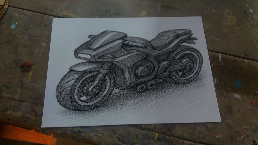
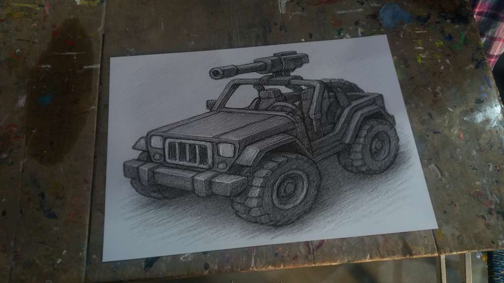
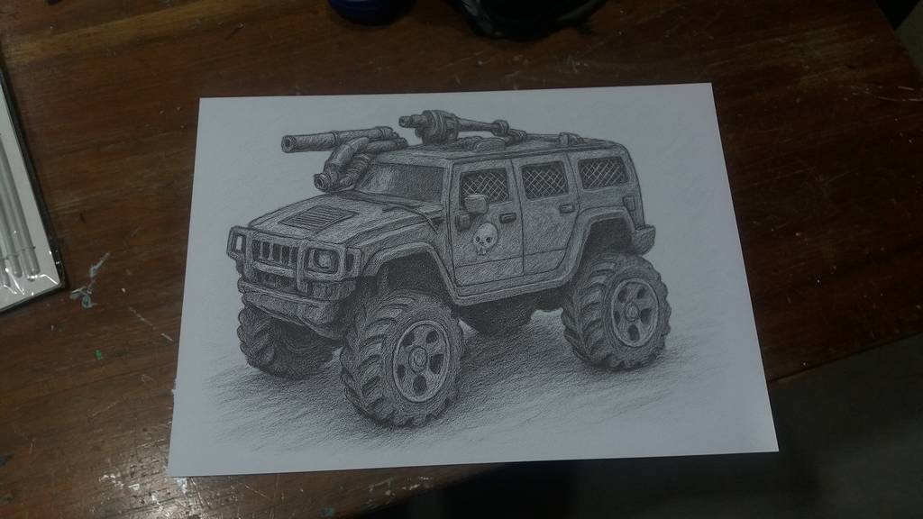
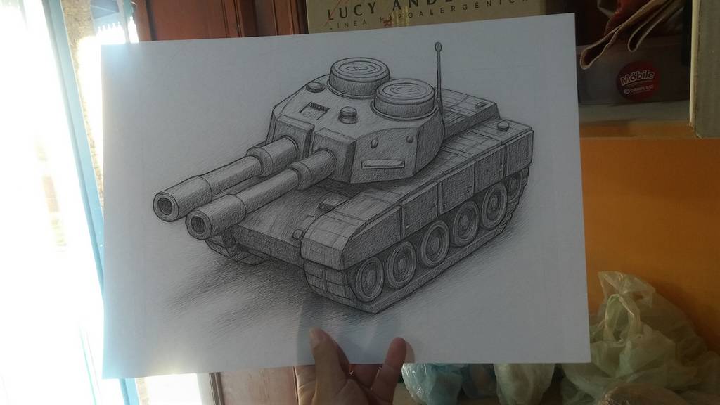
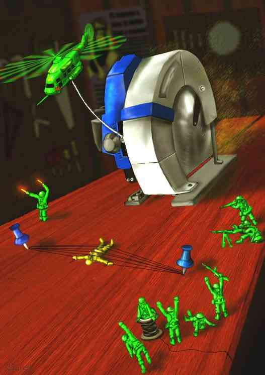
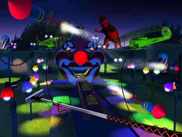
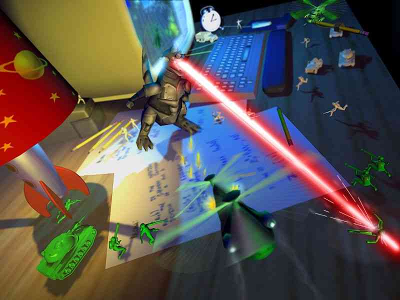
Remember those great Concept Art pieces? Well, we started making them a reality (sort of).
There are some ideas in Concept Art pieces that never became reality (or, in fact, most of them never did). So here we’ll show you the process of how we make them a reality, one way or another.
Concept ArtCGI recreationConcept ArtCGI recreationConcept ArtA more developed drawing, half CGI
The process of creating an illustration does not end with the first stroke. Every visual piece goes through different stages of transformation, maturation, and refinement. What begins as a set of loose lines on paper can evolve into a complex digital scene with depth, color, textures, and three-dimensional elements.
Below, we explore step by step how a simple idea becomes a finished work of art.
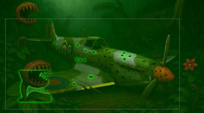
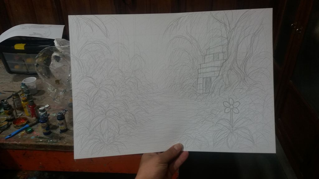
The Creation of a Forgotten Jungle
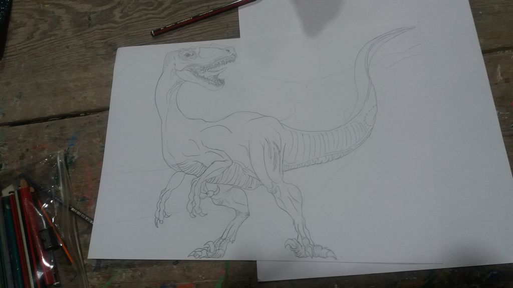
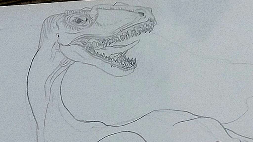
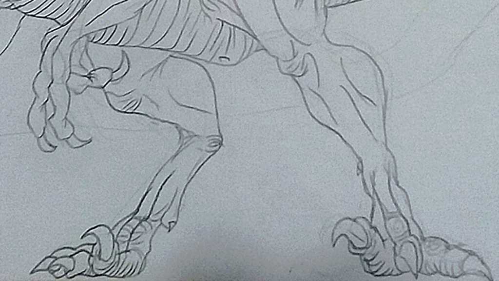
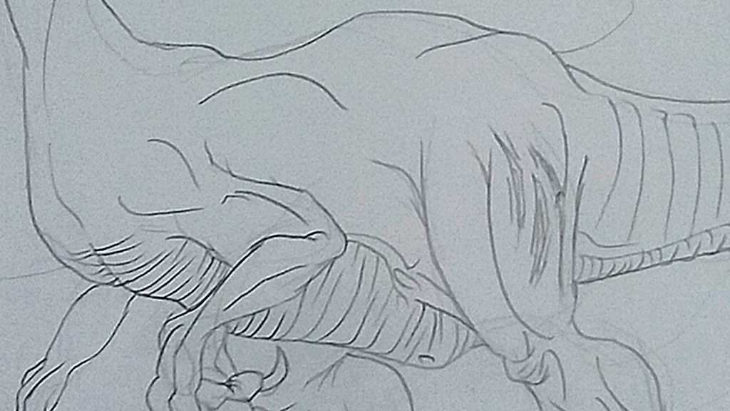
The process of this piece begins with the carnivorous plant, first conceived as a basic sketch with guiding lines. The initial strokes, just a skeleton of geometric shapes, captured the essence of its silhouette: the twisted stem, the oversized mouth, and the sharp teeth. Little by little, the drawing was refined until it gained volume, detail in the leaves, and a posture that conveys tension and aggressiveness. This creature became the central axis of the composition.
From Sketch to Complete Artwork: The Creative Journey of a Digital Illustration
With the base defined, the work progressed to the construction of the narrative environment: a dense jungle crossed by a river or spring flowing through the center of the scene. The vegetation grew in complexity: scattered flowers, trees with exposed roots, and an ancient temple made of massive stone blocks, hidden among the undergrowth. This drawing stage served to establish the visual structure of the piece, defining the relationship between the elements and the balance of the composition.
Slide from one image to another to compare
Slide from one image to another to compare
The next step was digital painting, where the setting gained life and atmosphere. Through layers of color, a humid, dark, and greenish environment was created, typical of a dense and oppressive jungle. The contrast between filtered light and deep shadows added depth and drama, enveloping the carnivorous plant and the temple in a mysterious ambience.
The piece evolved even further with the incorporation of a 3D model of the Spitfire of Flight Lieutenant Ruggels. Far from standing out as an external object, it was integrated into the visual narrative.
The fuselage was damaged by bullet holes, evidence of its violent fall.
Moss and vegetation had grown over its surface, symbols of the relentless passage of time.
The dents and metallic wear reinforced the idea of a war relic abandoned in the jungle.
In the post-production phase, plants in the foreground and overlapping vegetation were added to the 3D model, softening its outline so that it blended with the pictorial style of the illustration. Adjustments of color, texture, and line ensured that all the elements coexisted within a unified aesthetic.
The final result is a piece that tells a story without words: the confrontation between man’s destructive force and the resilience of nature. What began as simple sketch lines transformed into a cinematic and conceptual scene, where time, the jungle, and the remnants of the past interact in a visual balance full of mystery.
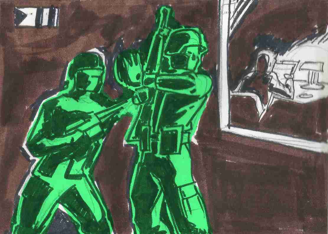
Flags, logos, and other visual representations are powerful tools in graphic design, serving as symbols that convey identity, values, and messages of groups, nations, factions, and communities. Let’s explore these elements from a graphic design perspective, focusing on representation, iconography, and the meanings behind various design elements and their users.
Army Men Nations flags
Flags in the Army Men franchise are somewhat diverse. Some use Real-World references, their initial font, or some kind of Shapes or Symbols. Black and White are used for the contrast element.
Army Men Green Army FlagGreen Flag from SH DreamcastArmy Men Tan Nation FlagTan Flag from SH DreamcastArmy Men Blue Nation FlagBlue Flag from SH DreamcastArmy Men Red Nation FlagSarge’s War GC Red flagGrey Flag from SH Dreamcast
Toyverse Project Original Flags
White Army FlagOrange Army FlagCyan Nation FlagViolet Nation Flag
In the case of the Orange and White armies we used the W and O from the “Real World” logo, which is heavily based on the “Real” slogan from 3DO. But the most for the White Army, because that W is too captivating for us to leave it alone in that logo. It also follows a bit the design aesthetic of the T of the Tan Army.
In the case of the Cyan Army, it is a flag more in the classic style of a Real-World country flag.
But in the case of the White Army flag, we are considering this idea for the design. Although it may end up being a mirror image… or even more distant, it may end up being the logo of Lord Malice or Major Malfunction!
Lord Malice possible logoMajor Malfunction possible logo
Representation in Graphic Design
Representation in graphic design involves creating visual symbols that encapsulate the essence of the entity they represent. This could be a nation, a company, a social movement, or a community. The goal is to create a design that is instantly recognizable and communicates the core values, ideas and identity of the group.
Other flags & logos
Space Troopers flagStorm Legion Flag (AM Strike’s Tan Colonel Destruction)Colonel Destruction’s Storm LegionBaron Von Beige squadron flagBaron Von Beige squadron CGI original textureAqua Marines flag (Water or Winters Marines)The order of the Rabbit
Iconography
Iconography is the study and use of images and symbols to represent ideas, concepts, or information. In graphic design, iconography is crucial because it allows for the quick and effective transmission of messages. Symbols and icons are more than decorative elements; they are the shorthand of communication, cutting through the clutter of words to convey complex messages swiftly.
The Army Men video game franchise, which began in 1998, is known for its distinctive iconography that draws heavily from the classic green plastic toy soldiers. Here are some key elements:
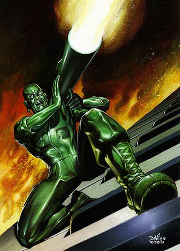
Color-Coded Factions: The games feature different factions represented by distinct colors, primarily the Green and Tan armies. Other factions like the Blue and Grey armies also appear, each with their own unique characteristics and allegiances.
Toy-Like Aesthetic: The visual style of the games emphasizes the plastic nature of the soldiers. When characters are defeated, they often melt or shatter, reinforcing the idea that they are toys.
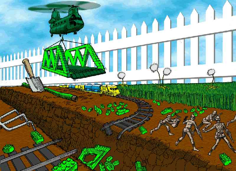
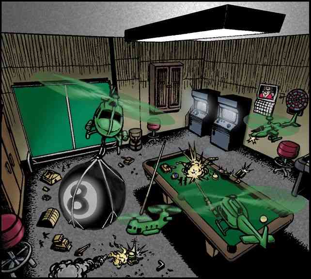
Real-World Settings: Many of the battles take place in exaggerated real-world environments, such as kitchen counters, gardens, and bathrooms. This juxtaposition of small toy soldiers in large human environments adds a playful and imaginative element to the games.
Military Symbols: The games incorporate traditional military iconography, such as medals, ranks, and insignias, but with a playful twist to fit the toy soldier theme.
Vehicles and Equipment: The franchise includes a variety of toy-like vehicles and equipment, such as jeeps, tanks, and helicopters, all designed to look like they belong in a child’s playset.
These elements combine to create a unique and nostalgic experience that appeals to both fans of classic toy soldiers and video game enthusiasts.
Original logotypes:
A remake of the Army Men Classic Logo
This was the first logo for the game franchise, later used in Army Men 3D. Later they used different versions for Army Men 2, Army Men Toys in Space and even Sarge’s Heroes and Air Attack. But it was right during the release of these last 2 games that they came up with the final version:
Definitive Army Men logo, with “Real Combat .Plastic Men.” slogan
This version was used in most (if not all) of the later games, with out the slogan. It was used for last versions of Sarge’s Heroes and Air Attack, until 3DO went out of business. Even after that it was still used for Sarge’s War and Major Malfunction.
Our Army Men Toyverse Project Logotypes
Army Men Real World Project
This logo is from our Toyverse project, the logo that the Army Men Alliance uses in their research initiative into the Real World, the world of humans. The design uses the REAL logo from the defunct company 3DO, a kind of slogan they used. It is worth noting that the 3 colors between the letters of REAL are the colors of the 3 pieces of the key that opens the portal in the first game and in Army Men 3D. Since we couldn’t find any matches for the font used, to add WORLD we cloned the R and the L, and created the other letters trying to respect the same style, giving a special emphasis to the W.
This logo captures the mystery and novelty that the Real World means to Army Men.
Army Men Revolution new videogame logo
This is the logo for our video game project. We wanted a somewhat innovative logo, without losing the essence of Army Men. And since it revolves around the Red Army, we gave it that color and some of the essence of the fonts used in the propaganda of the Soviet Union, in which our version of the Reds are strongly based (not for nothing their official flag is a star). Something that helped us finish the idea of the logo was the 2024 movie “Deadpool & Wolverine”, because of that texture of worn painted and metal underneath, which also alludes to the fact that one of the super weapons of the Red Army will be that they manufactured a massive army of vehicles and all kinds of war tools in Real World metal alloys.
Army Men Toyverse project
This is the logo for the Toyverse project, which serves to encompass other projects under the same initiative, in which ideas, canon and assets are shared. Read more in Army Men Toyverse project.
If you feel like the style sounds familiar, it’s because it’s very similar to the style of “Toys in Space”, which we think is a game that represents the imaginative diversity that can be brought to the world of Army Men.
Army Men REAL PLASTIC MEN logo
This is almost the same logo as the 2.0 logo, but in our case we used it for the branding of the plastic soldiers line in the Real World (Real Plastic Men).
Elements in design and their meanings
Colors: Colors play a significant role in visual representations. Each color can evoke specific emotions and symbolize different concepts. For example:
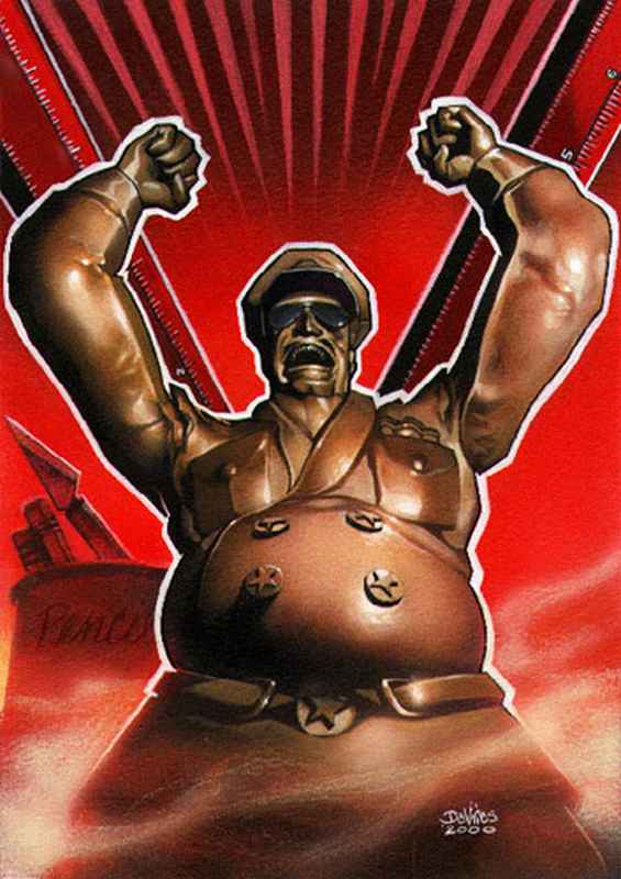
Red: Often associated with passion, energy, and danger. In the case of the Reds, it is appropriate because it represents their nationalist passion and protection of themselves and their culture. They believe that their ideals are correct above all other beliefs, and they defend their culture to the point of being totally closed to the outside world. At first they will be conservative and extremist in keeping it that way.
Blue: Represents calmness, trust, and stability. In the case of what brings us here, Blue is usually a color related to the sky, but especially to the Sea, Water and Ice. For this reason, the element dominated by the Blues will be water or ice, as we can see in the defensive towers of Army Men Warfare. Blue is also a cold and dark color, which helps to go unnoticed in the dark, which is what every spy needs to operate.
Green: Symbolizes nature, growth, and harmony. In the case of our project, it symbolizes the Greens’ initiative to respect the nature of the other worlds and maintain them in harmony, trying not to interfere with or modify them.
Orange: They represent fire, the element that the Orange Nation will dominate. Although the personality of some of its characters will go hand in hand with the intensity of fire.
Gray: They represent neutrality and the absence of diversity. In our Toyverse, the greys were like the Nazis: they rejected everything they considered incorrect or out of the normal status. Their colors lack individuality and diversity. It is also useful when it comes to camouflaging with the environment, one of the most neutral colors for this purpose.
Black: Can denote power, elegance, and mystery. You’ll know why…
Plants: Trees can symbolize life, growth, and wisdom, while flowers like roses can represent love and beauty.
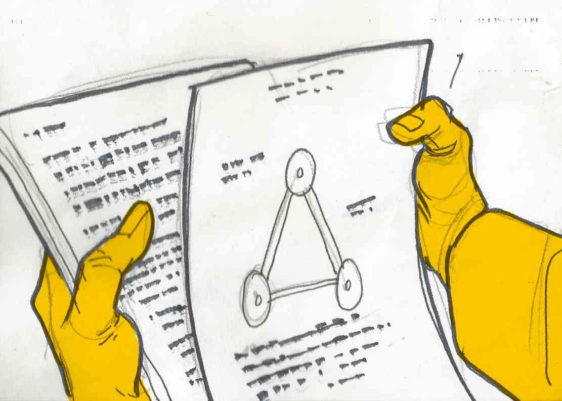
Shapes and Symbols: Shapes and symbols are integral to iconography. Common shapes and their meanings include:
Circles: Represent unity, infinity, and protection.
Triangles: Can symbolize stability, power, and direction.
Stars: Often used to denote excellence, aspiration, and guidance.
Imagery: The use of specific images can convey deeper meanings. For example:
Animals: Different animals can symbolize various traits. For instance, an eagle often represents freedom and strength, while a lion symbolizes courage and royalty.
Historically, the Army Men franchise is full of cultural references from literature, film and television… and we are not going to be left behind of this habit.
Since many of us in the Army Men Toyverse project are fans of Sci-Fi, war and action films in general, we take references from here and there, not only visual, but from the personality of a character being based on an iconic popular character, to certain sounds or weapons based on popular sound pieces.
We think that in the Army Men Microverse the toys themselves adopt and personify characters, as if they were children in a game, and that personality they adopt becomes the purpose that drives and defines them.
Army Men known references
Army Men: Green Rogue:
The introduction of the Omega Soldier in Army Men Green Rogue is almost a copy-paste of the storyboarding of the scene where Arnold Schwarzenegger’s T-800 appears in Terminator 2: Judgment Day
Terminator 2: Judgement Day T-800 introduction into the story
Army Men: Green Rogue Omega Soldier introduction into the story
The previous suspense, the tempo, the metallic beat music sound typical of the Terminator franchise and the nudity of the character, among other details, are totally based on these introductory scenes of the films of this franchise. For this reason one of the frames of reference for Omega’s personality will be Arnold’s T-800.
T-800 Arrival in The Terminator movie
T-850 Arrival in Terminator 3: Rise of the Machines
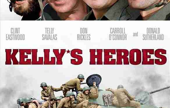
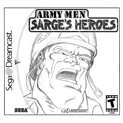
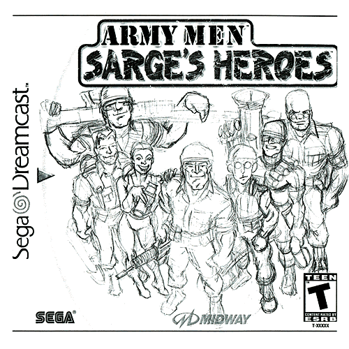
Army Men: Sarge’s Heroes
Army Men: Sarge’s Heroes game cover
Kelly’s Heroes movie poster
Sarge’s Heroes is an obvious reference to Kelly’s Heroes, the film of the same name. In fact, each member of Bravo Company has a very different personality and appearance from each other, and each member has a different specialty. The same thing happens with Kelly’s men. Besides, everyone is crazy… in their own way.
The Red Baron and the Beige Baron
Manfred Albrecht von Richthofen, known as the “Red Baron” or “Baron Von Richthofen”, was a German fighter pilot during the human’s World War I. He is considered the ace of aces of war because he managed to shoot down eighty enemy airplanes. The obvious parallels with Baron Von Beige don’t need much clarification, but it has nothing to do with the Red Baron’s personality, except that he was an honor fighter equivalent to the English gentlemen he fought against. The Beige Baron has equal respect for his enemies, like Captain Blade and instead of finishing off his opponents, he just knocks them down and leaves them a Beige scarf as his trademark. Therefore Von Beige is not a murderer, but an avid fighter who likes to compete against other great pilots.
During the First World War, pilots were considered to be medieval knights “riding” the skies, and that rivals recognized each other as such when they crossed paths on the battlefield. Certain pilots had the habit of giving the military salute to their opponents when passing each other during a reconnaissance mission, but that solemn salute was soon replaced by a much more practical gesture within the context of a total war, although perhaps less chivalrous: the aviators began to carry guns (and use them).
One of the reasons World War I pilots wore scarves was not to be thrown at downed enemies (although they got used to doing it), was the combination of open cockpits and open engine oil systems, which used castor oil. Many early aeronautic engines used an open oil system, in which, instead of circulating the oil, it was dripped out of the engine and replenished from a reservoir, since being rotary engines, the castor oil used It was thrown in all directions, even towards the pilot. Ingesting castor oil not only tastes disgusting, but can also cause quite catastrophic effects on the digestive system. A silk handkerchief filtered out most of the castor oil.
Cajun Joe Colonel
“Cajun Joe’s mansion” was written in the back of the mission list, or description of some kind about missions, in the poster of an Army Men PC special edition, product of a partnership of 3DO with Ubisoft, which led us to the lyrics of a song, called “Cajun Joe (The Bully Of The Bayou)”, a “Country” 60′ style song that coincides in some sort of way with the Gray Colonel mission, like the terrain where the mission take place, the Bayou land.
Colonel Blintz, Lord Malice, Major Malfunction and a Green Colonel
Both the former Colonel Blintz, later called “Blintz” or “King Plurtz One” from Army Men RTS and the Green Colonel from Army Men 2, were clear references to the character of Colonel Walter E. Kurtz from the movie Apocalypse Now. In some very diluted way, the plot of both games, RTS & 2, was based on the primary idea of this movie: hunt down the renegade Colonel because he is out of control or knew a lot, and that is considered dangerous…
Even Lord Malice was also partially based on this character, and Sgt. Hawk goin evil when he became Major Malfunction. Or at least the game’s plot was. Only at the end of the game we found out that Malice was Gooding and Hawk was Malfunction (when in the movie the identity of the villain is known from the beginning). All of them were good men that went crazy.
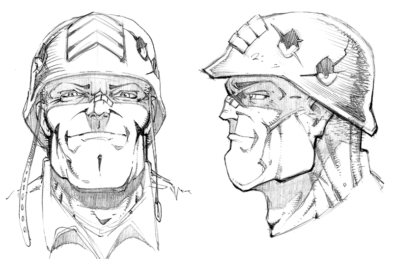
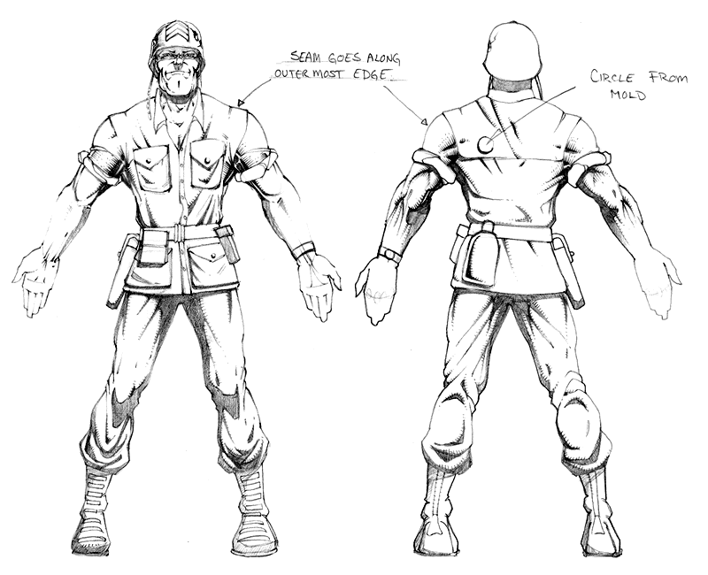
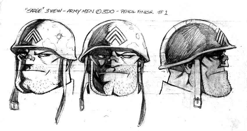
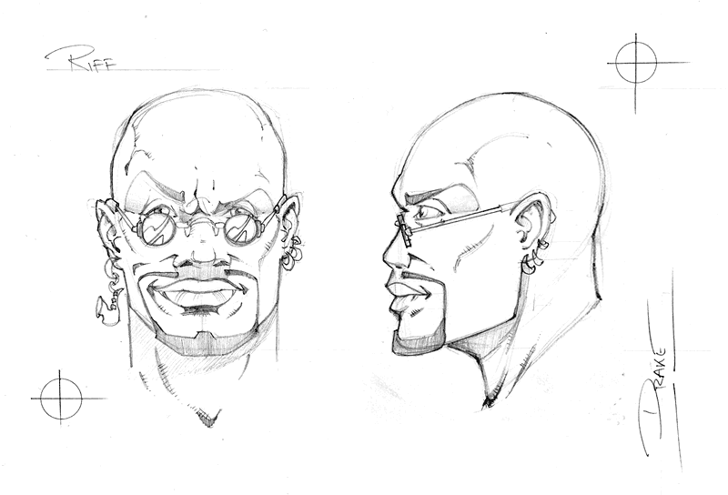
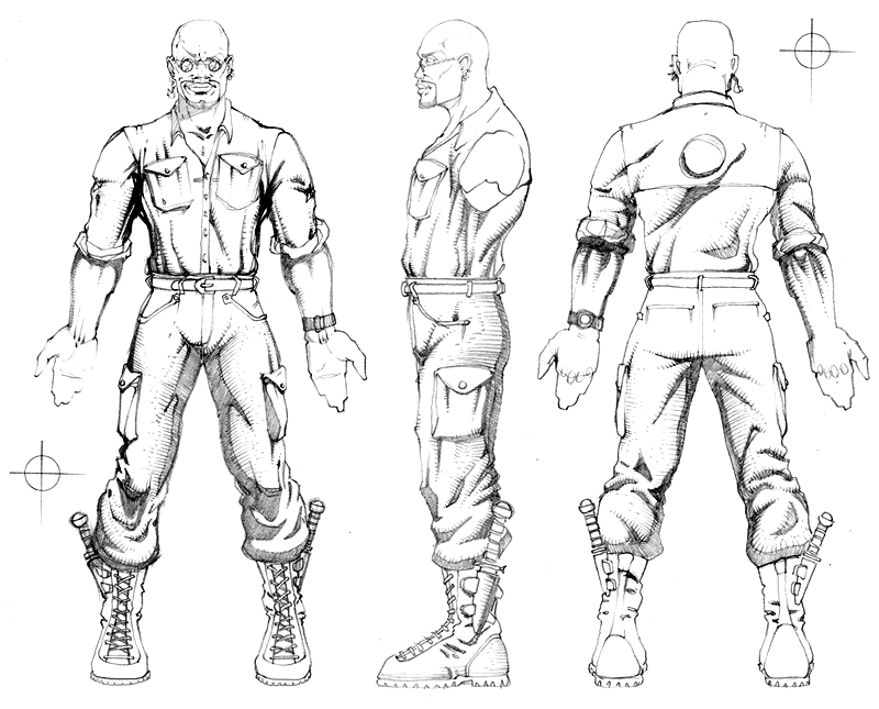
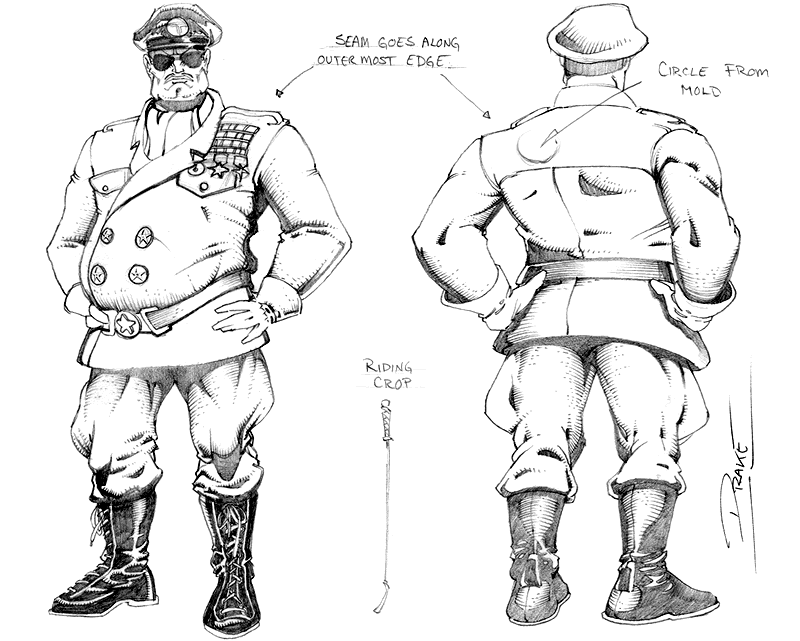
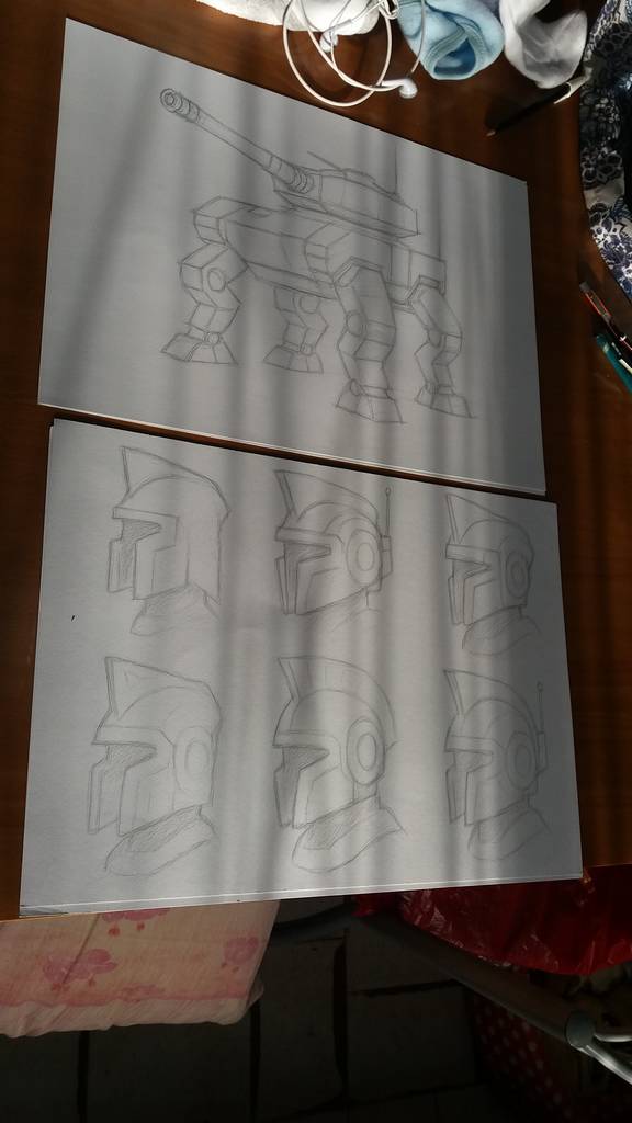
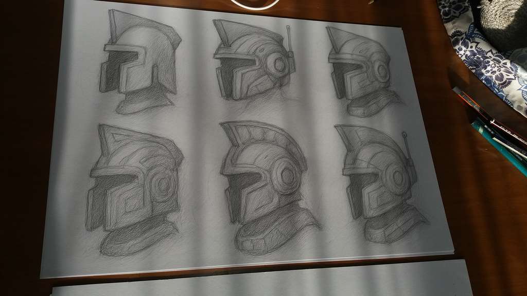
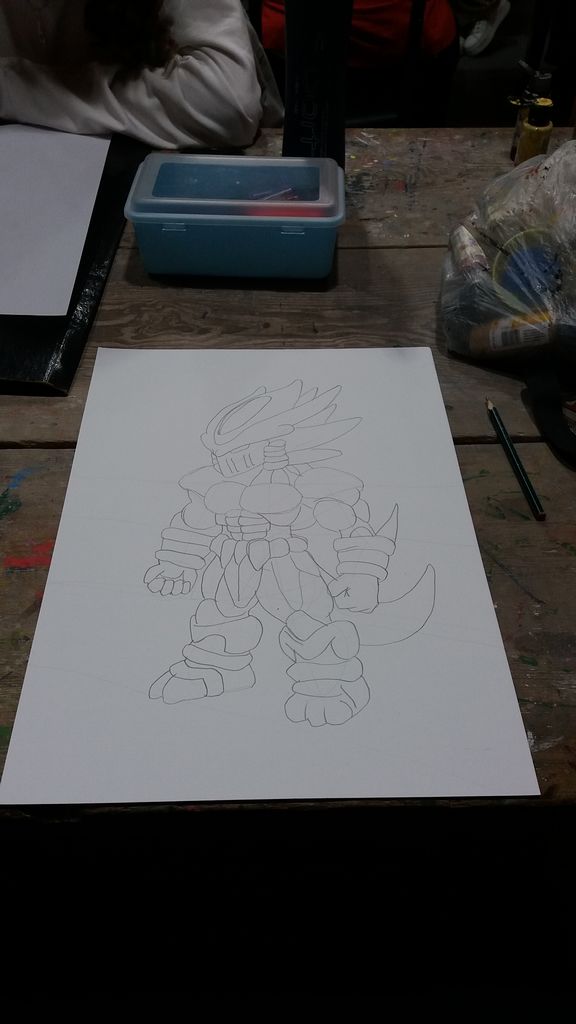
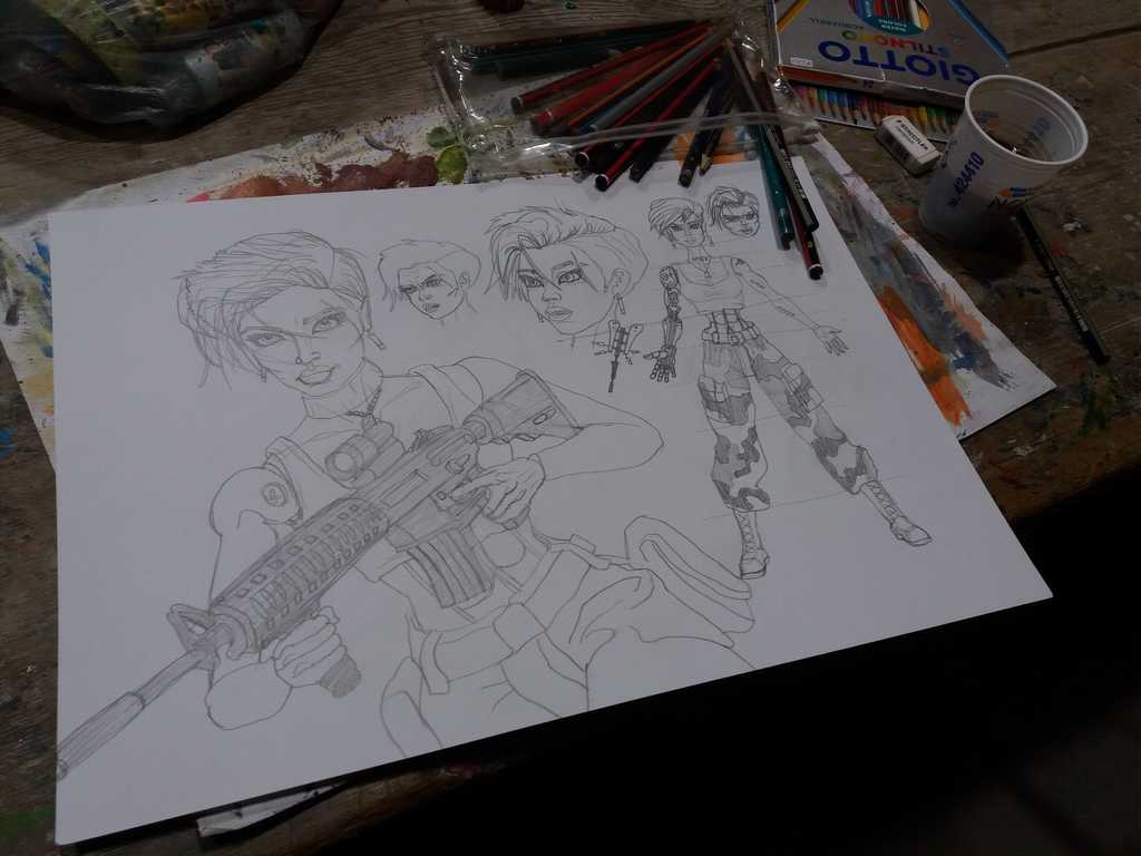
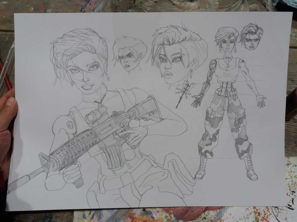
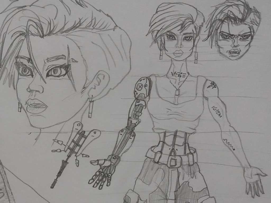
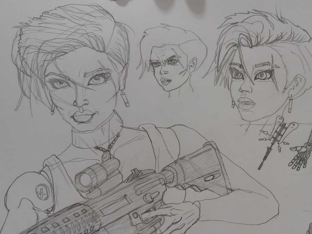
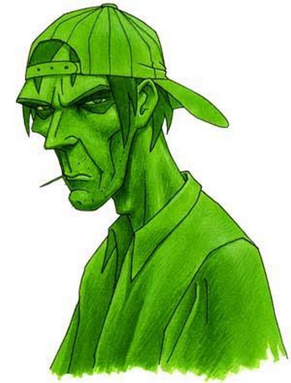
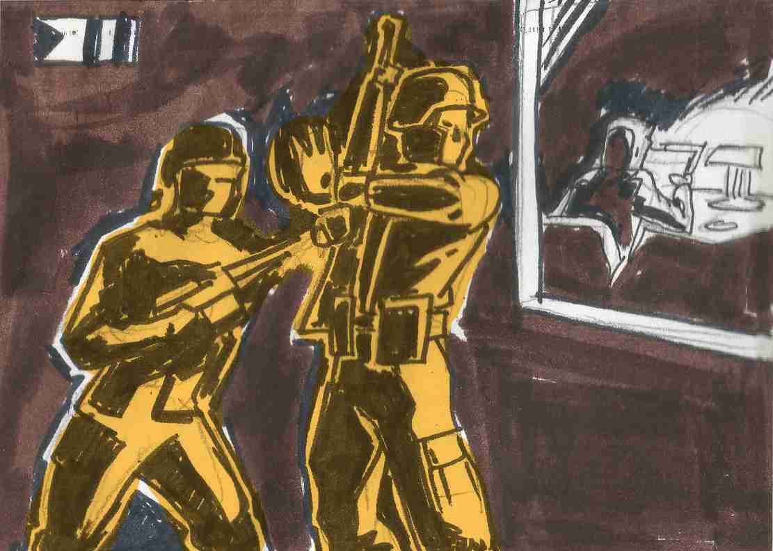
The points to take into consideration for our Army Men concept artists:
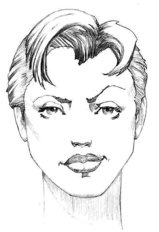
Sarge Hawk Vitruvio Army Men Concept Art
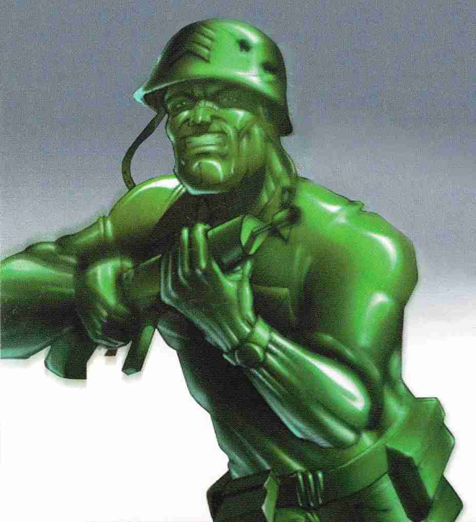
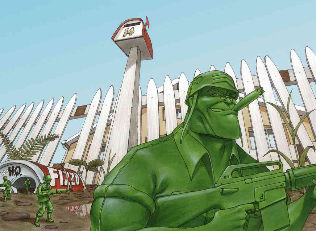
At first the Army Men must look like real soldiers, realizing later during the that they are actually miniature.
Any childish item, like a teddy bear, should look fierce and terrifying. A serious threat, although it may seem harmless at first for the player to take it lightly.
They should look like real little toys, plastic soldiers. There are details impossible to achieve on a certain scale, which make the plastic soldier 3D models look small.
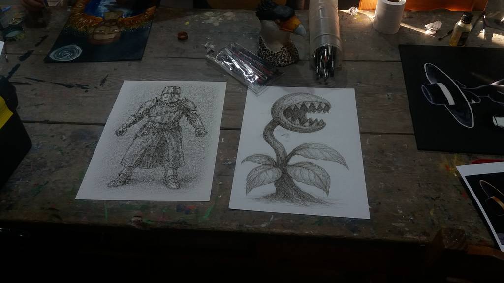
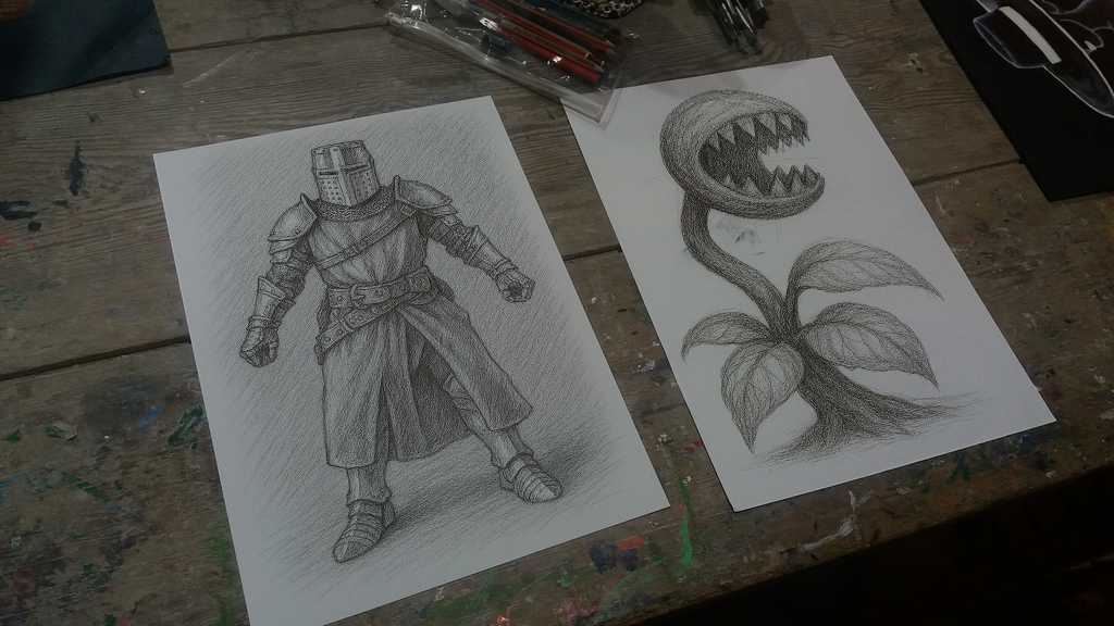
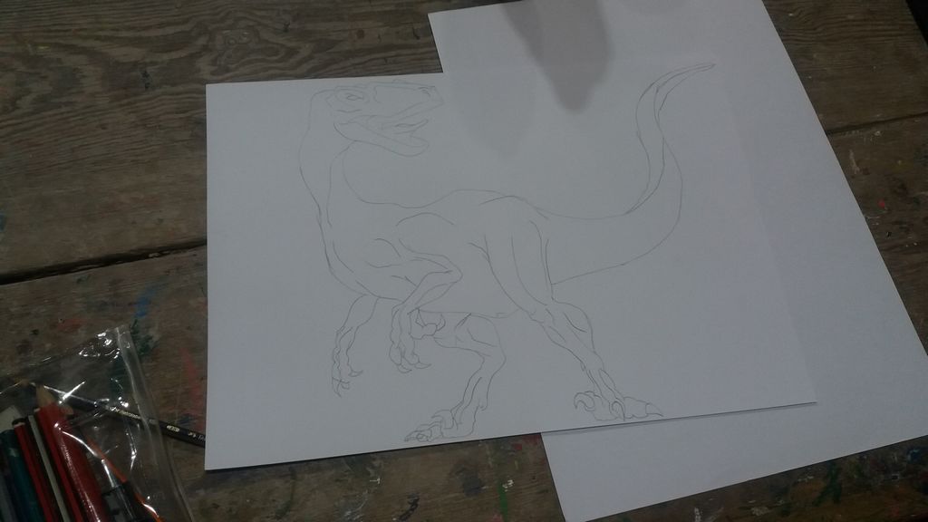
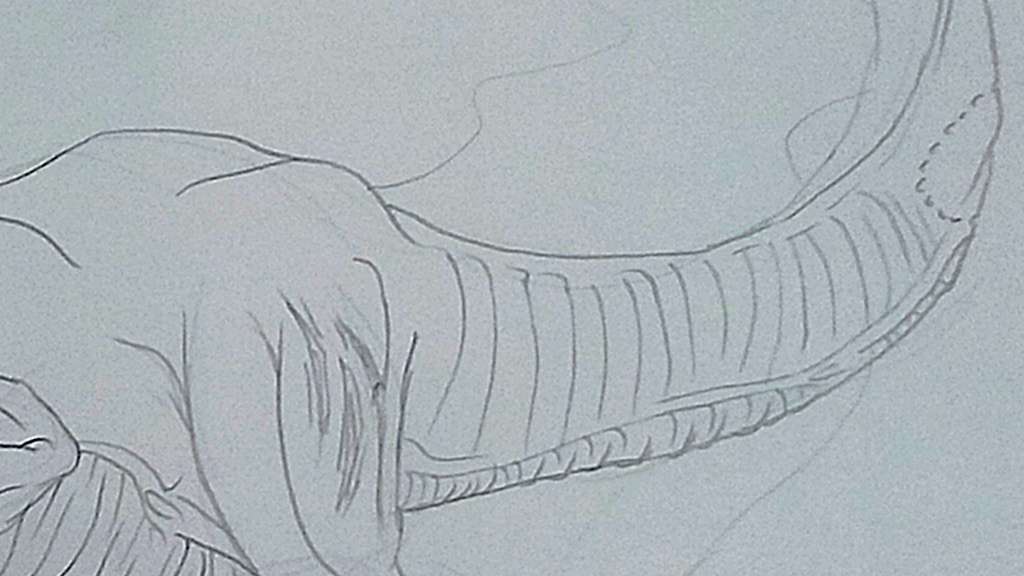
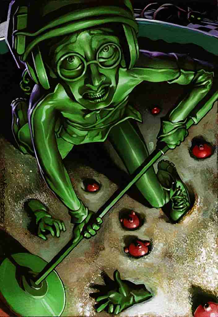
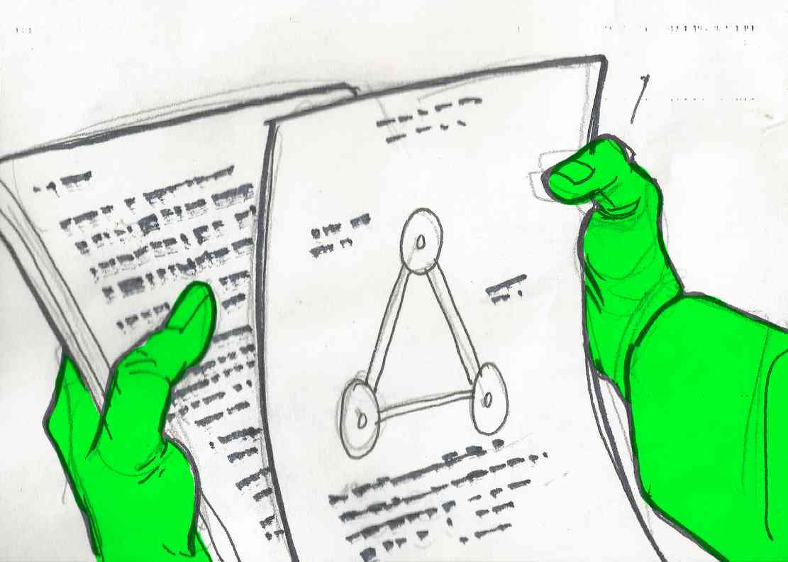
Conceptual art is an artistic and simplified sketch in which the conceptualization or idea is more important than the drawn/conceptualized art. Ideas prevail over their formal or sensitive aspects so that the artistic aspect of the concept takes a back seat, favoring the speed of production time of the idea, also reducing the mental process of understanding the idea.
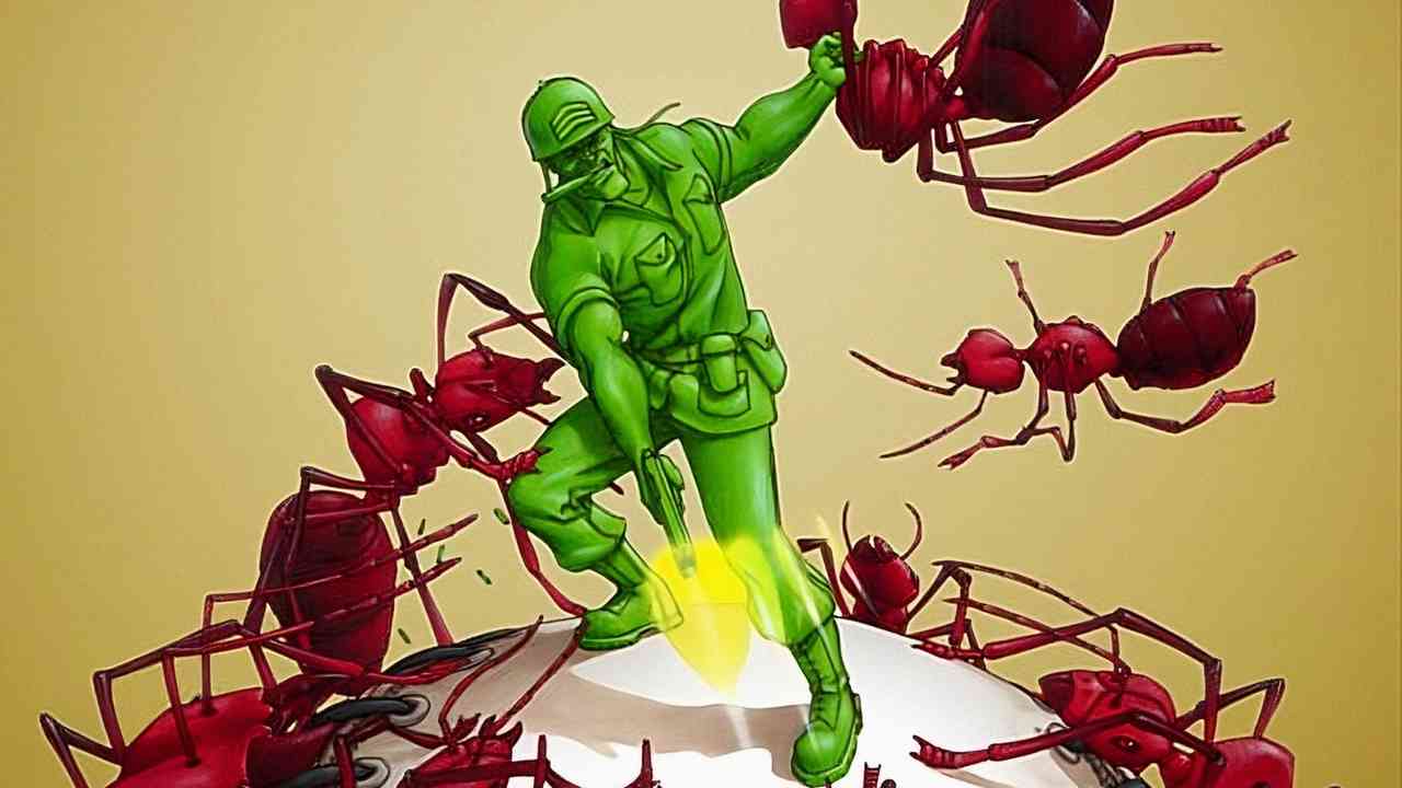
Sarge Hawk vs Ants
By dispensing with the complex creation of the final product before it is approved, so much time is not wasted on visual pieces that could not be approved. Therefore these sketches accelerate the idea production process. Regardless of the technique, material or form used to represent it is not something strict.
Before reaching the final choice of an idea, there may be several previously rejected conceptual pieces, and even this process can go through several steps, such as a very simple concept, which then evolves into a more complete and complex one (which is still a conceptual piece). After a concept art is approved, the chosen idea moves on to the actual production of the final product.
Classic Concept Art from 3DO
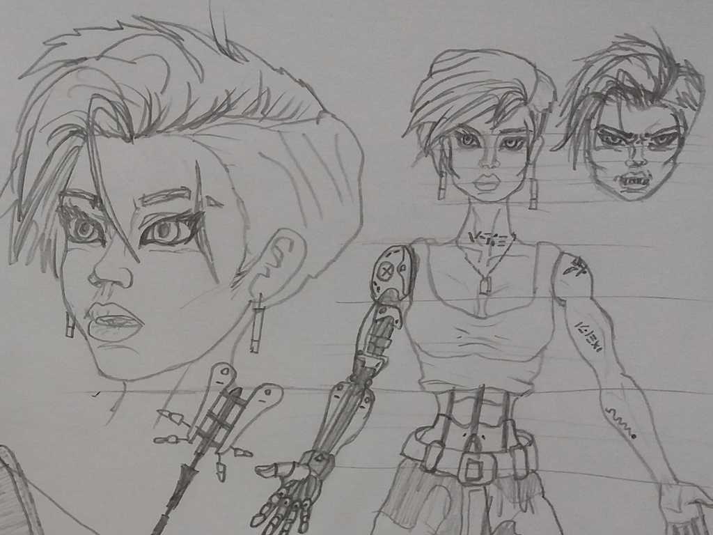
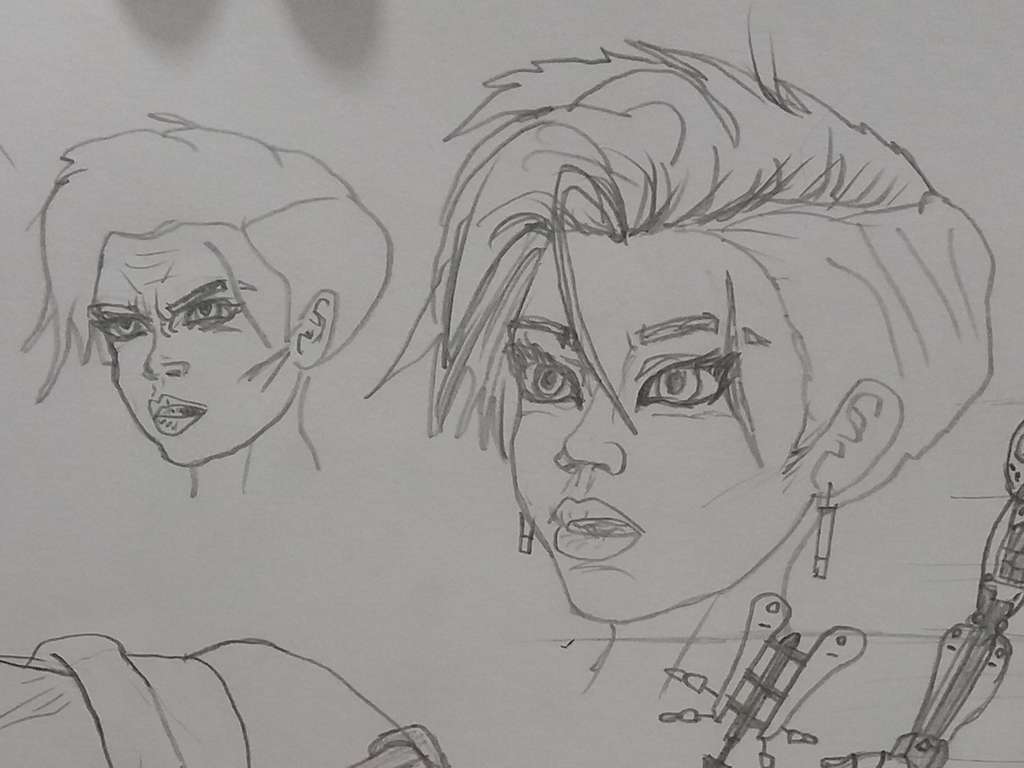
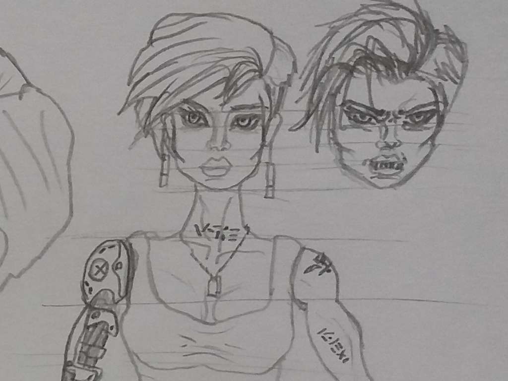
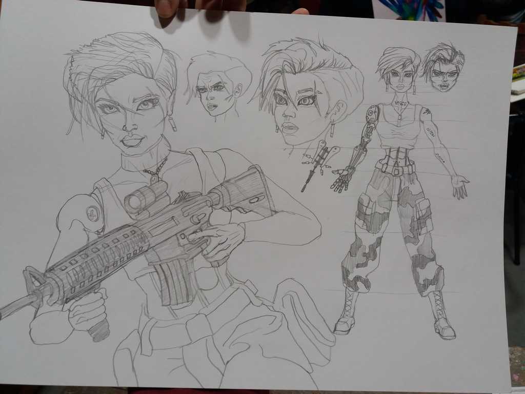
Characters from pencil to CGI
In the case of a video game, sketches are always the step prior to designing the 3D CGI character. In this case, we can see how the drawing evolves into 3D modeling, or how the 3D modeling evolves into the drawing? Both cases represent a back-and-forth of creative feedback.
A step prior to the final Vikki design…The final design!
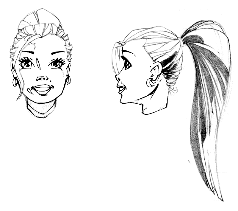
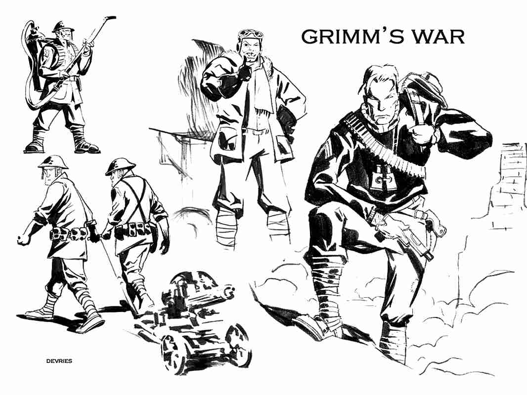
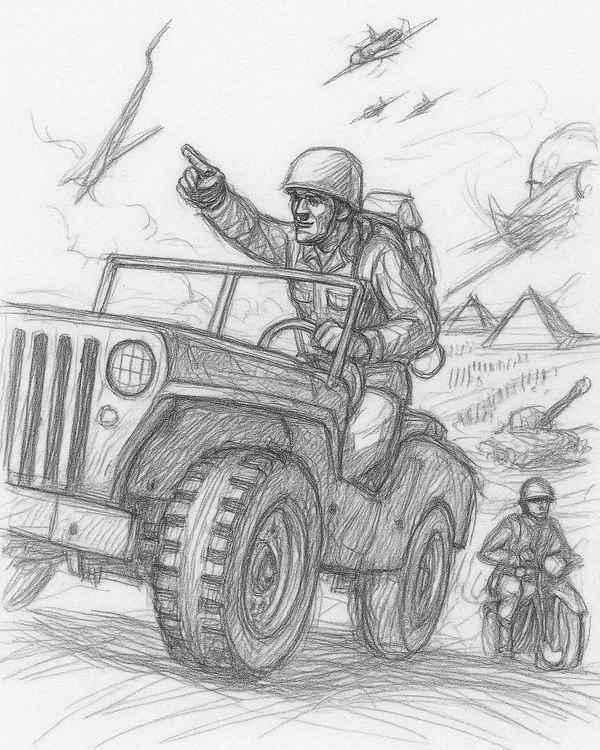
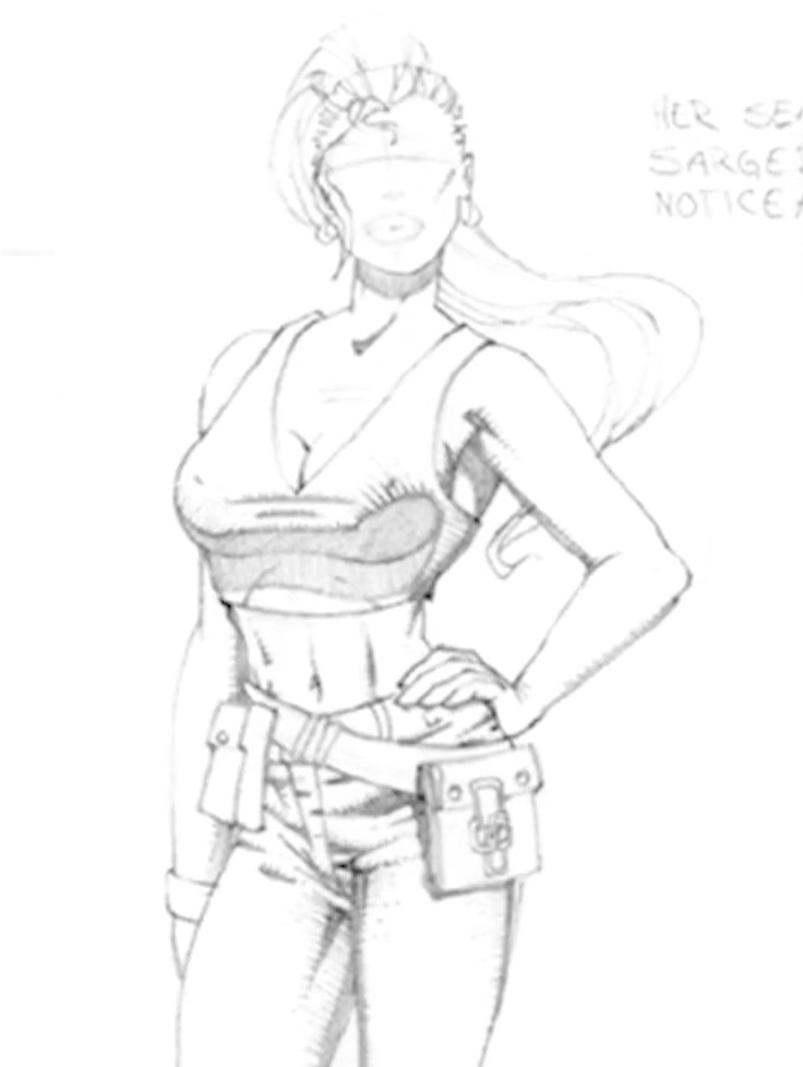
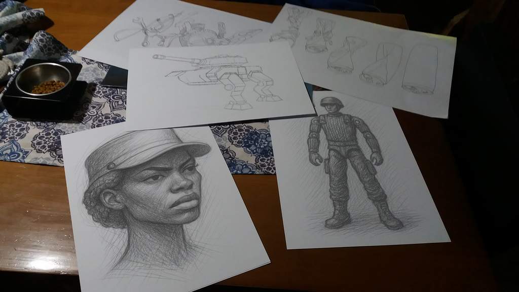
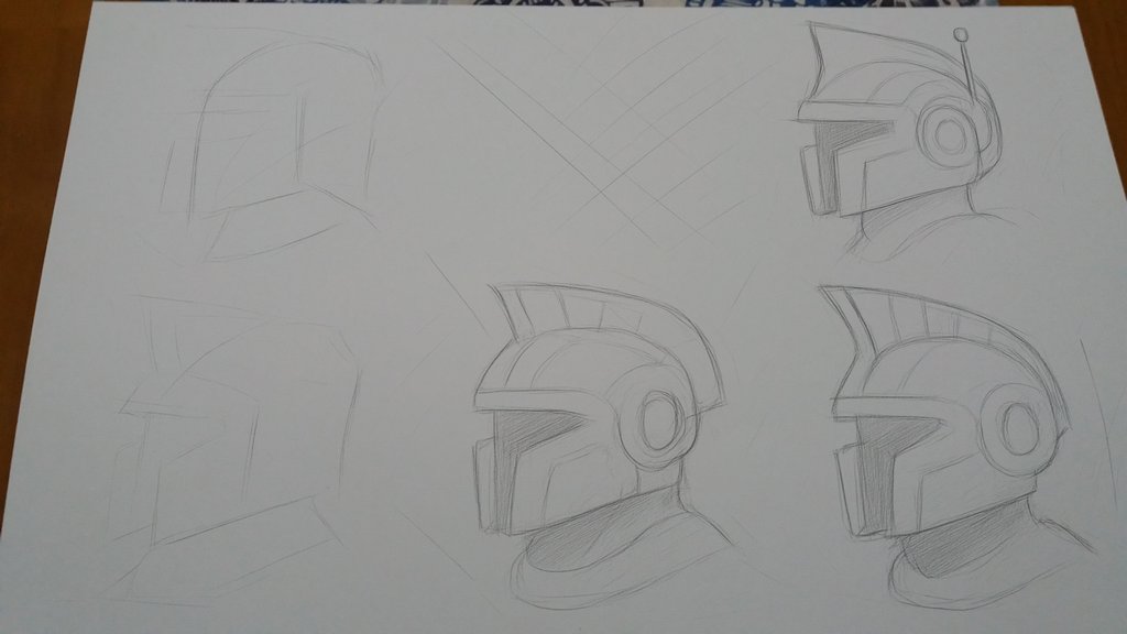
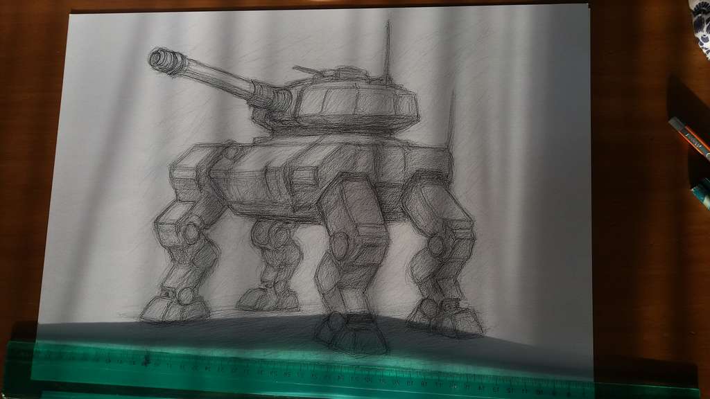
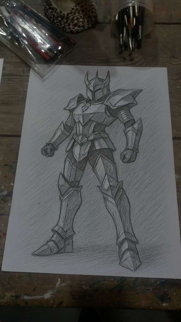
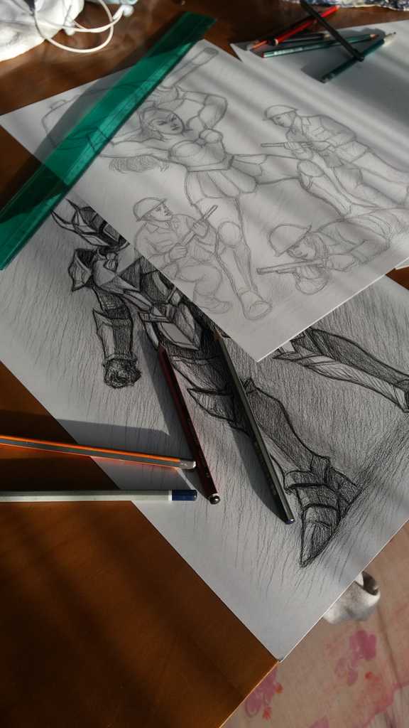
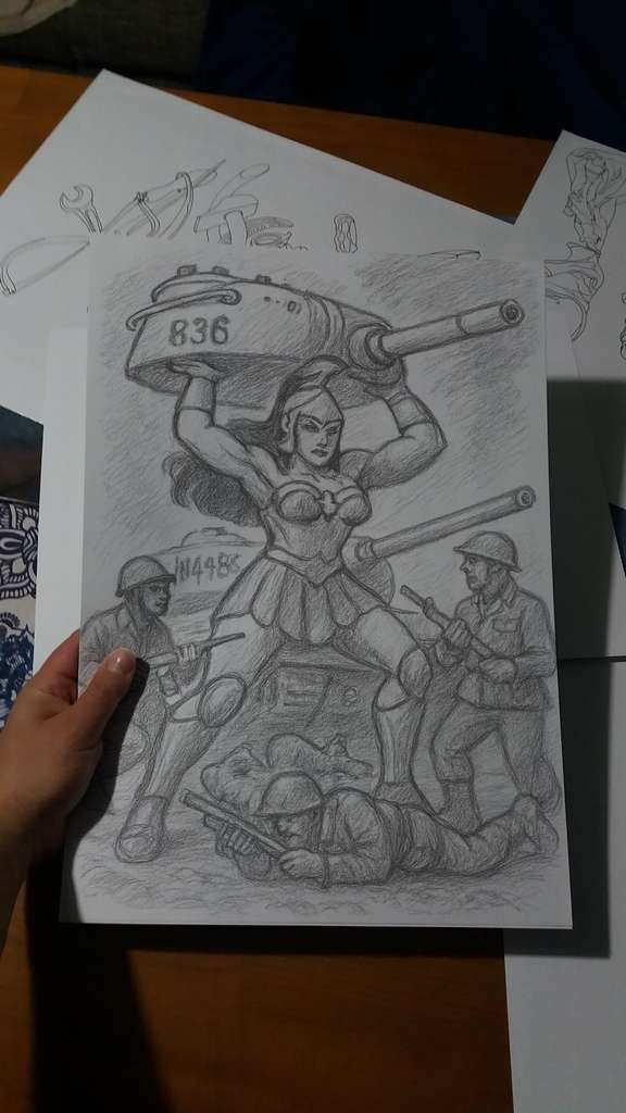
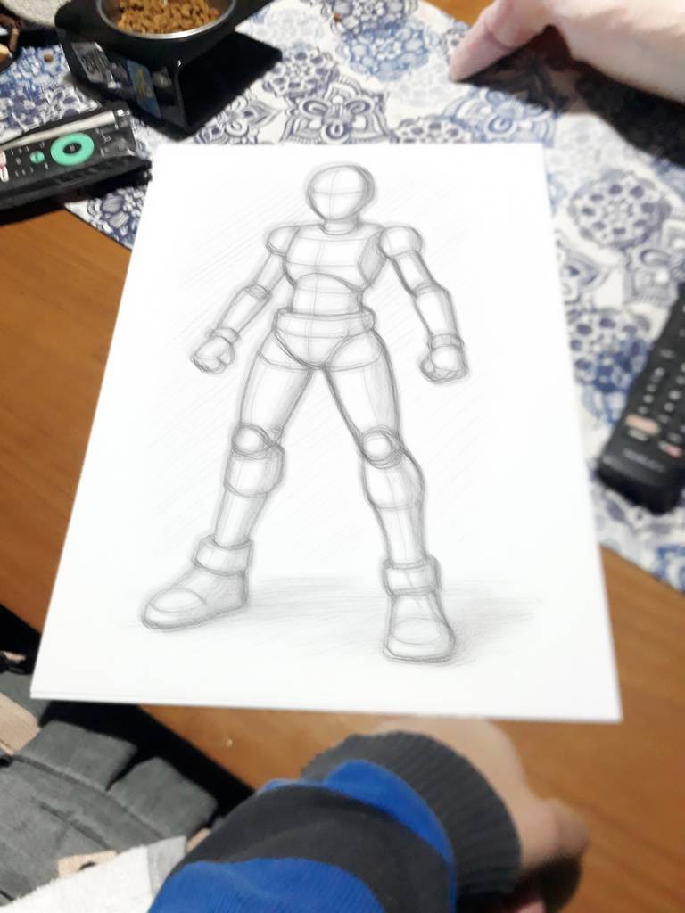
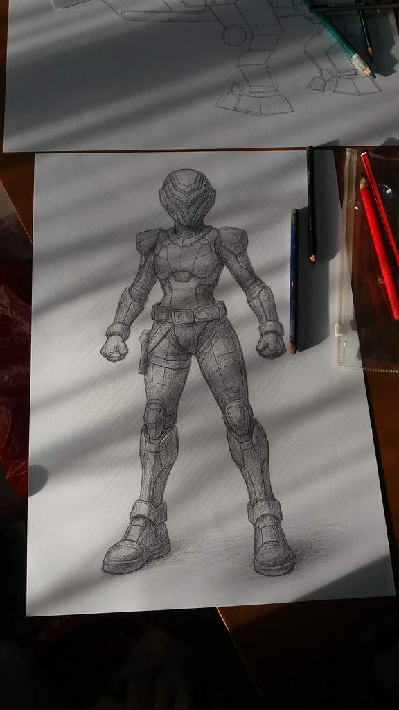
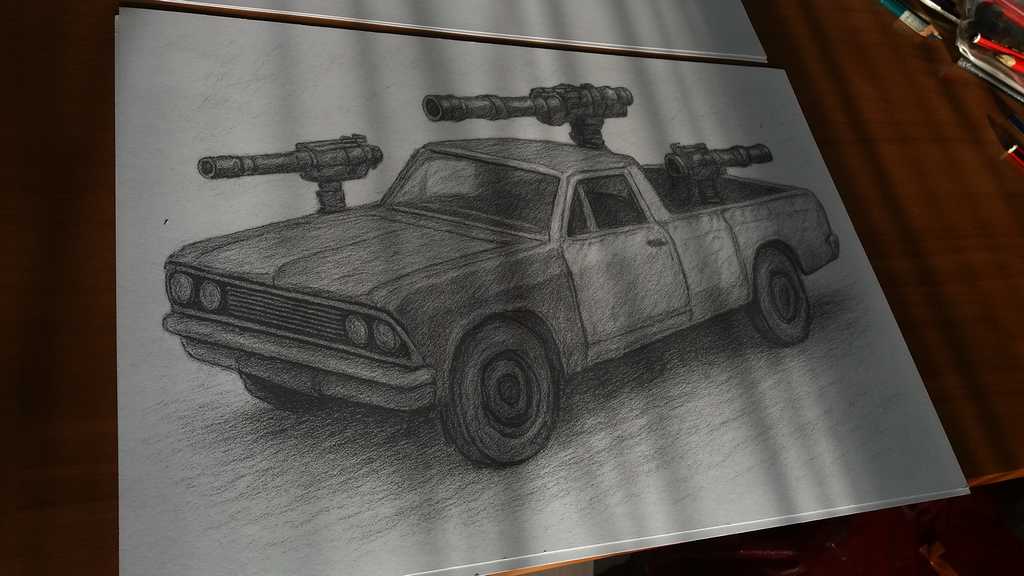
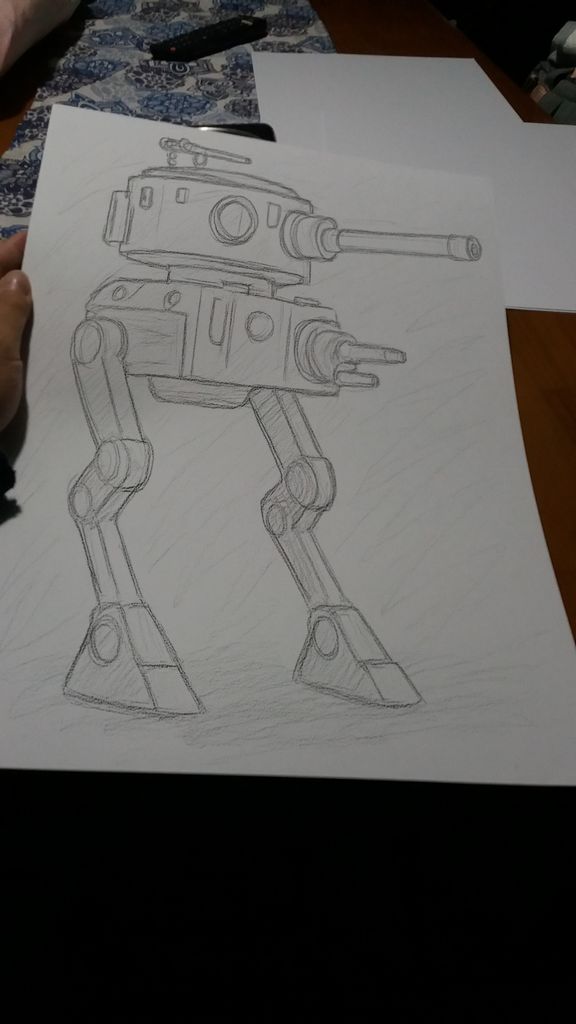
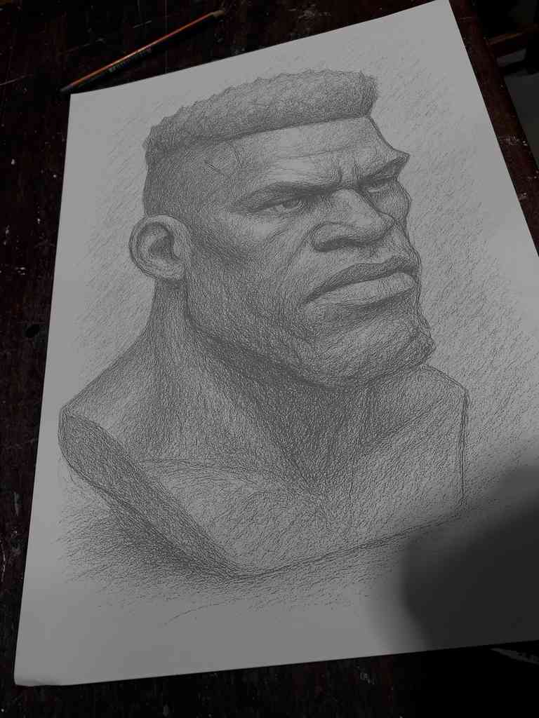
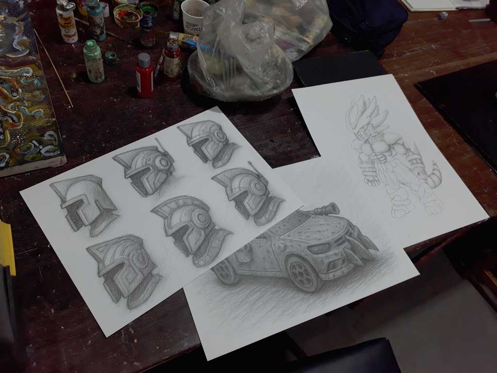
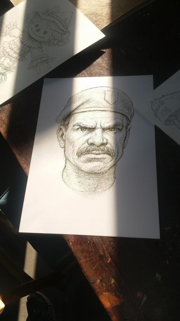
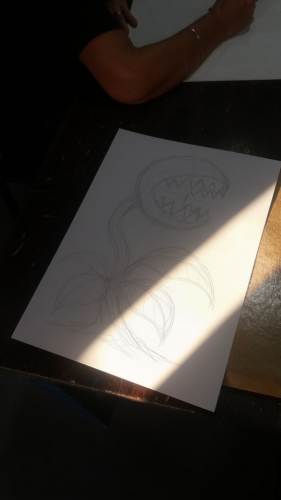
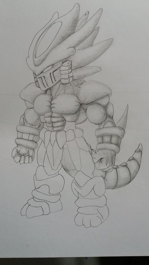
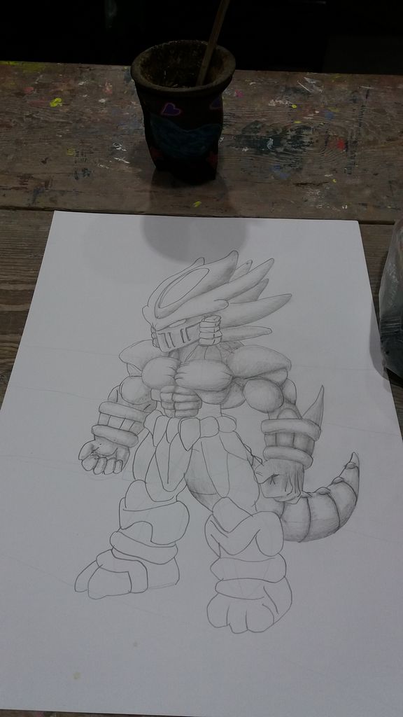
Our Pencil Character & Vehicles Concept Art
This Army Men expanded universe project, which we call “Toyverse,” requires the same steps and methodologies to achieve similar results, which resemble the old Army Men in both design and visual identity. So here are some examples…
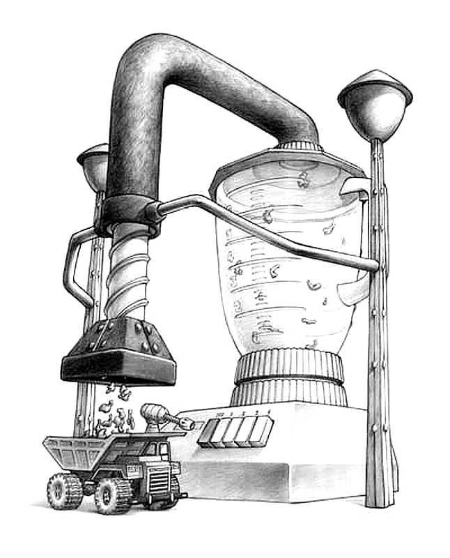
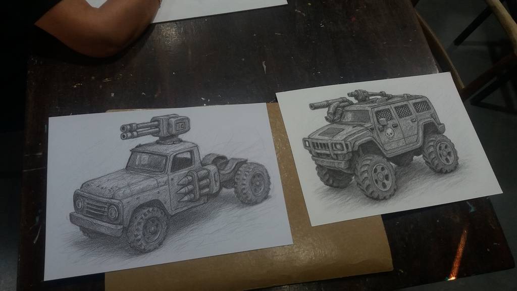
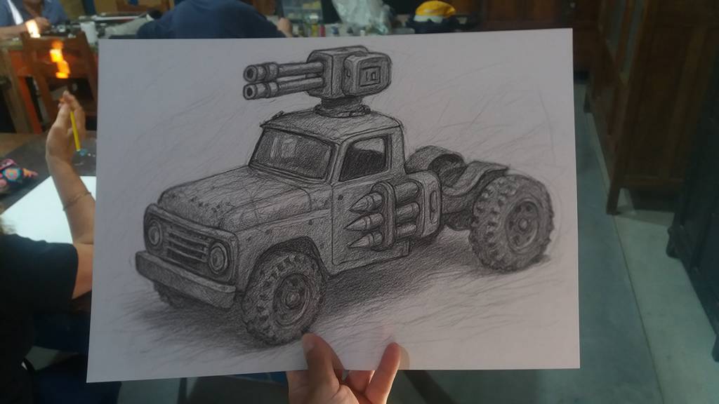
Concept Art, from basic pencil lines to the complex tridimensional idea: In this case a Mad Max or Vigilante 8 modified Die-cast battlecar.
… and a Super Soldier in full combat armor.
Penny from Army Men Strike, form 3.
Turtle tank full color concept art.
From Sketch to Complete Concept Art
The process of creating an illustration does not end with the first stroke. Every visual piece goes through different stages of transformation, maturation, and refinement. What begins as a set of loose lines on paper can evolve into a complex digital scene with depth, color, textures, and three-dimensional elements.
Below, we explore step by step how a simple idea becomes a finished work of art.
The Creation of a Forgotten Jungle
The process of this piece begins with the carnivorous plant, first conceived as a basic sketch with guiding lines. The initial strokes, just a skeleton of geometric shapes, captured the essence of its silhouette: the twisted stem, the oversized mouth, and the sharp teeth. Little by little, the drawing was refined until it gained volume, detail in the leaves, and a posture that conveys tension and aggressiveness. This creature became the central axis of the composition.
From Sketch to Complete Artwork: The Creative Journey of a Digital Illustration
With the base defined, the work progressed to the construction of the narrative environment: a dense jungle crossed by a river or spring flowing through the center of the scene. The vegetation grew in complexity: scattered flowers, trees with exposed roots, and an ancient temple made of massive stone blocks, hidden among the undergrowth. This drawing stage served to establish the visual structure of the piece, defining the relationship between the elements and the balance of the composition.
Slide from one image to another to compare
Slide from one image to another to compare
The next step was digital painting, where the setting gained life and atmosphere. Through layers of color, a humid, dark, and greenish environment was created, typical of a dense and oppressive jungle. The contrast between filtered light and deep shadows added depth and drama, enveloping the carnivorous plant and the temple in a mysterious ambience.
The piece evolved even further with the incorporation of a 3D model of the Spitfire of Flight Lieutenant Ruggels. Far from standing out as an external object, it was integrated into the visual narrative.
The fuselage was damaged by bullet holes, evidence of its violent fall.
Moss and vegetation had grown over its surface, symbols of the relentless passage of time.
The dents and metallic wear reinforced the idea of a war relic abandoned in the jungle.
In the post-production phase, plants in the foreground and overlapping vegetation were added to the 3D model, softening its outline so that it blended with the pictorial style of the illustration. Adjustments of color, texture, and line ensured that all the elements coexisted within a unified aesthetic.
The final result is a piece that tells a story without words: the confrontation between man’s destructive force and the resilience of nature. What began as simple sketch lines transformed into a cinematic and conceptual scene, where time, the jungle, and the remnants of the past interact in a visual balance full of mystery.
Full Color 3DO Character Concept Art
Some full-color pieces from a variety of Army Men games. Concept art and some images are character concepts, others are simply promotional images.
Army Men Strike Concept Art
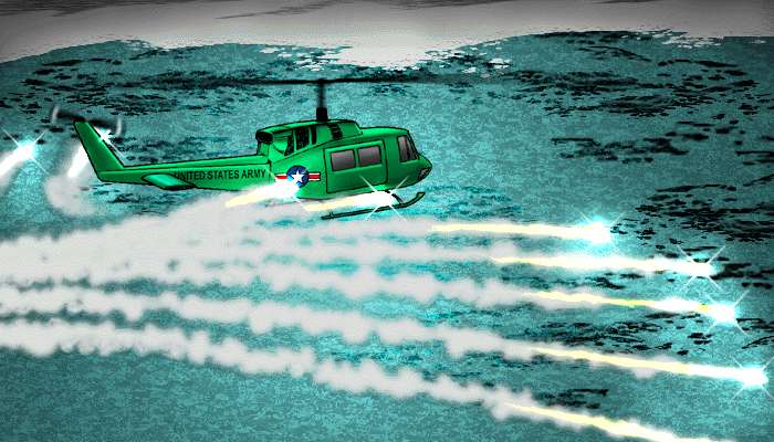
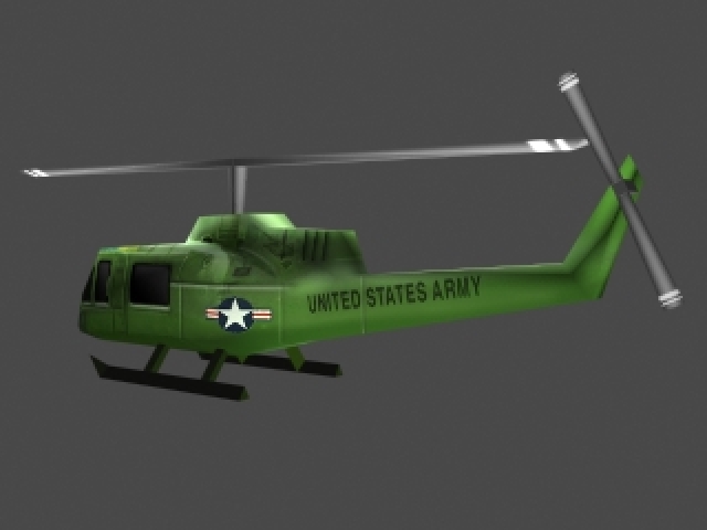
Army Men Air Attack 1 & 2 Concept Art
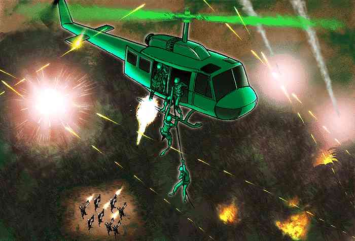
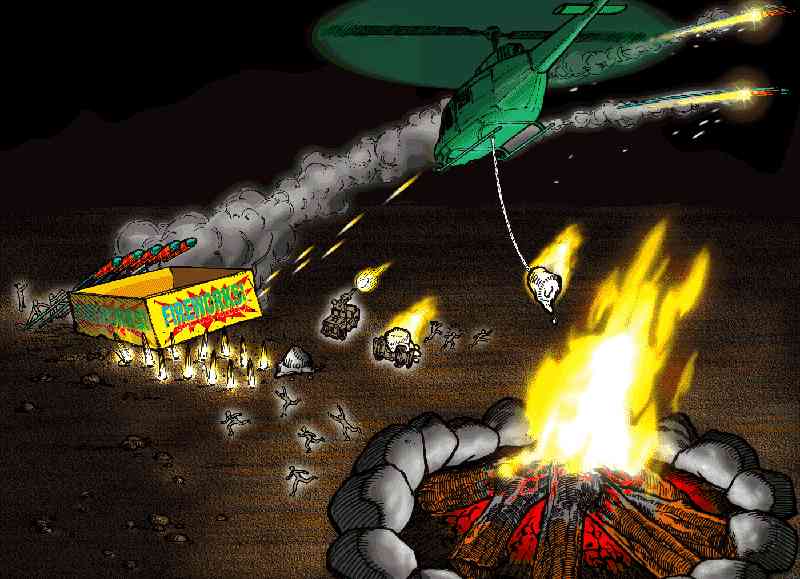
Some of the ideas that want to be tested in helicopter games are interesting. They probably all would have been achieved in Air Attack 3, maybe?
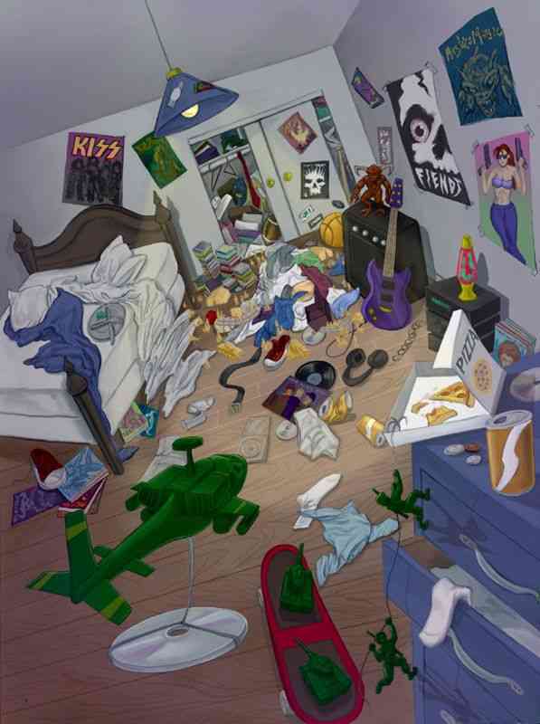
Making Concept Art a reality
Remember those great Concept Art pieces? Well, we started making them a reality (sort of).
There are some ideas in Concept Art pieces that never became reality (or, in fact, most of them never did). So here we’ll show you the process of how we make them a reality, one way or another.
Concept ArtCGI recreationConcept ArtCGI recreationConcept ArtA more developed drawing, half CGI
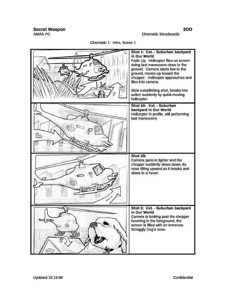
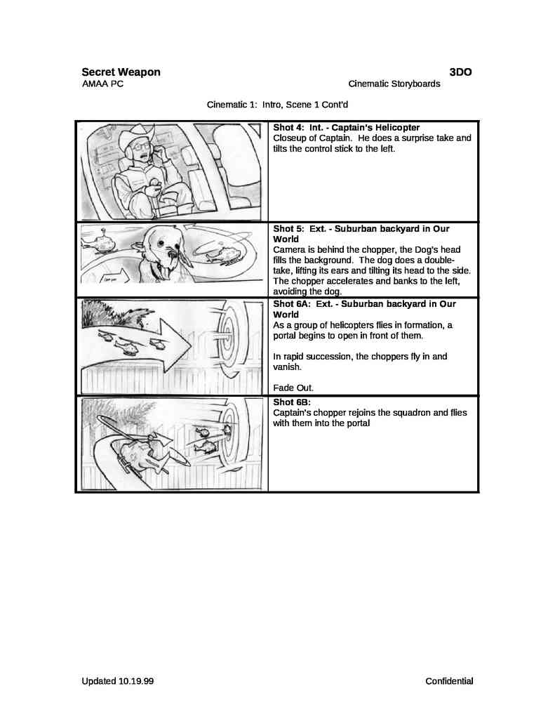
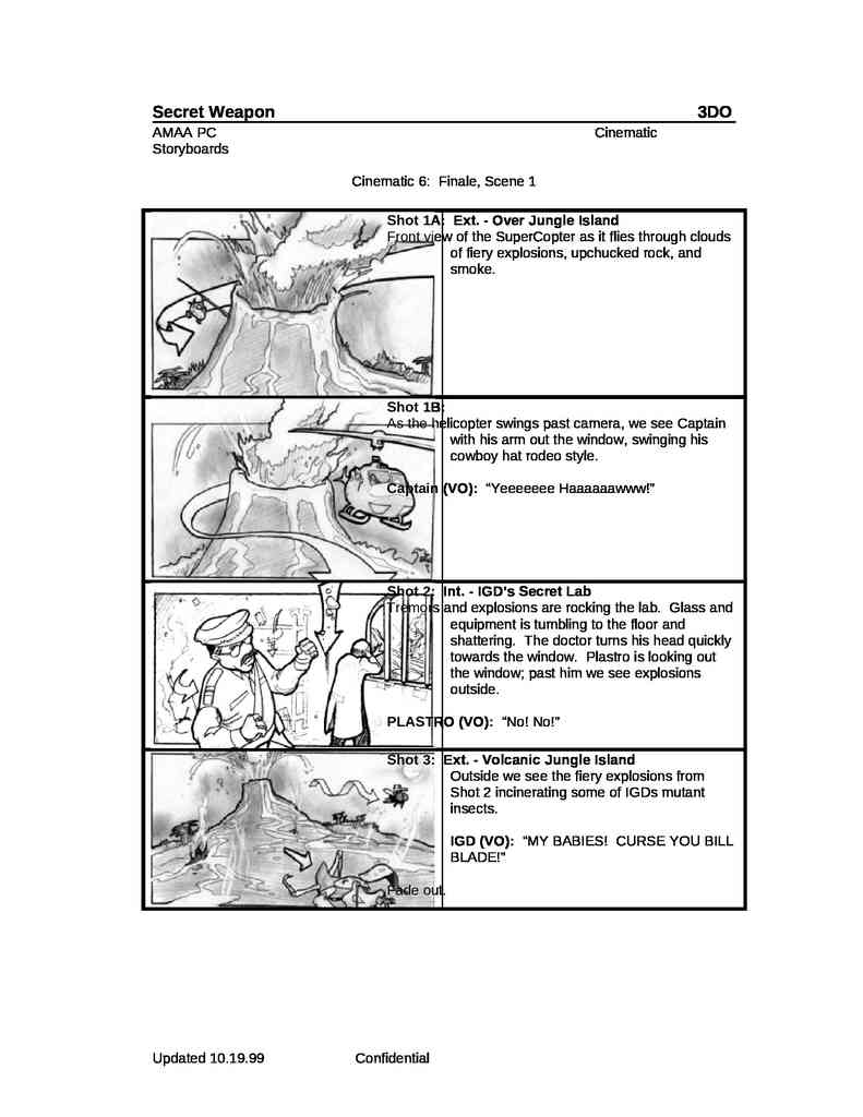
Storyboards
The Army Men franchise used a lot of storyboarding for the CGI animations of the games’ cut scenes, but also for the in-game animations of Sarge’s Heroes 1 and 2 for the Nintendo 64 (made with the game engine).
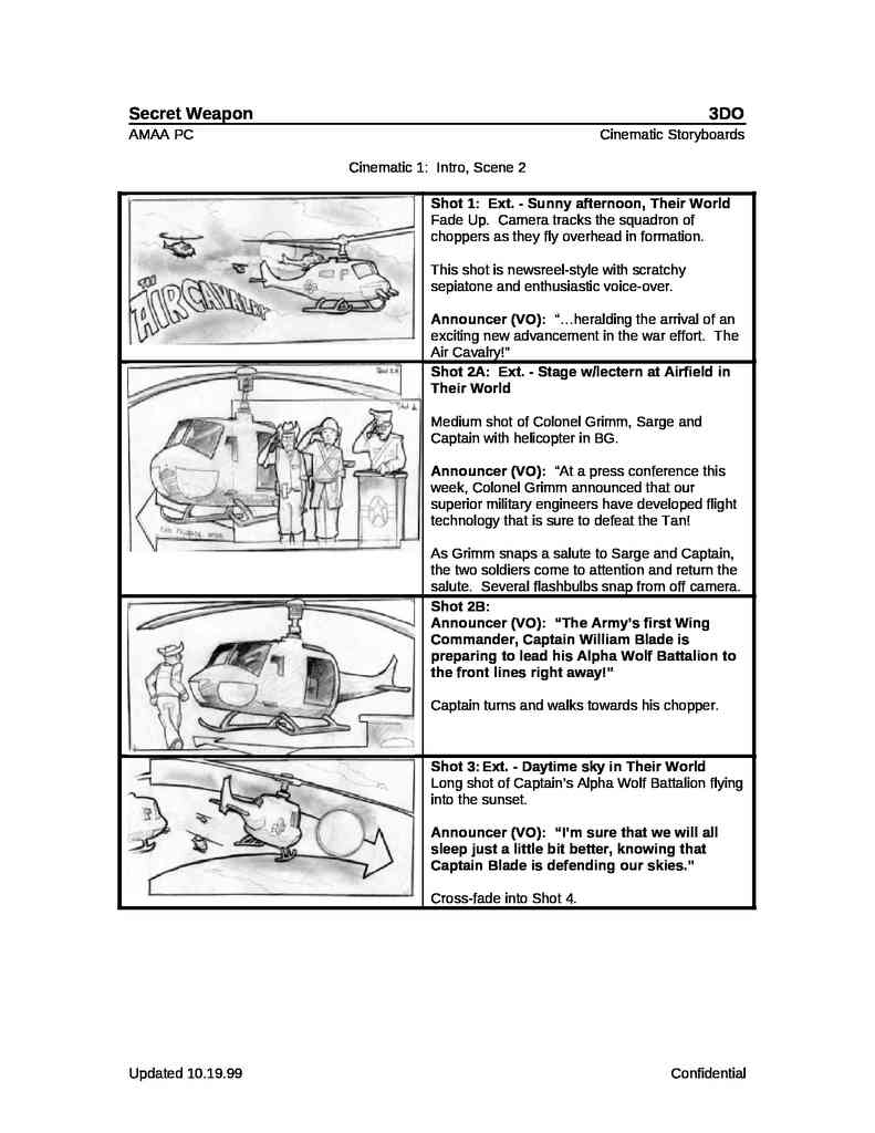
Army Men: Sarge’s Heroes Storyboard
To put it simply, storyboards, at least in this case, look like comic book adaptations of movies, but with instructions and guidelines for animation. For example, where a character is at the beginning of a shot, and where they are at the end. They are a series of graphic instructions that serve as a rough draft or basis for later animation. Keep in mind that different teams did different jobs, so those who drew the storyboards (drawn by hand) were somewhat like scriptwriters for the animation department.
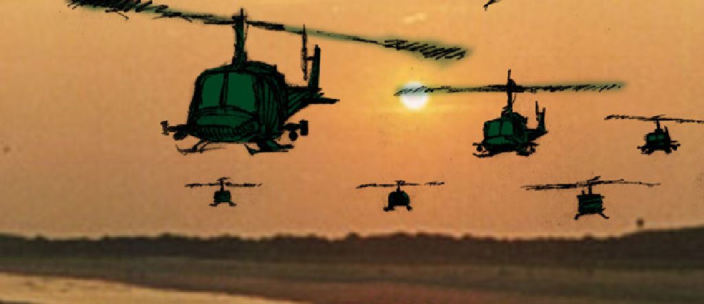
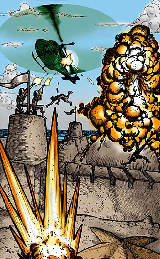
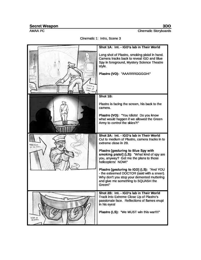
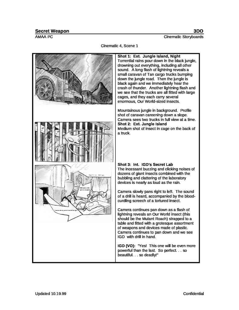
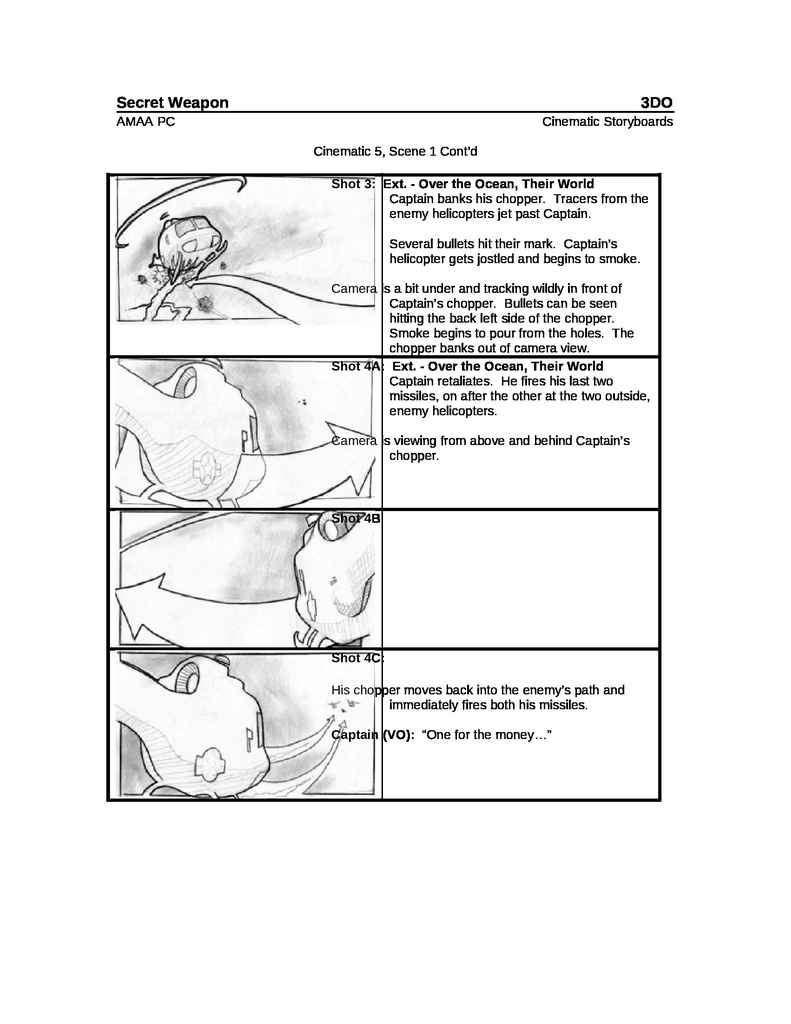
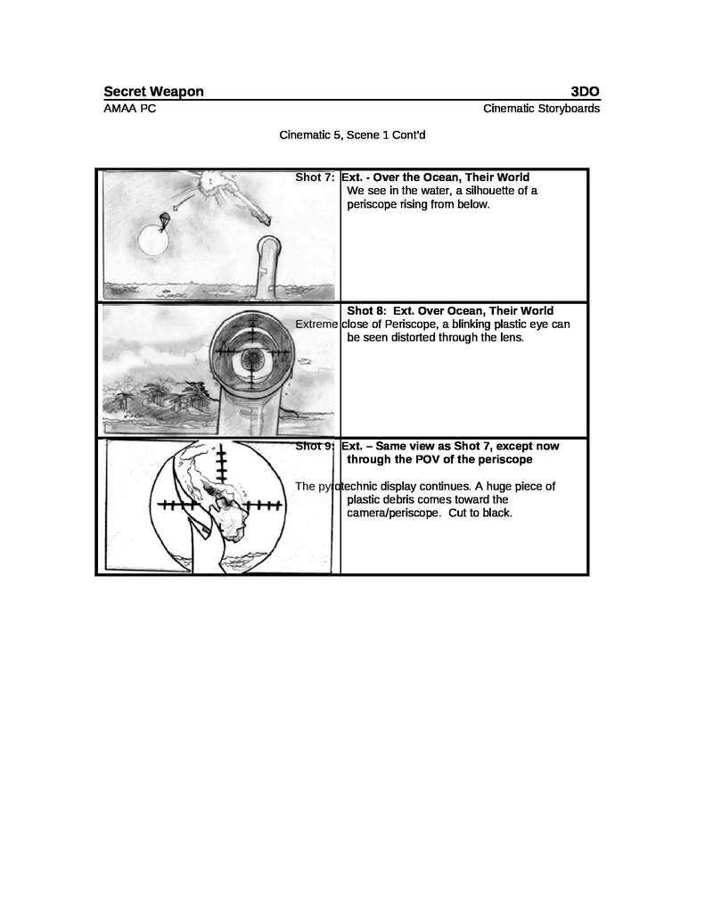
Army Men Air Tactics Storyboards
The entire storyboard for the CGI animated images of Army Men: Air Tactics. Scanned and inserted into digital text files.
One of the scanned conceptual storyboards, a step prior to inserting them into the digital text files.
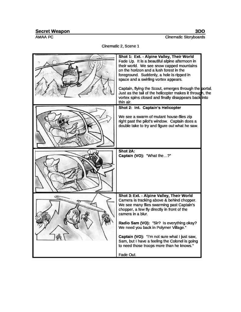
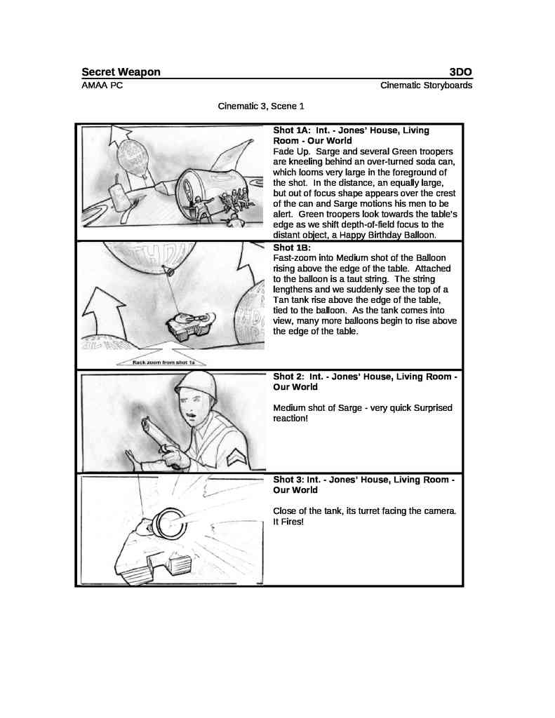
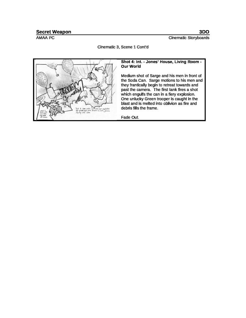
Army Men (1998) storyboards
Storyboards made for the original Army Men game, but used later in World War for PS1 or simple not used.
How do we interpret these Storyboards?
In the case of finding Conceptual Art of the original Army Men games, before the Heroes saga, we would need more information as it is in black and white, which would not allow us to interpret what colors each one is. The following is an example:
Others ways of making Storyboards & Concepts
Example of photo montage
Both Army Men Revolution and our animations will take place in environments based on real places. Therefore, here is a simple example of a Storyboard made with photographs:
Example of montage with image editing or Photoshop
The following is a conceptual representation of how the Heroes would function, for Sarge’s Heroes, in its early stages of development.
The heroes were supposed to have a more prominent role, functioning as companions during battles, following the protagonist’s movements but contributing their weapon skills (e.g., Scorch with his flamethrower, Riff with his bazooka).
It was even considered to be a kind of turn-based game, like some RPGs of the time.
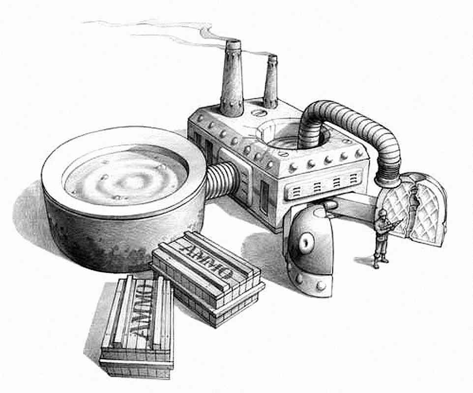
This style of concept art is made up of CGI renders, Photoshop, etc., to ensure maximum fidelity to the idea of how the video game should look.
The stoves that are activated to burn the enemy or the magnifying glasses, for practically the same thing.
In this case a conceptual example of calling an airstrike
These examples could even showcase different UI designs, and as in this case, graphically illustrate some of the desired special mechanics that hardly ever made it into the final product. But dreaming is cheap!
How they wanted the PS2 game to look? Sarge’s Heroes 2
Edited images composites of CGI 3D models, scenarios in a HD definition (maybe the map editor or 3D editing program too) and a lot of added effects.
Army Men: Sarge’s War Artwork
How to make a depressing, dark, and gritty Army Men: Sarge’s Heroes? Immerse everything in realistic war environments, like those of World War II Europe: everything destroyed, ruined, and with noisy, dirty, and stained textures.
More than Storyboards and Character Concepts
Back in the late 1990s and early 2000s, right at the dawn of digital design, due to a shift in generational change, processing speed, and lower computer power, hand-drawn artwork was the fastest way to conceptualize practically everything.
Army Men User Interface (Graphical User Interface, GUI or UI) hand drawn concept art
Army Men Level Design
Army Men Hand Drawn Level Design
And in fact, some hand-drawn artworks, later digitized and painted on the computer, ended up included in games, such as Sarge’s Hero designs in the bios of the first game of the same name.
In short, from character, vehicle and object design, to dynamic concepts for animation, graphic representations of the story’s narrative, the design of the games’ menu graphic interfaces, to the design of the playable scenarios… concept art (at least in those days) was the backbone of the graphic/visual design of the Army Men adventures, the words and ideas represented visually, which previously began being printed on paper.
Curiosities and Trivia:Toy Story movie Concept Art from the Plastic Soldier scenesSources for this article:
The Army Men Videogames Website, home of the Army Men Toyverse
Manage Consent
To provide the best experiences, we use technologies like cookies to store and/or access device information. Consenting to these technologies will allow us to process data such as browsing behavior or unique IDs on this site. Not consenting or withdrawing consent, may adversely affect certain features and functions.
Functional
Always active
The technical storage or access is strictly necessary for the legitimate purpose of enabling the use of a specific service explicitly requested by the subscriber or user, or for the sole purpose of carrying out the transmission of a communication over an electronic communications network.
Preferences
The technical storage or access is necessary for the legitimate purpose of storing preferences that are not requested by the subscriber or user.
Statistics
The technical storage or access that is used exclusively for statistical purposes.The technical storage or access that is used exclusively for anonymous statistical purposes. Without a subpoena, voluntary compliance on the part of your Internet Service Provider, or additional records from a third party, information stored or retrieved for this purpose alone cannot usually be used to identify you.
Marketing
The technical storage or access is required to create user profiles to send advertising, or to track the user on a website or across several websites for similar marketing purposes.