Flags, logos, and other visual representations are powerful tools in graphic design, serving as symbols that convey identity, values, and messages of groups, nations, factions, and communities. Let’s explore these elements from a graphic design perspective, focusing on representation, iconography, and the meanings behind various design elements and their users.
Army Men Nations flags
Flags in the Army Men franchise are somewhat diverse. Some use Real-World references, their initial font, or some kind of Shapes or Symbols. Black and White are used for the contrast element.

Toyverse Project Original Flags

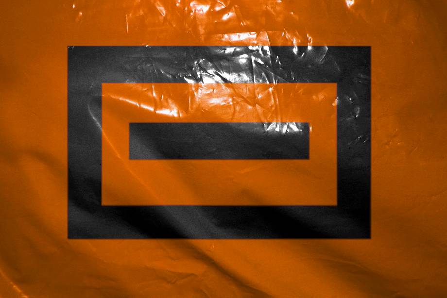

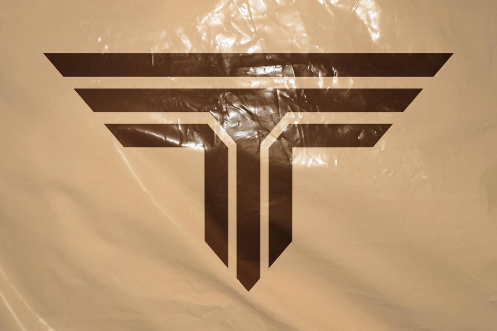
In the case of the Orange and White armies we used the W and O from the “Real World” logo, which is heavily based on the “Real” slogan from 3DO. But the most for the White Army, because that W is too captivating for us to leave it alone in that logo. It also follows a bit the design aesthetic of the T of the Tan Army.
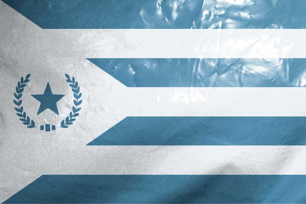
In the case of the Cyan Army, it is a flag more in the classic style of a Real-World country flag.
But in the case of the White Army flag, we are considering this idea for the design. Although it may end up being a mirror image… or even more distant, it may end up being the logo of Lord Malice or Major Malfunction!
Representation in Graphic Design
Representation in graphic design involves creating visual symbols that encapsulate the essence of the entity they represent. This could be a nation, a company, a social movement, or a community. The goal is to create a design that is instantly recognizable and communicates the core values, ideas and identity of the group.
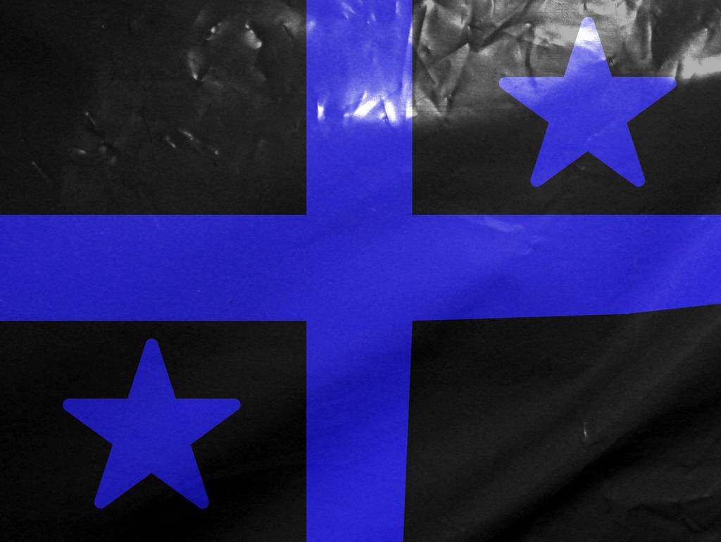
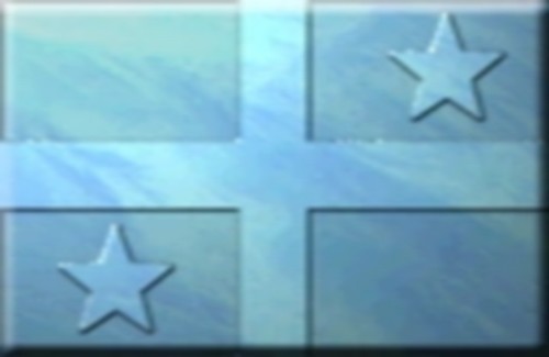
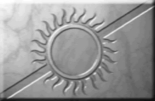
Other flags & logos
Iconography
Iconography is the study and use of images and symbols to represent ideas, concepts, or information. In graphic design, iconography is crucial because it allows for the quick and effective transmission of messages. Symbols and icons are more than decorative elements; they are the shorthand of communication, cutting through the clutter of words to convey complex messages swiftly.
The Army Men video game franchise, which began in 1998, is known for its distinctive iconography that draws heavily from the classic green plastic toy soldiers. Here are some key elements:
- Color-Coded Factions: The games feature different factions represented by distinct colors, primarily the Green and Tan armies. Other factions like the Blue and Grey armies also appear, each with their own unique characteristics and allegiances.
- Toy-Like Aesthetic: The visual style of the games emphasizes the plastic nature of the soldiers. When characters are defeated, they often melt or shatter, reinforcing the idea that they are toys.
- Real-World Settings: Many of the battles take place in exaggerated real-world environments, such as kitchen counters, gardens, and bathrooms. This juxtaposition of small toy soldiers in large human environments adds a playful and imaginative element to the games.
- Military Symbols: The games incorporate traditional military iconography, such as medals, ranks, and insignias, but with a playful twist to fit the toy soldier theme.
- Vehicles and Equipment: The franchise includes a variety of toy-like vehicles and equipment, such as jeeps, tanks, and helicopters, all designed to look like they belong in a child’s playset.
These elements combine to create a unique and nostalgic experience that appeals to both fans of classic toy soldiers and video game enthusiasts.
Original logotypes:
This was the first logo for the game franchise, later used in Army Men 3D. Later they used different versions for Army Men 2, Army Men Toys in Space and even Sarge’s Heroes and Air Attack. But it was right during the release of these last 2 games that they came up with the final version:
This version was used in most (if not all) of the later games, with out the slogan. It was used for last versions of Sarge’s Heroes and Air Attack, until 3DO went out of business. Even after that it was still used for Sarge’s War and Major Malfunction.
Our Army Men Toyverse Project Logotypes
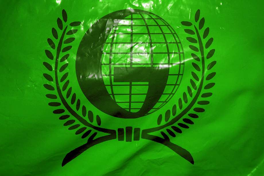
This logo is from our Toyverse project, the logo that the Army Men Alliance uses in their research initiative into the Real World, the world of humans. The design uses the REAL logo from the defunct company 3DO, a kind of slogan they used. It is worth noting that the 3 colors between the letters of REAL are the colors of the 3 pieces of the key that opens the portal in the first game and in Army Men 3D. Since we couldn’t find any matches for the font used, to add WORLD we cloned the R and the L, and created the other letters trying to respect the same style, giving a special emphasis to the W.
This logo captures the mystery and novelty that the Real World means to Army Men.
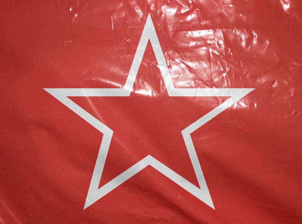
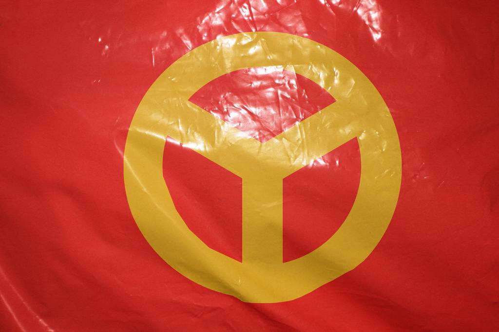
This is the logo for our video game project. We wanted a somewhat innovative logo, without losing the essence of Army Men. And since it revolves around the Red Army, we gave it that color and some of the essence of the fonts used in the propaganda of the Soviet Union, in which our version of the Reds are strongly based (not for nothing their official flag is a star). Something that helped us finish the idea of the logo was the 2024 movie “Deadpool & Wolverine”, because of that texture of worn painted and metal underneath, which also alludes to the fact that one of the super weapons of the Red Army will be that they manufactured a massive army of vehicles and all kinds of war tools in Real World metal alloys.

This is the logo for the Toyverse project, which serves to encompass other projects under the same initiative, in which ideas, canon and assets are shared. Read more in Army Men Toyverse project.
If you feel like the style sounds familiar, it’s because it’s very similar to the style of “Toys in Space”, which we think is a game that represents the imaginative diversity that can be brought to the world of Army Men.
This is almost the same logo as the 2.0 logo, but in our case we used it for the branding of the plastic soldiers line in the Real World (Real Plastic Men).
Elements in design and their meanings
- Colors: Colors play a significant role in visual representations. Each color can evoke specific emotions and symbolize different concepts. For example:
Red: Often associated with passion, energy, and danger. In the case of the Reds, it is appropriate because it represents their nationalist passion and protection of themselves and their culture. They believe that their ideals are correct above all other beliefs, and they defend their culture to the point of being totally closed to the outside world. At first they will be conservative and extremist in keeping it that way.
Blue: Represents calmness, trust, and stability. In the case of what brings us here, Blue is usually a color related to the sky, but especially to the Sea, Water and Ice. For this reason, the element dominated by the Blues will be water or ice, as we can see in the defensive towers of Army Men Warfare. Blue is also a cold and dark color, which helps to go unnoticed in the dark, which is what every spy needs to operate.
Green: Symbolizes nature, growth, and harmony. In the case of our project, it symbolizes the Greens’ initiative to respect the nature of the other worlds and maintain them in harmony, trying not to interfere with or modify them.
Orange: They represent fire, the element that the Orange Nation will dominate. Although the personality of some of its characters will go hand in hand with the intensity of fire.
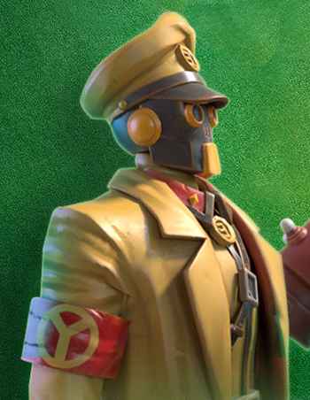
Gray: They represent neutrality and the absence of diversity. In our Toyverse, the greys were like the Nazis: they rejected everything they considered incorrect or out of the normal status. Their colors lack individuality and diversity. It is also useful when it comes to camouflaging with the environment, one of the most neutral colors for this purpose.
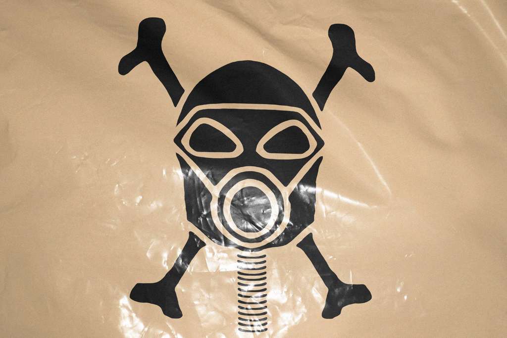
Black: Can denote power, elegance, and mystery. You’ll know why…
- Plants: Trees can symbolize life, growth, and wisdom, while flowers like roses can represent love and beauty.
- Shapes and Symbols: Shapes and symbols are integral to iconography. Common shapes and their meanings include:
Circles: Represent unity, infinity, and protection.
Triangles: Can symbolize stability, power, and direction.
Stars: Often used to denote excellence, aspiration, and guidance.
- Imagery: The use of specific images can convey deeper meanings. For example:
Animals: Different animals can symbolize various traits. For instance, an eagle often represents freedom and strength, while a lion symbolizes courage and royalty.